
by AnshumanD | Oct 30, 2024
Executive summary Client: A large US-based construction company with about 2,000 employees and annual revenue of $400 million. Challenge Faced by Client: Customer satisfaction scores had steadily declined for two consecutive quarters, and without a root-cause...
by AnshumanD | Oct 30, 2024
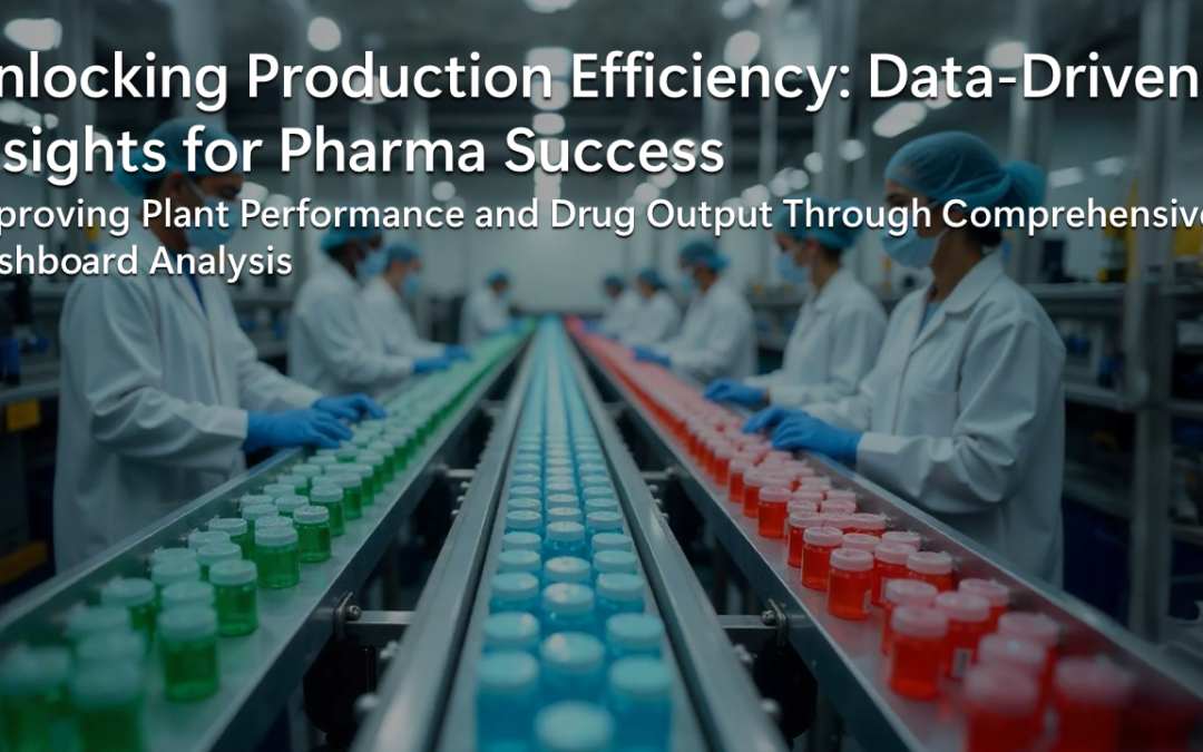
Learn how we empowered a pharmaceutical company to optimize plant drug production with a custom-built dashboard solution. This production summary dashboard provided real-time visibility into key production metrics, allowing the team to evaluate target achievements and...

by AnshumanD | Sep 24, 2024
Explore how we helped a pharmaceutical company streamline their drug stability testing with a custom dashboard. With rapid alert detection and data-driven insights, the company was able to make faster, informed decisions, ensuring quality control throughout the...

by AnshumanD | Jul 20, 2024
Executive Summary Client: A leading food manufacturing company with $600M annual revenue and 500 employees. Challenge: Rising IT vendor spend lacked transparency and root cause visibility, creating inefficiencies and potential budget leakages. Tools Used: Tableau,...

by AnshumanD | Jul 20, 2024
Executive Summary Client: Mid-sized US construction firm with 700–1000 employees Challenge Faced by Client: Limited, fragmented pipeline tracking and no centralized analytics Tools Used: Power BI, CRM integration, DAX, Power Query Solution: We meticulously designed a...
Recent Comments