by sagarp4412@gmail.com | Jul 9, 2026 | Resources
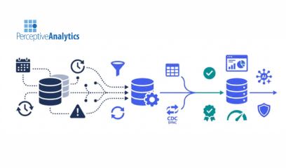
Executive SummaryIncremental refreshes have become essential as data volumes continue to grow, but they solve only part of the scalability challenge. The larger issue is how organizations manage historical data through Slowly Changing Dimensions (SCDs) without...
by AnshumanD | Mar 5, 2026 | Resources
Benefits-of-using-a-fully-managed-ETL-Tool 1.No Infrastructure & Instant Scalability – No servers or hardware to manage. The platform scales automatically based on workload, from small jobs to large data volumes. 2.Faster & Easier Implementation –...
by AnshumanD | Jan 1, 2025 | Resources
https://www.perceptive-analytics.com/wp-content/uploads/2025/09/TTF-GIF-V7.mp4 Power BI introduces Translytical Task Flows: Faster decisions for today’s CXOs Until now, if you wanted to make changes or trigger workflows from Power BI, you needed external apps like...
by AnshumanD | Jan 1, 2025 | Resources
Importance-of-ToolTip Dashboards with tooltips deliver clarity: Get answers on hover, no digging required Clear charts with deeper context instantly Focused insights that speed up decisions Examples in action: Churn KPI shows 8% → Tooltip flags spikes above average...
by AnshumanD | Jan 1, 2025 | Resources
Mobile-Dashboard-Guide 60% of dashboard consumption now happens on mobile. Designing dashboards for mobile isn’t just about shrinking visuals – it’s about rethinking the experience. This guide helps you – Spot the differences in how users consume and interact on...
by AnshumanD | Jan 1, 2025 | Resources
Sunburst-Chart A Sunburst is a multi-layered radial chart that shows hierarchical data in one view. It starts with a central category and expands outward into phases and tasks, with slice size representing metrics such as time, cost, or sales. Unlike pie charts or...

Recent Comments