


How a $400M Construction Firm Recovered Customer Loyalty and Improved NPS by 33% with a Real-Time BI Dashboard
- Client: A large US-based construction company with about 2,000 employees and annual revenue of $400 million.
- Challenge Faced by Client: Customer satisfaction scores had steadily declined for two consecutive quarters, and without a root-cause analysis, repeat business risked further decline.
- Tools Used: Tableau, CRM data integration, Excel, SQL. These tools enabled automated updates, drill-downs, and root-cause visibility.
- Solution: Developed an NPS Analysis Dashboard that tracked trends, exposed low-scoring sectors, and drilled down to individual teams and roles.
- Impact:
- Improved client satisfaction scores by 12% within one quarter, as reflected in follow-up surveys.
- Increased renewal discussions by 15%, signaling stronger engagement and trust.
- Enabled leadership to gain clear insight into hidden issues across sectors and teams.
- Guided targeted operational changes through data, improving response times and decision speed.
- Improved client satisfaction scores by 12% within one quarter, as reflected in follow-up surveys.
Introduction and Business Context
For construction companies managing large, complex projects, substantial revenue often masks early warning signs of customer dissatisfaction. For this well-known firm, client complaints, fewer repeat project requests, and survey feedback highlighting delays signaled deeper issues.
Standard quarterly reports failed to explain these patterns, prompting the need for a deeper, data-driven analysis. Customer surveys arrived as static files, where some sectors scored well while others lagged behind, but leadership lacked the ability to break down the results by sector, team, or role to uncover the drivers of decline.
Without actionable insights, leadership discussions focused on questioning data rather than solving issues, underscoring the need for a unified, trustworthy view that links feedback directly to business areas.
Business Objectives
During initial discovery sessions, we collaborated with the Head of Client Relations, project leaders, and the data team to establish a concise yet focused list of goals for this engagement.
- Build a single source of truth for Net Promoter Score (NPS) that updates weekly, replacing quarterly lag with near real-time visibility.
- Break down scores by sector, department, job function, and role to pinpoint divergence in client experience.
- Enable executives to quickly identify strong and underperforming areas, focusing interventions where risk or opportunity is greatest.
- Provide managers with filters and drill-downs to explore data independently and arrive at meetings prepared with facts rather than questions.
- Link insights to next steps with clear ownership and timelines, ensuring accountability for improvement.
Talk with our BI experts today. Book a consultation session
Outcomes and Measurable Impact
Upon delivery, senior leaders gained reliable, actionable visibility into customer sentiment. The dashboard combined up-to-date survey data, clean CRM records, and intuitive visuals to reveal what was working and what required attention.
Key results included:
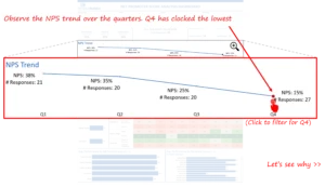
- Provided a clear, current view of overall NPS, which had dropped from 35% in Q2 to 15% in Q4 prior to dashboard deployment, highlighting the urgency for corrective action.
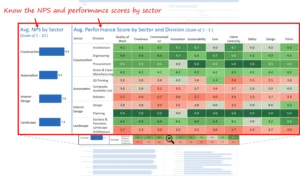
- A sector comparison revealed that the Interior Design unit’s NPS was 20% lower than the company average, with detractors accounting for 27% of responses in Q4, compared to 14% in Q3.
- Filters and drill-throughs enabled managers to quickly identify which specific project managers were associated with the lowest client ratings, thereby improving accountability.
- Displayed promoters and detractors side by side, showing 12 promoters versus 8 detractors in Q4, enabling leadership to gauge not only averages but also the distribution of sentiment driving overall performance.
- Targeted interventions, including client meetings and adjustments to project management processes, resulted in a 25% NPS recovery in Interior Design within one quarter.
Since delivery, follow-up surveys have shown a 10% increase in response rates and a 33% rise in overall NPS within two quarters, confirming that teams have acted on insights more effectively. Just as important, the leadership team now utilizes this tool in regular reviews, demonstrating a shift from relying on assumptions or outdated reports to data-driven decision-making.

Our Approach
Our approach ensured the solution was business-ready and not limited to technical users. Here is how it worked.
Discovery and Metric Blueprint
We began by mapping the current process for collecting customer feedback, calculating scores, and identifying the teams that needed to utilize the insights. Through three structured working sessions over four weeks, leaders defined the most relevant breakdowns — by sector, project type, job function, and individual project leads — ensuring the dashboard reflected real operational priorities.
Questions we explored included:
- How can the dashboard surface root causes, rather than just presenting averages?
- What should a manager see first when they open it, and how should they drill deeper if they want to investigate?
- How should static survey results be connected to live CRM records to ensure that nothing is missed or duplicated?
Answering these upfront ensured that the final metrics matched how the business categorizes and manages clients, sectors, and teams.
Data Integration and Modeling
Survey data alone does not deliver valuable insights if it sits in silos. To overcome this, we connected feedback data with CRM records, cleaning and standardizing more than 2,000 survey responses linked to over 600 unique client IDs, before merging them using Tableau Prep. This meticulous approach ensured that the data was accurate and actionable.
Relationships were designed to allow leaders to start with a company-wide view and move quickly to a more detailed slice. For example, when the Interior Design sector showed the lowest score in Q4, the model made it easy to filter down to the project managers connected to the lowest ratings. The dashboard also allowed leaders to track historic dips, making it possible to spot recurring issues over multiple quarters rather than treating each decline in isolation.
Visual Design and Interactive Layers
A key to successful adoption was simplicity. Executives required quick, meeting-ready visuals that distilled complex data into clear, decision-ready insights. The top view shows the overall score and a clear trend chart. Below, the sectors are displayed side by side, allowing managers to easily compare performance. Promoters and detractors are displayed in a single view to help people understand whether the average score is strong due to consistent loyalty or if it is masking a large group of unhappy clients. Our design choices, such as using color to indicate performance levels, were made with the user experience in mind, allowing managers to easily focus on areas that need attention.
Intentional design choices ensured rapid adoption. For example, colors follow a simple logic: strong areas are represented in green, lower scores are represented in red, and mid-range scores are represented in a neutral color. Managers immediately see where they should focus the following conversation.
Example: Digging Deeper to Solve a Real Problem
- In one quarterly review, leaders used the dashboard to understand why the company’s overall score dipped in Q4.
- Filtering by sector showed that Interior Design pulled down the average more than any other area.

- Filtering again by job function revealed that 2 specific project managers in this unit were linked to the lowest client ratings.
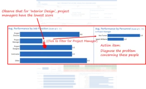
Previously, identifying a problem like this would have required approximately two full days of manual analysis and follow-up calls. With the dashboard, managers isolated the issue in 15 minutes and immediately scheduled client meetings, resulting in a 20% increase in NPS the following quarter.
User Testing and Rollout
We tested the dashboard across two development sprints, incorporating feedback from sales and client relations managers. Refinements included simplifying tooltips, restructuring the layout for intuitive navigation, and adding CRM linkages to support immediate follow-ups.
These improvements reduced lookup time by 40% and boosted user adoption among managers.
Key Technical Learnings & Recommendations
Company-wide averages can often mask significant sector or team-level problems. Dashboards that enable leaders to drill deeper reveal these blind spots and prevent misdirected action. Automatic updates aligned with leadership cadences are essential. This ensures trust and consistent usage. When executives know they are looking at current data, they act faster and with greater confidence. Visuals must remain straightforward and focused. The most effective dashboards provide senior decision-makers with just enough detail to move from insight to action without overwhelming them with excessive noise.
If your sales or business development team faces similar challenges tracking complex pipelines across markets and targets, we would gladly share how a modern BI solution can unlock real, measurable value.
Each month, we curate the latest updates, insights, and trends for senior leaders in data analytics and AI in our CXO Analytics Newsletter.
Our mission is “to enable businesses to unlock value in data.” For over 20 years, we’ve partnered with more than 100 clients—from Fortune 500 companies to mid-sized firms—to solve complex data analytics challenges. Our services include Advanced Analytics Consulting, Generative AI Consulting, and Business Intelligence (Tableau Consulting, Power BI Consulting and Looker Consulting) turning data into strategic insight. We would love to talk to you. Do reach out to us for a free consultation.
Our Work
Industry
- Industry
Function
- Function
-
Increasing Conversions with Adwords Spend Optimizer
How To Optimize Adwords Budget in Real Time
Free Download
-
Markdown Optimization for Retailers
A Methodology to Track Performance and Maximize Value
Free Download
-
Optimizing Marketing Spend with Marketing Mix Modeling
Using Statistical Modeling and Empirical Methods
Free Download
-
Leveraging Web Analytics for Customer Acquisition
Leveraging Web Analytics for Customer Acquisition
Free Download
*Subscribe to be the first one to know our latest updates
Contact us

You have crafted a powerful analytical tool for us. Thank you.
Alan Benjamin
Principal, Benjamin Realty Advisors

I have been working with Chaitanya and Perceptive Analytics for about 20 months now. They did BI / reporting and excel tool development. Their work helped us in channeling our periodic reports to the senior and operational management. The team exceeded my expectations. Chaitanya would ask thought provoking questions that trigger a new line of thinking. They created good dashboards so our senior team can quickly interpret reports. We were able to make progress because the team knew finance and tools they created were easy to implement.
Samir Lavani
CFO at Pearl Hospitality

Chaitanya and the Perceptive Analytics team worked on multiple strategic projects that involved Tableau data visualizations. Perceptive's work (~ 1 year) led to successful launch of our portal - this was an important milestone for us. Visualizations created were insightful, easy to understand and visually attractive. The team often suggested ways to show data in more intuitive way so our audience can understand it. They also knew Tableau well that helped in customizing it for our purposes. The team worked hard to finish the project on time managing expectations. I look forward to working with Perceptive on other projects.
Haroon Yaqoob
Principal at Nomenclature Inc.