
by AnshumanD | Feb 3, 2025
Executive Summary Client: Mid-sized AI finance solutions provider ($50M annual revenue, ~200 employees) Challenge: Fragmented reporting led to missed sales targets and unreliable forecasting; sales leaders lacked visibility into bookings, renewals, and opportunity...

by AnshumanD | Feb 3, 2025
Executive summary Client: Regional property management firm with $10 million in revenue and around 100 employees. Challenge: Leasing and occupancy data were fragmented across spreadsheets and ad hoc reports. Leadership lacked a single, reliable view of vacancies, unit...
by AnshumanD | Feb 3, 2025
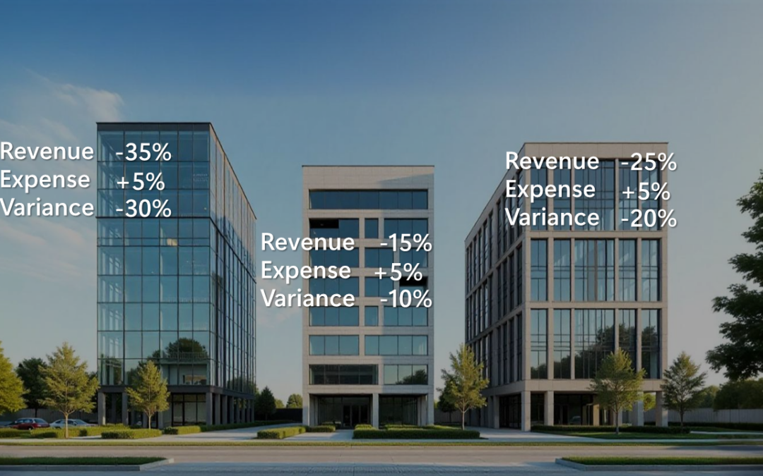
Executive summary Client: A mid-sized property management company (~$40M annual revenue, 100 employees). Challenge: The leadership team lacked a unified financial view across properties. Reports were static and backward-looking, making it challenging to identify...

by AnshumanD | Feb 3, 2025
Discover how we helped a private lending company gain control over loan servicing health. The dashboard enabled real-time monitoring of overall loan performance, delinquency management, and escrow balance tracking. With these insights, the company effectively...

by AnshumanD | Feb 3, 2025
Explore how we helped a private lending company enhance employee performance management. The dashboard provided a comprehensive view of overall employee performance, tracked goal achievement, and streamlined incentive management. These insights led to improved...
Recent Comments