-
- Client: A mid-sized property management company (~$40M annual revenue, 100 employees).
- Challenge: The leadership team lacked a unified financial view across properties. Reports were static and backward-looking, making it challenging to identify underperforming properties or act on overspending trends in real time.
- Tools Used: Power BI, Excel, SQL Server.
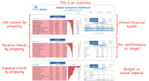
- Solution: Designed and implemented a Budget Comparison Dashboard in Power BI to provide real-time visibility into property-level revenues, expenses, and profit margins. The dashboard integrated income statements from multiple regions and offered variance analysis against budgets.
- Impact:
-
- Reduced budget variance by nearly 15% within two quarters, strengthening financial accuracy and control.
- Detected overspending early across multiple categories, enabling leadership to curb cost overruns proactively.
- Accelerated financial reviews by over 40%, fostering collaboration between CFOs and property managers.
- Increased revenue contribution from top-performing properties by 10%.
- Enhanced forecasting precision by aligning financial KPIs with operational data, ensuring more reliable quarterly targets.
- Reduced budget variance by nearly 15% within two quarters, strengthening financial accuracy and control.
Introduction and Business Context
The line between profitability and overspending is often thin for property management firms. Maintaining accurate financial visibility across dozens of properties is a constant challenge, especially when revenues, repair expenses, and operating costs vary widely.
Our client, a $40 million property management company, managed over 100 employees and multiple residential and commercial properties. Despite strong top-line growth, the finance team struggled to pinpoint why some locations underperformed against budget while others consistently exceeded expectations.
Financial reports were static, often prepared weeks after the month-end close, leaving the executive team in the dark about current performance. Without real-time visibility, financial decisions were reactive and guided by spreadsheets, rather than strategy.
Business Objectives
The engagement was scoped to deliver CFO-aligned outcomes that improved financial transparency and operational accountability:
- Consolidate financial data across properties into a single source of truth for revenue, expense, and profit tracking.
- Enable real-time budget comparison to detect early deviations and trigger corrective actions.
- Highlight high- and low-performing properties with clear visual cues for immediate management focus.
- Empower regional managers to make data-driven financial decisions independently.
- Improve cost discipline by pinpointing overspending categories and their impact on net income.
Talk with our BI experts today.Book a consultation session
Outcomes and Measurable Impact
Within just a few months of deployment, the Budget Comparison Dashboard became a cornerstone of financial decision-making for the leadership team. It unified fragmented budget data, enabled real-time monitoring, and allowed executives to anticipate financial risks rather than react to them.
The following measurable impacts demonstrate how the solution translated analytics into meaningful business results:
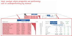
1. Improved Financial Control through Variance Visibility
Leadership could instantly view variance across revenue and expense categories. For example, one property recorded a –35% revenue gap and a +5% expense variance, which was immediately surfaced through the dashboard’s visual indicators.
This early detection allowed finance managers to act before losses compounded, ultimately helping reduce overall budget variance by nearly 15%.

2. Enhanced Focus on Profitability Drivers
The dashboard’s “Revenue and Expense Trends” views let managers compare performing and underperforming properties. They quickly spotted properties exceeding expense thresholds while lagging on revenue, allowing targeted corrective measures.
By addressing such mismatches early, teams improved the average profitability of low-performing properties by 8–10% over subsequent review cycles.
3. Identified Overspending Hotspots
The tool revealed that 808 Broadway Lofts consistently exceeded its allocated repair budget. The deep-dive analysis confirmed that building repairs were the prime driver of missed profit targets.
With these insights, leadership introduced maintenance spend controls that cut overspending by nearly 12%, directly boosting the property’s net income outlook.


4. Accelerated Reporting and Review Cadence
Previously, monthly financial consolidation required multiple data extracts and manual validation. With the Power BI dashboard, CFOs and regional managers now access all property summaries in seconds.
Review sessions were shortened by 40%, and reconciliation cycles dropped from days to hours, freeing leadership time for strategic forecasting rather than retrospective analysis.
Talk with our BI experts today. Book a consultation session
5. Strengthened Accountability and Decision Agility
Automated variance alerts notify property teams when revenue or expense deviations cross set thresholds.
As a result, leaders can act within the same day, reallocating budgets or scheduling follow-ups with managers, improving response speed by over 60% and strengthening overall financial governance.
Our Approach
The Power BI dashboard was developed with an emphasis on transparency, usability, and financial precision. Our process included four focused phases:
1. Data Integration and Model Design
We integrated income statements and budget data from all properties into a centralized SQL-based model, ensuring consistent category definitions, eliminating Excel version mismatches, and enabling unified financial visibility across the portfolio.
2. Dashboard Design and Visualization
The dashboard was structured into intuitive layers, from company-wide summaries to individual property-level performance. Each visualization was designed to provide immediate clarity on revenue, expense, and variance trends.

3. Variance Analysis and Root Cause Detection
We incorporated variance metrics comparing actuals against budget for each property and expense category. The design made it easy to trace which locations drove positive or negative variances, allowing managers to quickly investigate the root causes. This phase was crucial in providing actionable insights for decision-making.

4. Actionable Insights for Decision-Making
Once the insights surfaced, CFOs could directly act on reallocating funds, adjusting forecasts, or initiating spending reviews within minutes of reviewing the dashboard. This shortened the action loop drastically from weeks to days.
Key Learnings and Recommendations
This engagement reinforced key principles for financial analytics success in property management:
- Clarity Drives Confidence:
Executives make faster, better decisions when visuals directly reflect financial goals, including revenue, expense, and profit, without unnecessary complexity. - Timeliness Beats Perfection:
Weekly refreshes, rather than monthly, ensured real-time awareness, which proved more valuable than perfect end-of-quarter reconciliations. - Localized Insight Matters:
Comparing properties side by side made it easy to spot problem areas and replicate success patterns from profitable sites. - Visualization Should Trigger Action:
Highlighting variance in red or green guided attention instantly, turning the dashboard into a live management tool, not just a reporting asset.
The Budget Comparison Dashboard provided our client with the control they needed to manage their property finances confidently. By integrating operational and financial data into a single interactive Power BI dashboard, leadership can identify trends, control spending, and maximize returns across their portfolio.
In conclusion, the Budget Comparison Dashboard revolutionized our client’s financial management. Executives no longer waited weeks to understand what went wrong. They could now intervene on the same day insights appeared. The result was a more agile, performance-driven culture that valued foresight over hindsight. This project serves as a testament to the power of modern BI solutions in unlocking real, measurable value for businesses.
If your sales or business development team faces similar challenges tracking complex pipelines across markets and targets, we would gladly share how a modern BI solution can unlock real, measurable value.
Each month, we curate the latest updates, insights, and trends for senior leaders in data analytics and AI in our CXO Analytics Newsletter.
Our mission is “to enable businesses to unlock value in data.” For over 20 years, we’ve partnered with more than 100 clients—from Fortune 500 companies to mid-sized firms—to solve complex data analytics challenges. Our services include Advanced Analytics Consulting, Generative AI Consulting, and Business Intelligence (Tableau Consulting, Power BI Consulting and Looker Consulting) turning data into strategic insight. We would love to talk to you. Do reach out to us for a free consultation.
Our Work
Industry
- Industry
Function
- Function
-
Increasing Conversions with Adwords Spend Optimizer
How To Optimize Adwords Budget in Real Time
Free Download


-
Markdown Optimization for Retailers
A Methodology to Track Performance and Maximize Value
Free Download
-
Optimizing Marketing Spend with Marketing Mix Modeling
Using Statistical Modeling and Empirical Methods
Free Download
-
Leveraging Web Analytics for Customer Acquisition
Leveraging Web Analytics for Customer Acquisition
Free Download
*Subscribe to be the first one to know our latest updates
Contact us

You have crafted a powerful analytical tool for us. Thank you.
Alan Benjamin
Principal, Benjamin Realty Advisors

I have been working with Chaitanya and Perceptive Analytics for about 20 months now. They did BI / reporting and excel tool development. Their work helped us in channeling our periodic reports to the senior and operational management. The team exceeded my expectations. Chaitanya would ask thought provoking questions that trigger a new line of thinking. They created good dashboards so our senior team can quickly interpret reports. We were able to make progress because the team knew finance and tools they created were easy to implement.
Samir Lavani
CFO at Pearl Hospitality

Chaitanya and the Perceptive Analytics team worked on multiple strategic projects that involved Tableau data visualizations. Perceptive's work (~ 1 year) led to successful launch of our portal - this was an important milestone for us. Visualizations created were insightful, easy to understand and visually attractive. The team often suggested ways to show data in more intuitive way so our audience can understand it. They also knew Tableau well that helped in customizing it for our purposes. The team worked hard to finish the project on time managing expectations. I look forward to working with Perceptive on other projects.
Haroon Yaqoob
Principal at Nomenclature Inc.