-
-
- Client: Regional property management firm with $10 million in revenue and around 100 employees.
- Challenge: Leasing and occupancy data were fragmented across spreadsheets and ad hoc reports. Leadership lacked a single, reliable view of vacancies, unit types that drive downtime, or the operational reasons behind empty units. This made prioritization and targeted remediation slow and inconsistent.
- Tools used: Power BI, SQL, and Excel data.
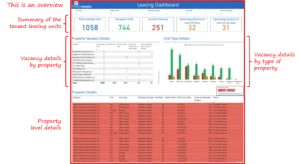
- Solution: A Tenant Leasing Dashboard that consolidates unit-level occupancy, vacancy counts, property drill downs, and manager annotations into a single interactive decision surface. The dashboard surfaces portfolio-level vacancy trends, as well as the specific units and reasons that require action.
- Impact:
-
- Converted dispersed vacancy signals into a clear and prioritized action list for operations and leasing teams.
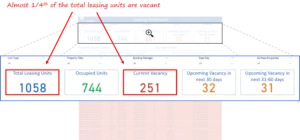
- Surfaced that almost one quarter of leasing units were vacant in the sample dataset, creating a clear headline for executive focus.
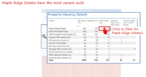
- Identified property-level hotspots as well as unit type concentration, enabling focused marketing, maintenance, and manager engagement.
- Brought manager-level notes into the same view so actions can be assigned directly from the dashboard.
- Converted dispersed vacancy signals into a clear and prioritized action list for operations and leasing teams.
-
Introduction and Business Context
Vacancies are a direct and visible drag on rental income and operational efficiency. For this regional manager, many of the inputs required to understand vacancy patterns were scattered across various systems and spreadsheets. That fragmentation meant leaders reacted to symptoms rather than addressing root causes. During the sample period covered by the dashboard, nearly one-quarter of the portfolio’s leasing units were vacant. That single headline demanded a clear and fast response.
The Tenant Leasing Dashboard was built to change the operating model. Instead of running periodic manual reconciliations, leaders and field teams can now see which properties, which unit types, and which managers require attention in one place. The dashboard converts volume-level observations into actionable tasks by combining vacancy counts, unit metadata, and manager notes.
Business Objectives
The project focused on outcomes that matter to executives responsible for revenue and portfolio health:
- Provide a single source of truth for occupancy and vacancy across all leasing units.
- Prioritize remediation efforts by surfacing the properties and unit types that drive most downtime.
- Expose operational root causes at the unit level through manager annotations.
- Reduce time to act by enabling teams to convert discovery into assigned actions from the same dashboard.
- Enhance rent flow and tenant experience by closing vacancies more efficiently and effectively.
Outcomes and measurable impact
The Tenant Leasing Dashboard enables the organization to transition from fragmented monitoring to prioritized action. The dashboard visuals demonstrate clear operational signals and the concrete steps that follow from them.
- Portfolio-level Clarity: The dashboard provides a single, actionable headline to the C-suite. For our client, almost one quarter of all leasing units are vacant. This immediate visibility focuses executive energy and creates consensus on where to direct resources and campaigns.
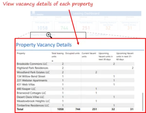
- Property hotspot identification: By highlighting the hotspots with a high number of vacant units, the dashboard enables operations and leasing to prioritize targeted interventions, such as promotional offers, maintenance prioritization, and manager coaching. For instance, Maple Ridge Estates is identified as the area with the highest number of vacant units.
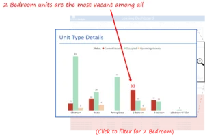
- Unit type prioritization: The dashboard displays the number of current vacancies at the unit level, providing marketers and leasing staff with a precise target for promotions and pricing tests. For instance, for our client, Two-bedroom units are the largest contributor to vacancy in the sample.
- Property-Level Root Cause Visibility: Manager annotations in the dashboard indicate that poor property management is the primary reason for several vacancies. Bringing these notes directly into the data view reduces the time teams spend in meetings trying to reconcile anecdotal explanations and enables immediate assignment of corrective actions.

- Assignable actions and closure paths: Each flagged unit or property includes an action item prompt, such as connect with the on-site manager to resolve issues. Embedding the next step in the same interface removes ambiguity and accelerates follow-up.
Collectively, these outcomes reduce the organizational effort of discovery and channel attention to the highest-impact activities that reduce downtime and protect revenue.
Talk with our BI experts today. Book a consultation session
Our approach
We applied a decision-making methodology first. The goal was not to build every possible chart but to create the smallest set of views that change what people do.
Discovery and KPI definition
Workshops with leasing managers, operations, and regional leadership identified the minimal KPI set that would change behavior:
- Vacancy counts and vacancy rate.
- Vacancy by property.
- Vacancy by unit type.
- Unit level status, days vacant, and manager notes.
These choices were deliberate and aimed to produce a single operational playbook for weekly stand-ups.

Data Integration and Validation
Data was ingested from the property management system and Excel exports. Key validation steps included standardizing unit type labels (for example, single bedroom vs. two-bedroom), reconciling property identifiers, and ensuring that manager assignments were current so that every flagged unit had a responsible owner.
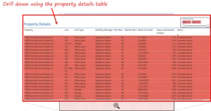
Dashboard Design and User Flow
Design centered on two complementary user journeys: Executive scanning for portfolio-level headlines and Operational drill for unit-level closure.
Main views of the dashboard include:
- Portfolio summary showing vacancy rate and counts.
- Property ranking to prioritize interventions.
- Unit type breakdowns to inform pricing and marketing.
- Unit detail table with manager notes and action prompts.
Iteration and Adoption
The dashboard was deployed iteratively. Early feedback from site managers clarified the taxonomy for vacancy reasons, which made manager annotations more useful. A short adoption phase included training for regional leads and a commitment to review the dashboard weekly as part of the management rhythm.
Key learnings and recommendations
- Make the headline visible and unambiguous: Displaying portfolio vacancy as a single headline statistic creates focus and helps leadership prioritize discussion time.
- Prioritize by unit type when a single category dominates vacancy: If two-bedroom units represent the bulk of downtime, it is faster to design targeted promotions than to pursue portfolio-wide changes.
- Integrate manager notes as mandatory fields for long vacancies: Requiring a short reason and next step when a unit crosses a vacancy threshold (for example, 14 days) reduces meeting friction and improves accountability.
- Embed action prompts to make discovery an assignable task: A dashboard that produces a prioritized list but does not offer the next step leaves teams to re-interpret data. Action prompts remove that friction.
- Align the refresh cadence with the meeting cadence: Ensure the dashboard is updated shortly before weekly stand-ups, so decisions are made based on current data, not stale spreadsheets.
The Tenant Leasing Dashboard turns a diffuse, manual vacancy process into an operational workflow that leadership can act upon. By surfacing that almost one quarter of units were vacant, highlighting that two-bedroom units account for a significant proportion of vacant units, and exposing property-specific hotspots, the dashboard converts doubt into direction. With manager notes and action prompts embedded, the dashboard facilitates a seamless transition from inquiry to assignment and from assignment to closure. That sequence is how downtime shrinks and rent flow steadies.
If your sales or business development team faces similar challenges tracking complex pipelines across markets and targets, we would gladly share how a modern BI solution can unlock real, measurable value.
Each month, we curate the latest updates, insights, and trends for senior leaders in data analytics and AI in our CXO Analytics Newsletter.
Our mission is “to enable businesses to unlock value in data.” For over 20 years, we’ve partnered with more than 100 clients—from Fortune 500 companies to mid-sized firms—to solve complex data analytics challenges. Our services include Advanced Analytics Consulting, Generative AI Consulting, and Business Intelligence (Tableau Consulting, Power BI Consulting and Looker Consulting) turning data into strategic insight. We would love to talk to you. Do reach out to us for a free consultation.
Our Work
Industry
- Industry
Function
- Function
-
Increasing Conversions with Adwords Spend Optimizer
How To Optimize Adwords Budget in Real Time
Free Download


-
Markdown Optimization for Retailers
A Methodology to Track Performance and Maximize Value
Free Download
-
Optimizing Marketing Spend with Marketing Mix Modeling
Using Statistical Modeling and Empirical Methods
Free Download
-
Leveraging Web Analytics for Customer Acquisition
Leveraging Web Analytics for Customer Acquisition
Free Download
*Subscribe to be the first one to know our latest updates
Contact us

You have crafted a powerful analytical tool for us. Thank you.
Alan Benjamin
Principal, Benjamin Realty Advisors

I have been working with Chaitanya and Perceptive Analytics for about 20 months now. They did BI / reporting and excel tool development. Their work helped us in channeling our periodic reports to the senior and operational management. The team exceeded my expectations. Chaitanya would ask thought provoking questions that trigger a new line of thinking. They created good dashboards so our senior team can quickly interpret reports. We were able to make progress because the team knew finance and tools they created were easy to implement.
Samir Lavani
CFO at Pearl Hospitality

Chaitanya and the Perceptive Analytics team worked on multiple strategic projects that involved Tableau data visualizations. Perceptive's work (~ 1 year) led to successful launch of our portal - this was an important milestone for us. Visualizations created were insightful, easy to understand and visually attractive. The team often suggested ways to show data in more intuitive way so our audience can understand it. They also knew Tableau well that helped in customizing it for our purposes. The team worked hard to finish the project on time managing expectations. I look forward to working with Perceptive on other projects.
Haroon Yaqoob
Principal at Nomenclature Inc.