
by AnshumanD | Jan 1, 2025 | Resources
LinkedIn-HexBin-Plot In dense datasets, important patterns often remain hidden due to overlapping points. Traditional scatter plots struggle when thousands of data points compete for space, masking trends and creating visual noise. Hexbin charts address this challenge...
by AnshumanD | Jan 1, 2025 | Resources
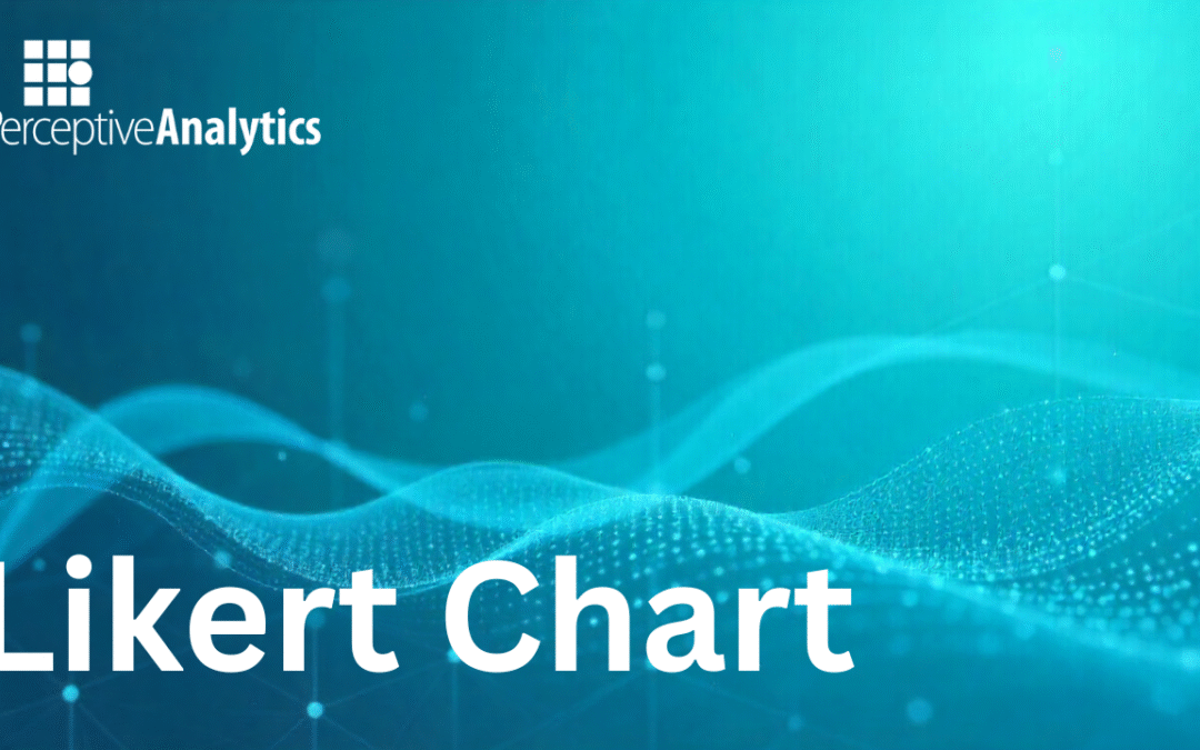
Likert-Chart In customer experience analytics, clarity of sentiment distribution is critical. Traditional stacked bar charts often fail to show balance across satisfaction dimensions. A Likert Chart solves this by splitting positive and negative responses from a...
by AnshumanD | Jan 1, 2025 | Resources
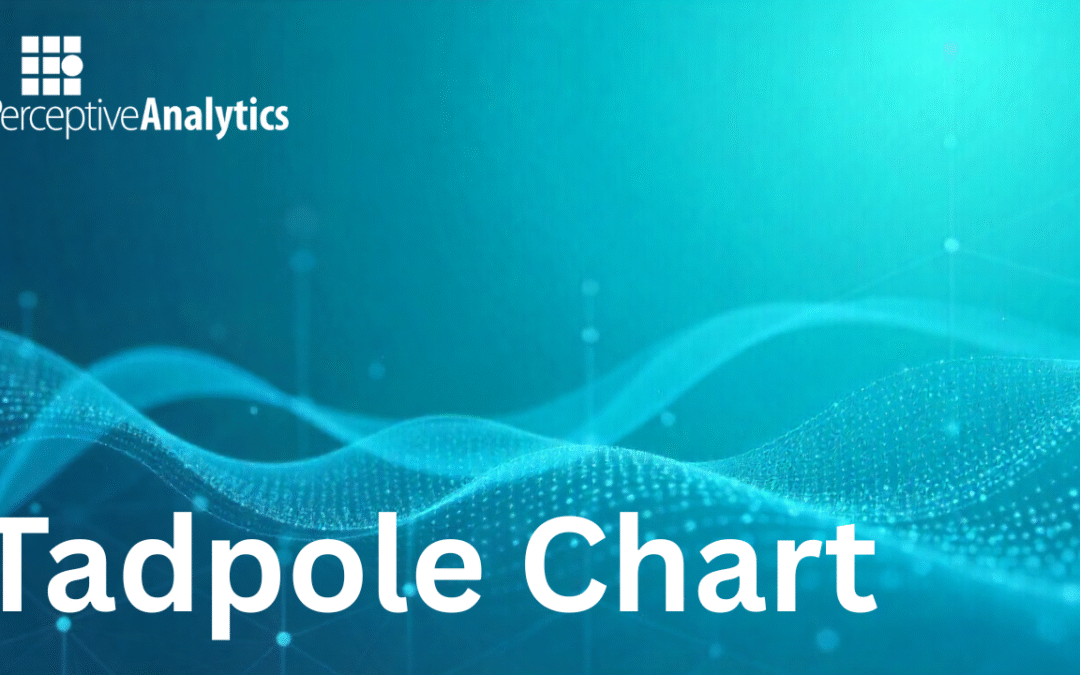
Tadpole-Chart Understanding change is as important as understanding value. A Tadpole Chart provides a compact way to show shifts between two point,s start and end through a single directional line. It highlights direction, magnitude, and outcome in one view, making it...
by AnshumanD | Jan 1, 2025 | Resources
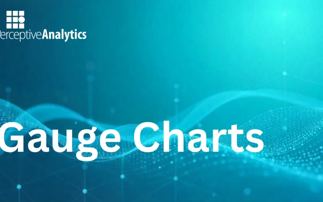
Gauge-Chart Gauge Charts turns key metrics into visual indicators of performance, making it easy to monitor progress and compare it with the targets. When to Use Gauge Chart? 1. To show progress of a metric towards the target2. When you need quick, visual cues for...

by AnshumanD | Jan 1, 2025 | Resources
Key-Influencers The Key Influencers visual in Power BI brings automated, AI-powered analysis directly to your dashboard, helping you understand why a metric is behaving a certain way. It identifies and ranks the most impactful factors to facilitate decision making....

by AnshumanD | Jan 1, 2025 | Resources
Enclosed-Dot-Plot Enclosed Dot Plots display the actual value as a dot, plotted against a background bar or target range, clearly showing how close or far each value is from its peers or target. When to Use Enclosed Dot Plot? To compare values or metrics between and...
Recent Comments