
by AnshumanD | Jan 1, 2025 | Resources
Bar-Charts-Reimagined Traditional bar charts give you the “what” (What your numbers look like at a glance). But in today’s data storytelling, leaders also need the how (how the numbers evolved) and the when (when peaks and drops occurred). Where bar charts fall short...

by AnshumanD | Jan 1, 2025 | Resources
Box-and-Whisker-Chart When it’s critical to understand variability, spot outliers, or compare performance consistency, the Box and Whisker chart is the go-to visual. It offers a compact but rich snapshot of your data, showing not just the centre, but also the...

by AnshumanD | Jan 1, 2025 | Resources
Decompostion-Tree Turn static visuals into interactive views, using drill-down paths and branching paths to help users explore hierarchies and uncover insights step by step. When to Use Decomposition Tree? Ideal for investigating how a key metric is influenced by...

by AnshumanD | Jan 1, 2025 | Resources
Data-Lake-vs-Data-Warehouse Data Lake or Data Warehouse: Which one powers your data best? What is a Data Lake? A flexible repository that stores all types of data in a raw format. It’s well-suited for advanced analytics and AI-powered insights. What is a Data...

by AnshumanD | Jan 1, 2025 | Resources
Tables-Reimagined Traditional tables are useful for tracking performance, but they often lack clarity and speed. Enhanced Tables with embedded visuals like sparklines, bars, and color scales, make patterns and priorities immediately clear while preserving detail. When...
by AnshumanD | Jan 1, 2025 | Resources
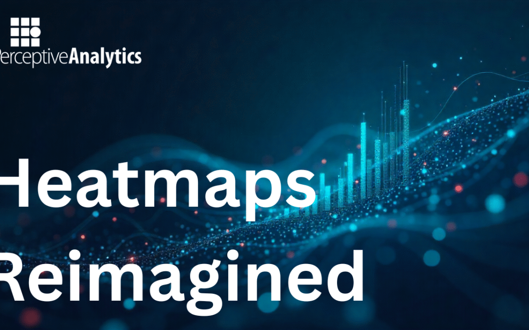
Heatmaps-Reimagined Heatmaps effectively highlight high and low values but do not explain the underlying patterns. Heatmaps with Sparklines address this by embedding small trendlines within each cell, combining value and variation. This makes it easier to interpret...
Recent Comments