by AnshumanD | Mar 13, 2026 | AI
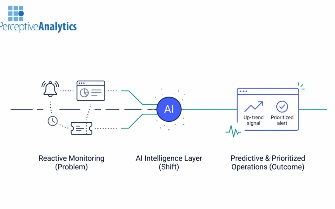
Most operations environments rely on reactive monitoring systems, fragmented incident data, and manual ticket triage. When a problem appears in a dashboard or service desk queue, the SLA clock is already running. Teams then spend valuable time diagnosing issues...
by AnshumanD | Mar 13, 2026 | Digital Transformation
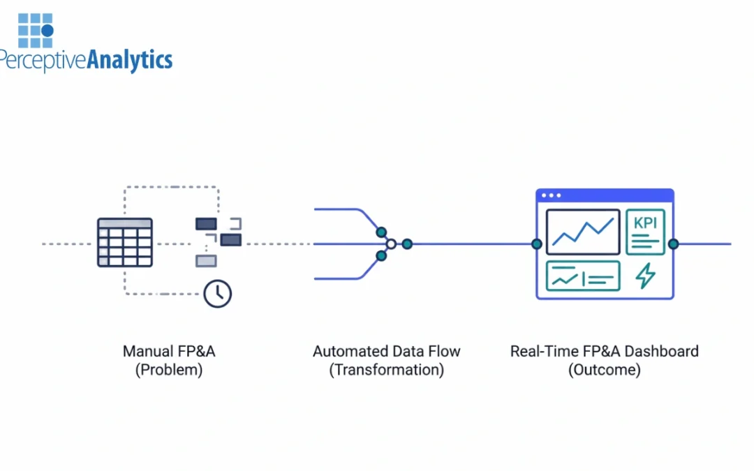
Finance leaders today face a growing expectation: deliver faster insights without compromising accuracy. Yet many FP&A teams still rely on spreadsheet-heavy workflows, manual consolidations, and fragmented data sources. The result is long reporting cycles and...
by AnshumanD | Mar 12, 2026 | Analytics
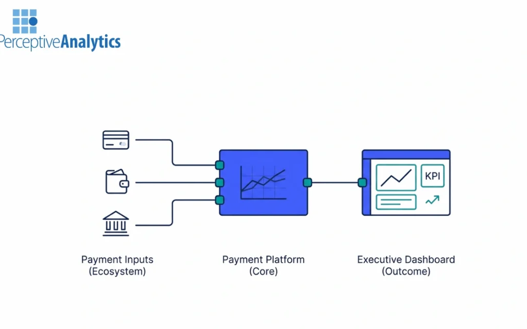
IntroductionPayment platforms are the Fintech infrastructure which facilitates the execution of electronic transactions between buyers, sellers, banks, and network operators . Payment platforms process tremendous volumes of transactions, with the payment volume...
by AnshumanD | Mar 12, 2026 | Analytics
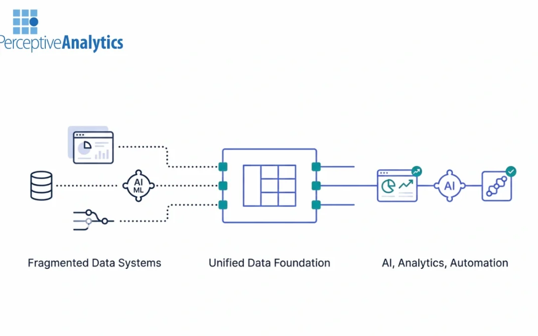
Executive SummaryGlobal spending on data and analytics is projected by IDC to surpass 400 billion dollars in the coming years, yet AI ROI remains inconsistent across industries. The constraint is not algorithm sophistication but architectural fragmentation. Duplicate...
by AnshumanD | Mar 12, 2026 | Analytics
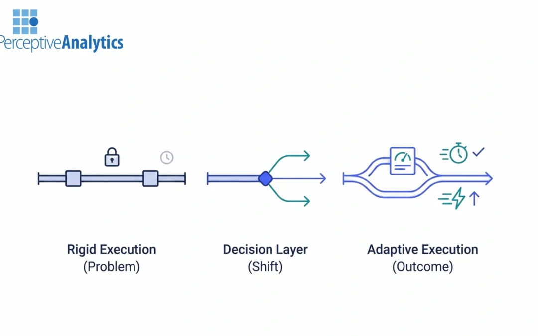
Rigid execution forces leaders to manage costs, SLAs, and priorities manuallyExecutive SummaryEnterprise data platforms are running on execution assumptions that no longer hold. Fixed priorities, preselected compute tiers, and static freshness targets were designed...
Recent Comments