by AnshumanD | Jan 1, 2025 | Resources
Divergent-Histogram Divergent histograms place each group on opposite sides of a central axis, making comparisons intuitive. Instead of stacking values into one bar, they show each distribution separately, so you can clearly see where one group leads the other....

by AnshumanD | Jan 1, 2025 | Resources
Linkedin-Mosaic-Plot When two metrics are shown in separate charts, it becomes difficult to understand their combined impact. Mosaic Plots address this by using bar width and height to represent two variables in a single, structured visual. This makes proportions and...
by AnshumanD | Dec 29, 2024 | Resources
Drill-down-Reimagined When you need to navigate complex hierarchies with clarity, the Icicle Chart provides a clear, structured, all-in-one solution. Our Use Case: Analyzing Sales by comparing Regions, States and Cities in a connected, hierarchical view We started...
by AnshumanD | Dec 1, 2024 | Uncategorized
Treemap Traditional tree maps can quickly become overwhelming when dealing with deep product hierarchies or a large number of SKUs. As complexity increases, these visuals often clutter the screen with too many elements, making it difficult to identify key performance...
by AnshumanD | Jan 1, 2024 | Tableau
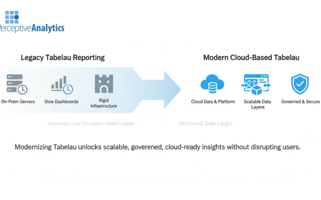
Tableau reporting is a core decision-making layer for modern enterprises. Yet many organizations still run Tableau reports on legacy infrastructure that struggles with scale, performance, and governance. As data volumes and user expectations grow, these environments...
Recent Comments