by AnshumanD | Feb 26, 2026 | Tableau
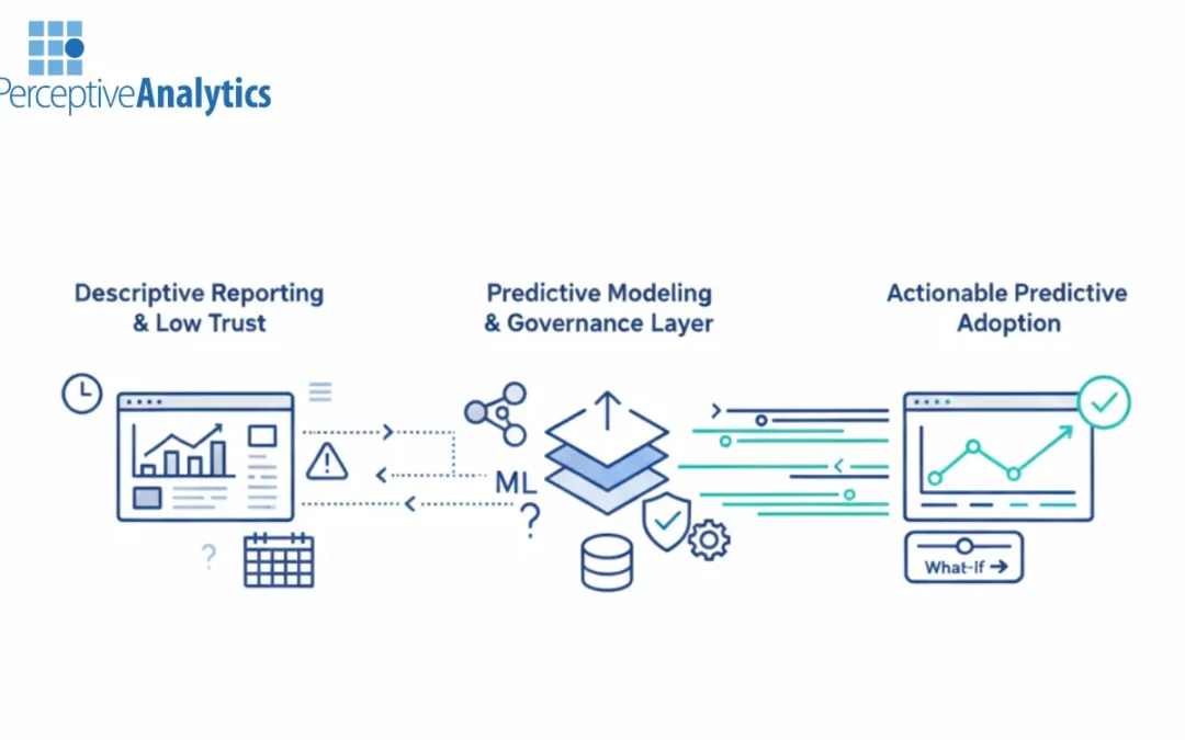
Turning Tableau from a descriptive reporting tool into a predictive engine is a significant hurdle for most enterprises. While the platform offers robust features for advanced analytics, many organizations find themselves with “shelfware” dashboards that...
by AnshumanD | Feb 26, 2026 | Tableau
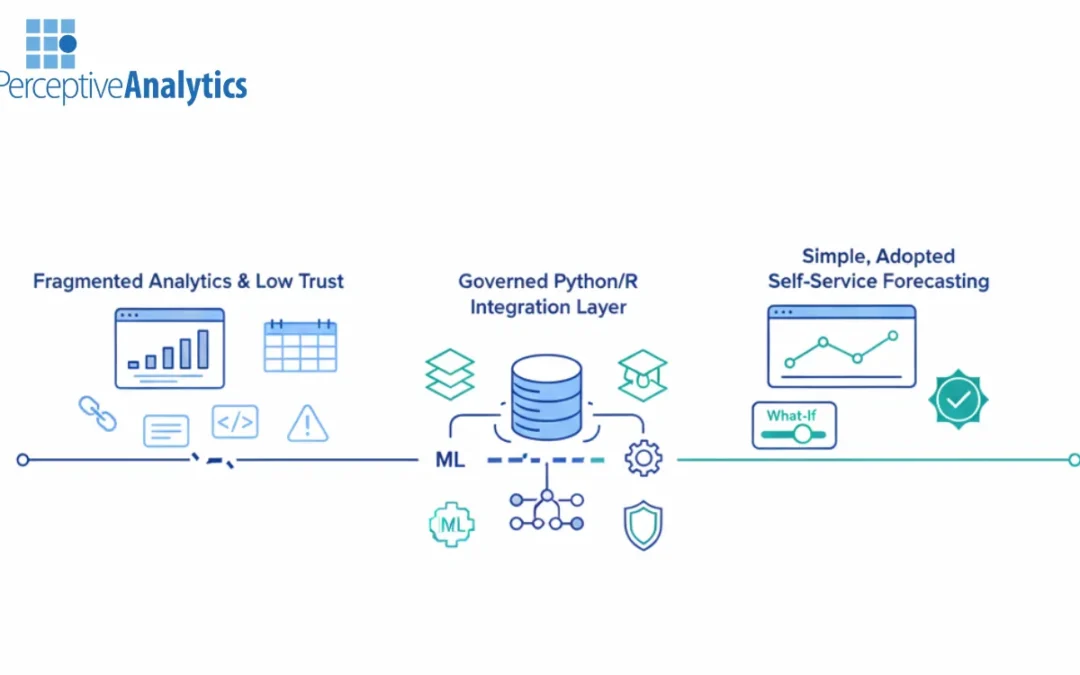
Enterprises today are increasingly evaluating Tableau partners and specialized firms like Perceptive Analytics to bridge the gap between basic reporting and advanced, predictive insights. While many organizations own the tools, the challenge lies in selecting a...
by AnshumanD | Feb 26, 2026 | Data Engineering
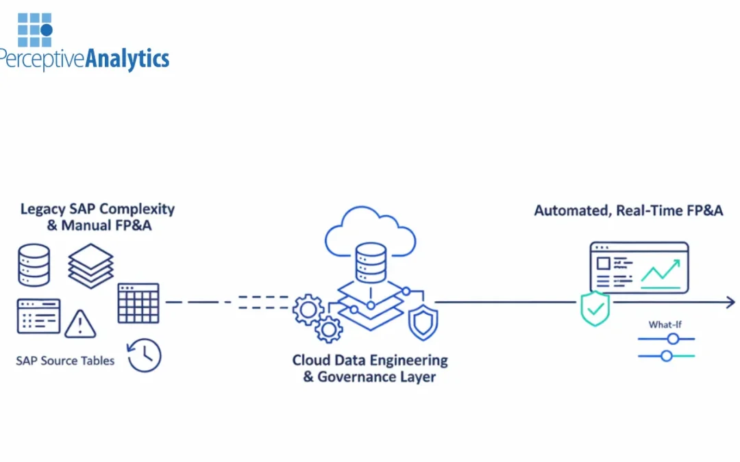
For finance leaders operating on SAP, the transition to automated Financial Planning and Analysis (FP&A) is often hindered by the complexity of legacy data structures and the technical challenge of integrating with modern cloud data warehouses. Choosing between an...
by AnshumanD | Feb 26, 2026 | Data Engineering
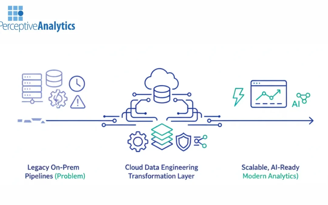
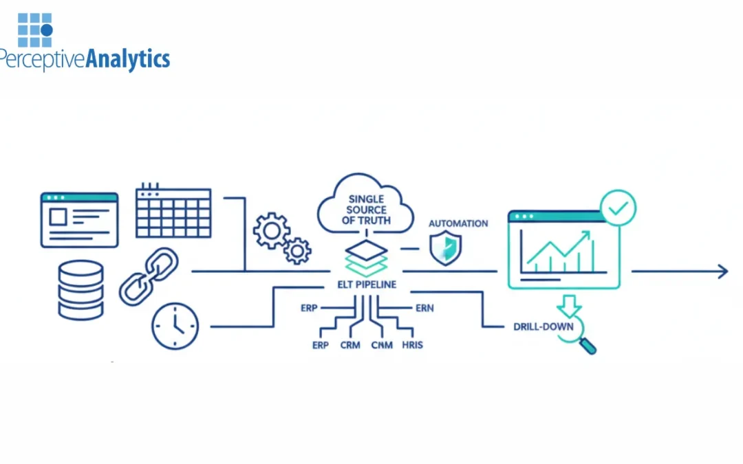
Most enterprise organizations today are grappling with the limitations of aging, on-premise data infrastructure. Brittle legacy pipelines, often built on decades-old ETL (Extract, Transform, Load) logic, are struggling to keep pace with the volume and velocity of...
by AnshumanD | Feb 26, 2026 | Data Integration
Enterprise data leaders often find themselves caught in a “data gravity” trap: as the volume of information grows, the manual effort required to move, clean, and report on it grows exponentially. This friction results in stalled analytics adoption, where...
Recent Comments