by AnshumanD | Mar 5, 2026 | Data Engineering
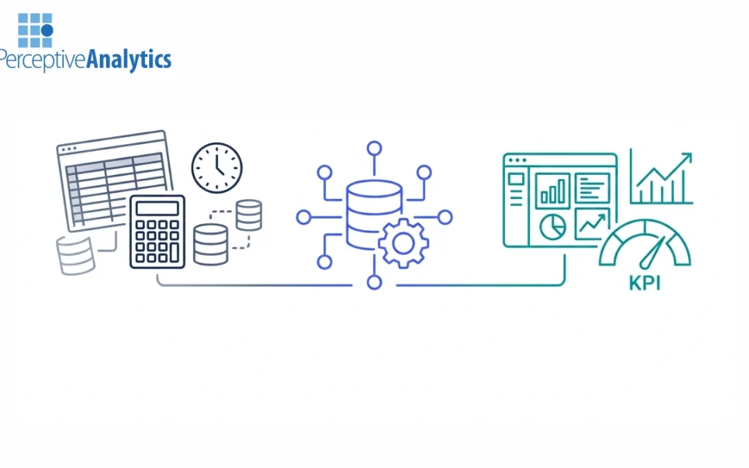
Financial Planning & Analysis (FP&A) is the set of processes that finance organizations undertake to plan budgets, forecast results, and analyze variances to inform senior business leaders with forward-looking analysis.As US companies are making a greater push...

by AnshumanD | Mar 5, 2026 | Data Engineering
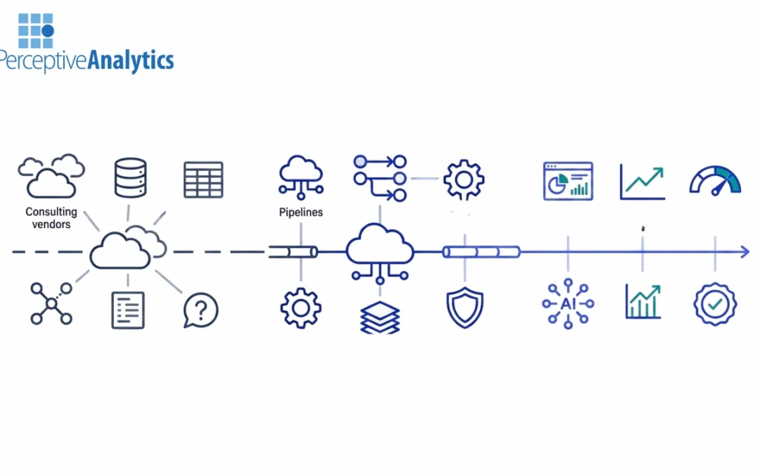
Enterprises adopting cloud analytics are increasingly turning to data engineering consulting services for scalable analytics, standardized KPIs, and forecasting use cases. Nevertheless, the industry is saturated with large system integrators, cloud-native vendors, and...
by AnshumanD | Mar 5, 2026 | Data Integration
Metadata and data lineage are sometimes considered governance or tooling issues, but in reality, they are the results of data integration decisions that were made much earlier in the architecture. Without a strategic approach to data integration, metadata becomes...
by AnshumanD | Mar 5, 2026 | Data Integration
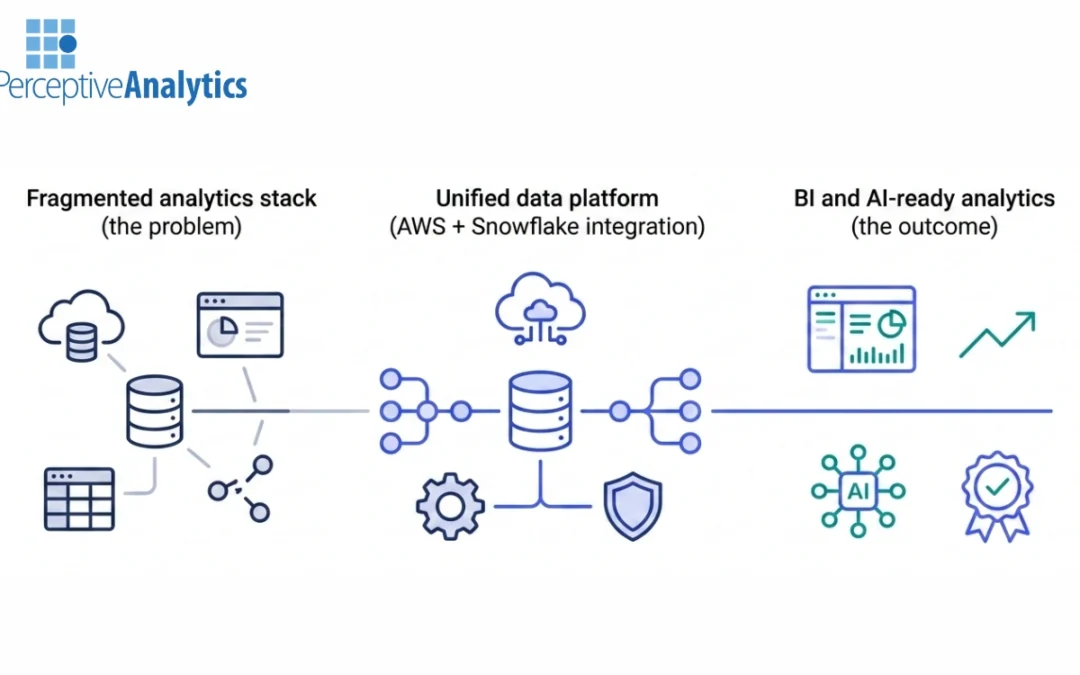
A lot of businesses that use AWS for analytics have a lot of data, but it’s not all in one place. AWS native services, Snowflake, and a number of BI tools that different teams use all store data. Each piece is useful on its own, but they don’t work well...
by AnshumanD | Mar 5, 2026 | Data Integration
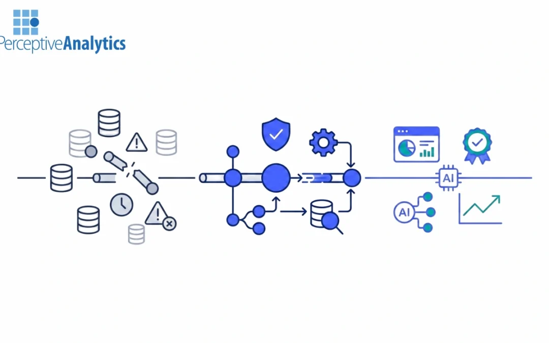
As data ecosystems become increasingly complex, data quality issues are less likely to remain contained within a single dataset or pipeline. The effects of schema drift, changes in upstream systems, late-arriving data, and silent failures can quickly propagate...
Recent Comments