by AnshumanD | Mar 5, 2026 | Power BI
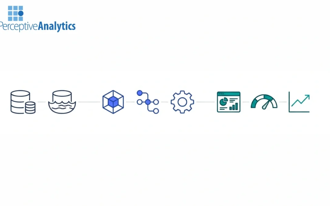
Enterprise BI leaders are not struggling to build dashboards. They are struggling to scale them.As user concurrency rises, data volumes expand, and reporting shifts from departmental to enterprise-wide, performance slows, costs increase unpredictably, and governance...
by AnshumanD | Mar 5, 2026 | Power BI
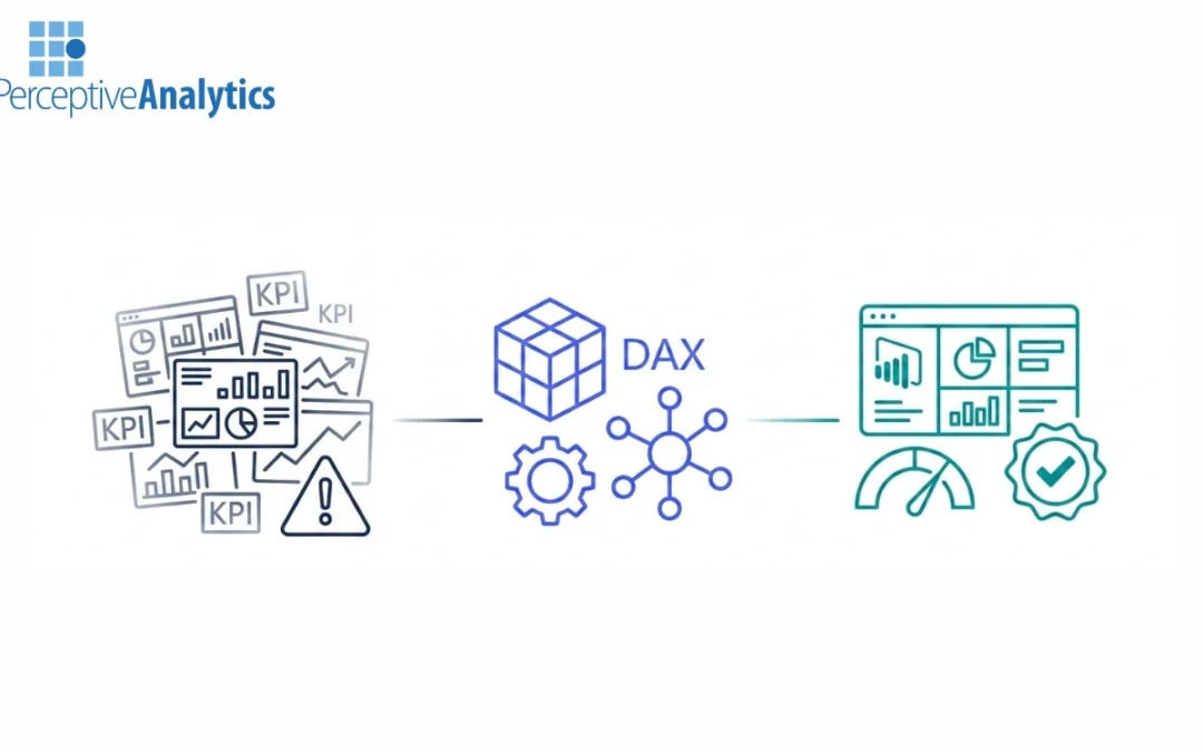
Enterprise adoption of Power BI often grows faster than governance. Within a few years, organizations face report sprawl, inconsistent DAX logic, duplicate KPIs, and mounting compliance concerns. At that stage, leadership typically turns to external BI consulting for...
by AnshumanD | Mar 5, 2026 | Power BI
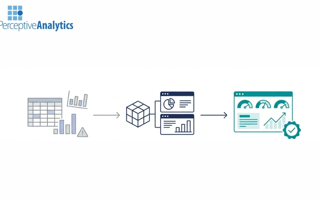
CFOs are under constant pressure to deliver faster closes, sharper forecasts, and board-ready insights—yet many FP&A teams still rely heavily on spreadsheets, manual consolidations, and static reports. The promise of Power BI for finance is real, but without the...
by AnshumanD | Mar 5, 2026 | AI
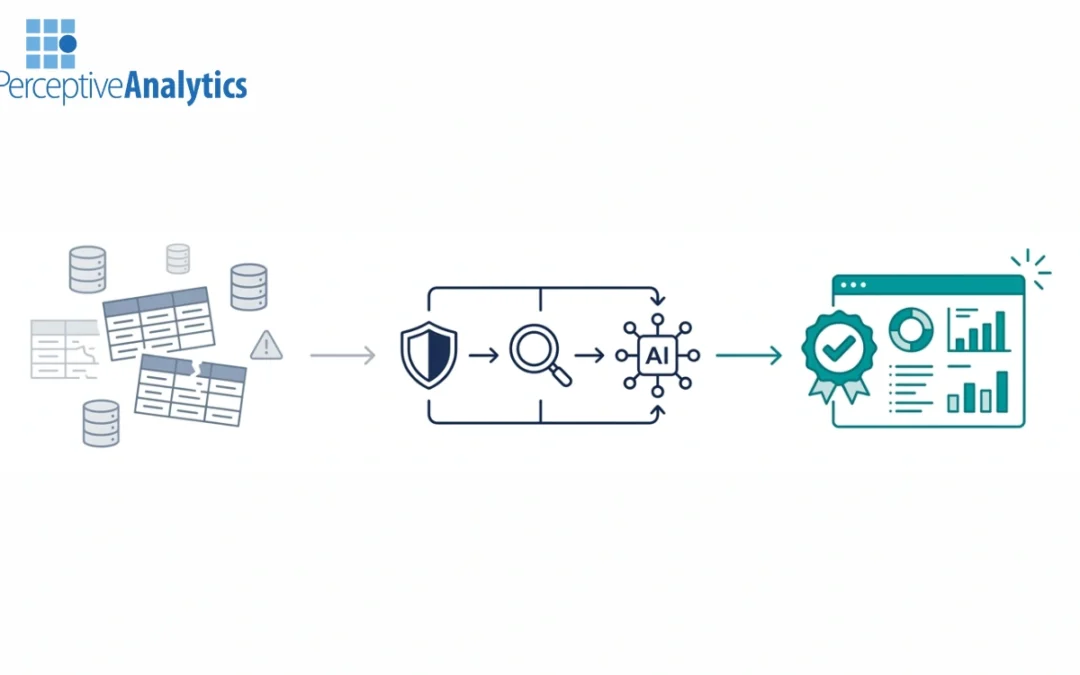
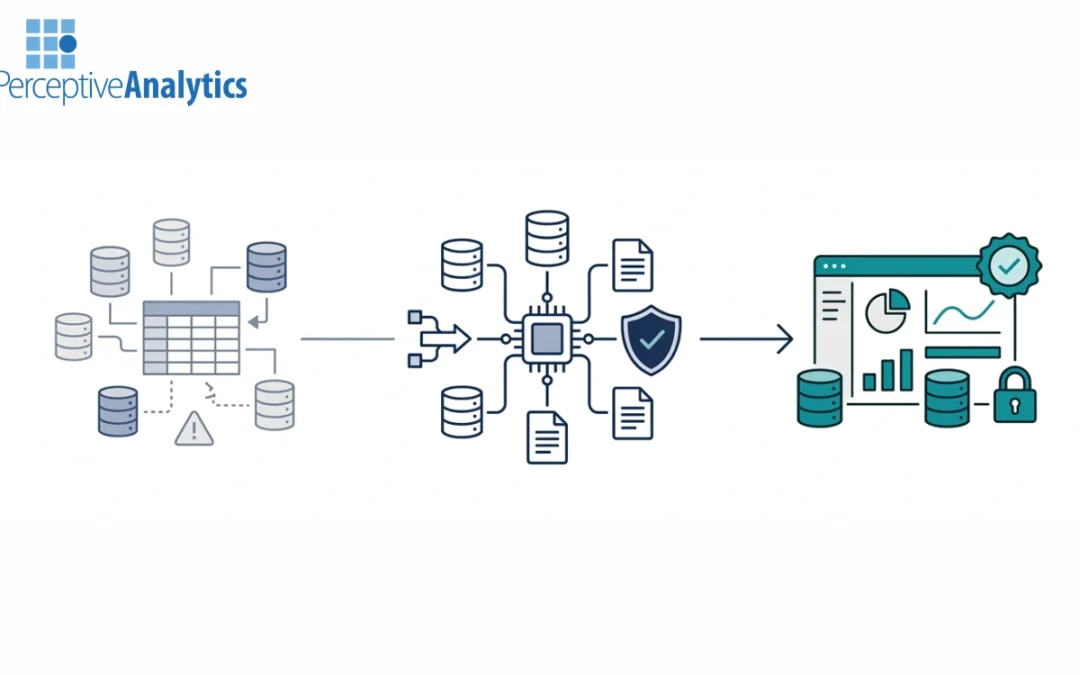
Automated data quality monitoring has become a prerequisite for trustworthy AI and analytics. As enterprises push generative AI into forecasting, reporting, and decision support, low-trust data quickly becomes a systemic risk. Generative AI consulting firms address...
by AnshumanD | Mar 5, 2026 | AI
Data leaders today face a difficult paradox. Organizations generate more data than ever, yet trust in that data is often fragile. Quality issues, incomplete lineage visibility, and manual compliance processes undermine analytics investments and slow innovation.At the...
Recent Comments