


How We Transformed Signup Funnel Visibility for a Global Payments Platform Using Looker Analytics
-
- Client: A leading global B2B payments platform with 1M+ customers across 100+ countries
- Challenge Faced by Client: Limited visibility into user signup funnel and inability to track drop-offs across critical stages
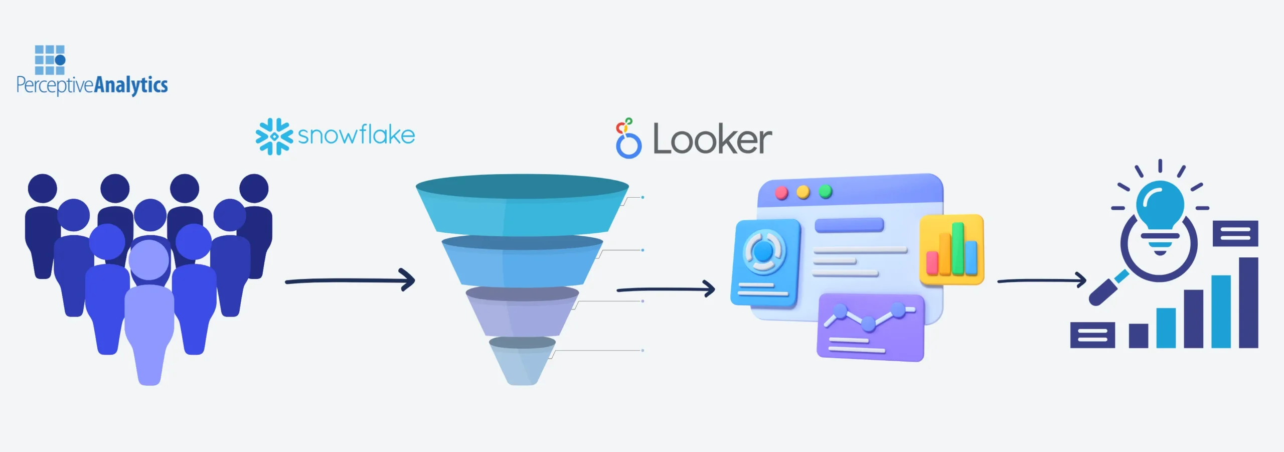
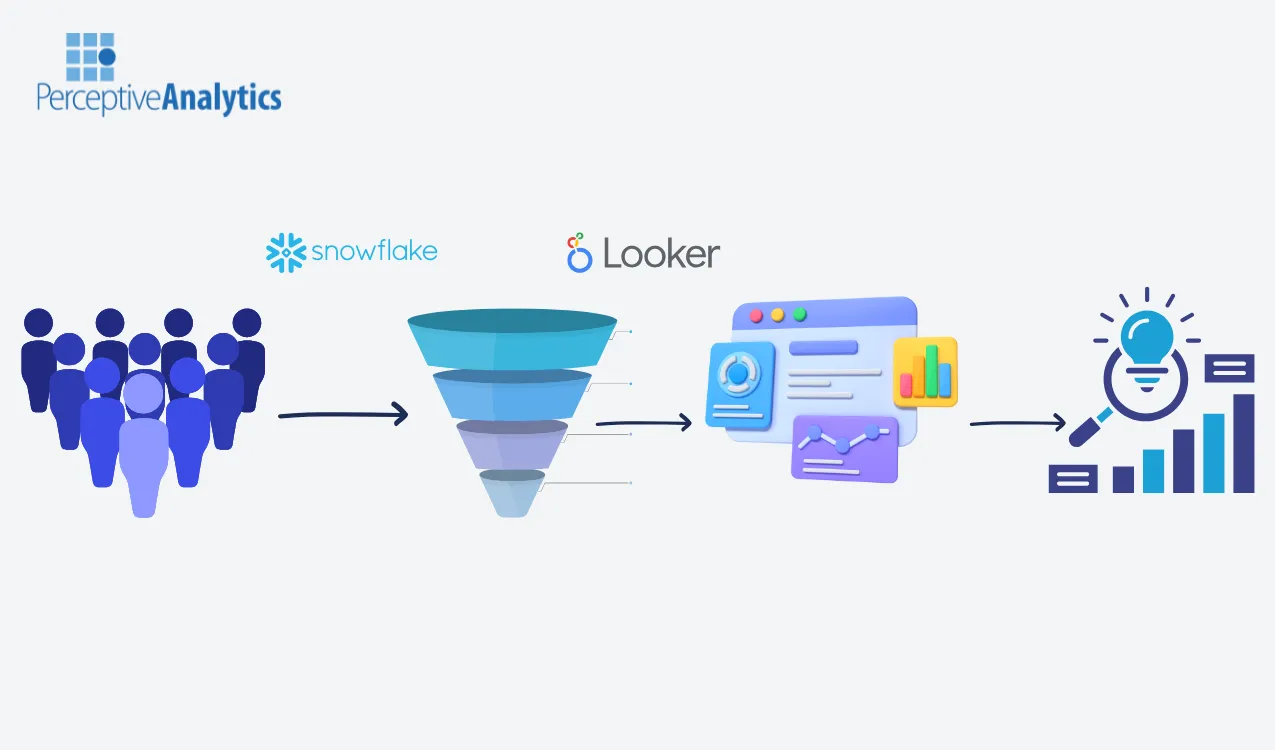
- Tools Used: Looker Enterprise with Snowflake integration
- Solution: We designed a scalable, interactive Signup Funnel Dashboard in Looker, powered by data directly from Snowflake. The dashboard provided real-time insights into user behavior, conversion trends, and drop-off bottlenecks across industries, geographies, and signup stages.
- Impact: Improved understanding of signup behavior, quicker identification of bottlenecks, and reduced time required by 50% for product and marketing teams to experiment and prioritize improvements. Outcomes led to 5% average increase in daily signups.
Introduction & Business Context
For any digital-first payments platform, user acquisition is the lifeline of sustained growth. While acquiring traffic is one challenge, ensuring that potential customers convert successfully during the signup process is equally critical. Even small inefficiencies in the funnel like an unclear call-to-action, a long form, or poor mobile experience, can lead to substantial revenue leakage.
Our client, a global B2B payments platform serving more than a million customers in over 100 countries, faced this exact challenge. Despite investing significantly in customer acquisition, the leadership team lacked end-to-end visibility into the signup funnel. Teams struggled to answer questions such as:
- At which stages of the signup journey are users dropping off?
- Which geographies or industries face the highest friction?
- How do conversion trends change over time?
- What is the customer behavior in the signup process for different user segments?
Data existed in Snowflake, but reporting was limited to static extracts and ad-hoc queries. The product and customer success teams had no single source of truth to monitor funnel performance. Without clarity, teams often resolved to reactive changes, such as tweaking form fields or adjusting messaging, without knowing which actions truly moved the needle.
Recognizing this gap, we collaborated with the company to design a comprehensive signup funnel dashboard in Looker. By directly connecting Looker to Snowflake, we built a scalable, reliable and executive-ready analytics solution that delivered clear, actionable insights into funnel performance.
Business Objectives
To align leadership, product, and customer success teams, we defined four clear objectives for this engagement:
- Track user signup process – Provide a consolidated view of the entire signup journey to understand funnel efficiency, monitor funnel health, detect emerging issues early, and make timely decisions.
- Identify areas of improvement – Quantify where and how users abandon the signup flow, enabling leaders to prioritize fixes and improvements to maximise ROI.
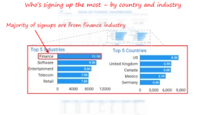
- Enable Segmented Analysis – Allow drill-down by geography, industry, and customer type. Marketing and customer success leaders can make targeting decisions, tailoring acquisition and retention strategies for each segment.
Outcomes & Measurable Impact
Within weeks of deployment, the Looker Signup Funnel Dashboard became the go-to tool for growth, product, and customer success teams. Key outcomes included:
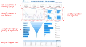
- Better Signup Metrics Tracking: Overview became a key discussion point in weekly check-ins, replacing lagging reports with actionable daily insights. Teams had a shared reference point for evaluating progress toward signup and conversion goals. The metrics were cited 32 times in monthly and executive reports in the first month.
![]()
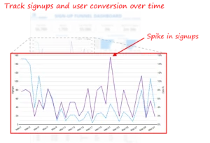
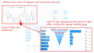
- End-to-End Funnel Visibility: Teams could now see where users dropped off. From the very first landing page visit to final account setup. For example, the dashboard revealed that many users abandoned after spending a lot of time in the landing page, leading to page redesign with a clearer call to action. This led to a 40% increase in click-through rate.
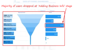
- Bottleneck Identification: The dashboard exposed that the ‘Adding Business Info’ stage was the most common drop-off point, enabling product teams to simplify form fields and clarify instructions. Improving the completion of the steps by 50%.
- Qualitative Productivity Gains: What previously required hours of manual analysis from Snowflake SQL queries became available instantly. Product managers, marketers, and executives now rely on Looker to monitor funnel performance.
- Informed Prioritization: Instead of making changes based on assumptions, teams could now test and validate specific funnel improvements (e.g., reducing form steps, optimizing CTA placement) with confidence.
Our Approach
Discovery & KPI Definition
We began with stakeholder workshops across product, marketing, and customer success teams to align on business goals and pain points. The focus was to map the end-to-end signup journey, understand where users succeed or struggle, and translate these insights into clear, measurable KPIs.
Guiding questions included:
- What outcomes define a successful signup journey for our business?
- What are the most logical funnel stages that matter most for understanding conversion behavior?
- What thresholds of drop-off are business-critical versus acceptable attrition?
- Which dimensions (geography, industry, acquisition channel) should be available for drill-down?
- Which behavioral signals (e.g., time spent, step completion) are available and best predict eventual conversion?
- How do we balance simplicity for leadership reporting with diagnostic detail for operational teams?
From these discussions, we defined the critical KPIs:
- Monthly Signups & Conversion Rate – tracks acquisition volume and overall funnel efficiency.
- Stage-wise Drop-Off Rate – highlights where users abandon the journey, pinpointing friction points.
- Segmented Conversion % – measures funnel performance across industries, geographies, and customer segments.
- Average Time to Drop-Off – flags steps with unclear CTAs or complex inputs that cause hesitation or abandonment.
- Top & Bottom Performing Segments – identifies industries, countries, or cohorts with the highest and lowest conversion efficiency.
Data Architecture & Integration
The technical foundation was built by directly connecting Looker to Snowflake. Unlike traditional BI pipelines that require multiple ETL layers, Looker leverages LookML models to query Snowflake directly, ensuring that the most recent data is always reflected in dashboards.
Dashboard UX Design & Visual Analytics
The final Looker dashboard was designed with clarity and adoption in mind.
Key design elements:
- Key Overview Metrics: Used KPI cards for quick overview of key signup metrics
- Funnel Visualization: Clear stage-by-stage visualization showing where users exited the process.
- Trend Analysis: Line charts showing signup and conversion trends over time, highlighting spikes or seasonal patterns.
- Segmentation filters and analysis: Marketing and product teams could filter funnel data by country and industry, revealing best and worst performing segments. The marketing team targeted best performing segments that the users signed up most frequently and the product team identified segments that had disproportionately higher drop-offs to resolve issues.
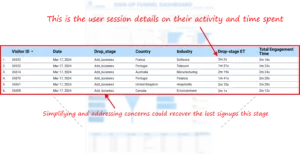
- Drill-Through Capability: From aggregate funnel metrics down to individual session records, enabling both macro and micro analysis.
- Granular User Session Explorer: The dashboard enabled focus and prioritization for targeted follow-ups with high-value prospects, while also supporting user-centric design through personalized nudges. This turned funnel insights into actionable strategies that balanced efficiency with personalization.
Testing & Stakeholder Review
We conducted iterative reviews with product managers and customer success leads. Feedback loops helped fine-tune the visuals for speed, clarity, and usability.
- Validation: Verified accuracy of drop-off rates by reconciling Looker outputs against raw Snowflake queries.
- Usability Enhancements: Simplified filters and added contextual tooltips to ensure non-technical users could self-serve.
- Performance: Optimized Looker queries to minimize load times, ensuring real-time responsiveness.
Key Technical Learnings & Recommendations
Several learnings emerged from this engagement:
- Direct Snowflake-Looker Integration is Powerful: Eliminating intermediate ETL layers streamlined data freshness and reduced maintenance.
- Model Once, Reuse Everywhere: Building a scalable LookML model with reusable measures saved time and ensured consistency.
- Design for Adoption, Not Just Analysis: A funnel dashboard only adds value if business users can interpret and act on it. Clear color-coding, intuitive drill-throughs, and simple filters accelerated adoption.
- Qualitative Signals Matter: Metrics like “time spent before drop-off” revealed friction points (e.g., unclear CTAs) that pure conversion percentages might have missed.
- Close the Loop with Action: By surfacing drop-off hotspots (e.g., ‘Business Info’ stage), the dashboard directly informed product changes that improved user experience.
Conclusion
For fast-growing digital platforms, signup funnel visibility is the difference between scaling efficiently and leaking potential customers. By leveraging Looker directly on Snowflake, our client gained a real-time, actionable view of their signup journey.
Instead of guessing why users abandoned the process, product and marketing teams now act with confidence — identifying bottlenecks, prioritizing fixes, and tracking improvements over time.
If your organization struggles with visibility into critical customer journeys, we would be glad to share how modern BI solutions like Looker can help unlock clarity, reduce friction, and accelerate growth.
Each month, we curate the latest updates, insights, and trends for senior leaders in data analytics and AI in our CXO Analytics Newsletter.
Our mission is “to enable businesses to unlock value in data.” For over 20 years, we’ve partnered with more than 100 clients—from Fortune 500 companies to mid-sized firms—to solve complex data analytics challenges. Our services include Advanced Analytics Consulting, Generative AI Consulting, and Business Intelligence (Tableau Consulting, Power BI Consulting and Looker Consulting) turning data into strategic insight. We would love to talk to you. Do reach out to us for a free consultation.
Our Work
Industry
- Industry
Function
- Function
-
Increasing Conversions with Adwords Spend Optimizer
How To Optimize Adwords Budget in Real Time
Free Download
-
Markdown Optimization for Retailers
A Methodology to Track Performance and Maximize Value
Free Download
-
Optimizing Marketing Spend with Marketing Mix Modeling
Using Statistical Modeling and Empirical Methods
Free Download
-
Leveraging Web Analytics for Customer Acquisition
Leveraging Web Analytics for Customer Acquisition
Free Download
*Subscribe to be the first one to know our latest updates
Contact us

You have crafted a powerful analytical tool for us. Thank you.
Alan Benjamin
Principal, Benjamin Realty Advisors

I have been working with Chaitanya and Perceptive Analytics for about 20 months now. They did BI / reporting and excel tool development. Their work helped us in channeling our periodic reports to the senior and operational management. The team exceeded my expectations. Chaitanya would ask thought provoking questions that trigger a new line of thinking. They created good dashboards so our senior team can quickly interpret reports. We were able to make progress because the team knew finance and tools they created were easy to implement.
Samir Lavani
CFO at Pearl Hospitality

Chaitanya and the Perceptive Analytics team worked on multiple strategic projects that involved Tableau data visualizations. Perceptive's work (~ 1 year) led to successful launch of our portal - this was an important milestone for us. Visualizations created were insightful, easy to understand and visually attractive. The team often suggested ways to show data in more intuitive way so our audience can understand it. They also knew Tableau well that helped in customizing it for our purposes. The team worked hard to finish the project on time managing expectations. I look forward to working with Perceptive on other projects.
Haroon Yaqoob
Principal at Nomenclature Inc.