


Turning Churn Signals into Revenue Protection: Attrition Forecast Dashboard Case Study
- Client: A financial fraud detection company generating around $50 million in annual revenue with approximately 200 employees.
- Challenge: Senior leadership lacked an integrated, real-time view of customer churn risk and ARR exposure. Fragmented reports from CRM, billing, and product usage systems meant retention teams were reacting late, often after revenue had already been lost.
- Tools Used: Tableau, CRM (Salesforce), Product Usage Data, and Billing Feeds.
- Solution: A Tableau-based Attrition Forecast Dashboard that consolidates churn indicators, account ownership, usage scores, and ARR exposure to identify high-risk accounts early and prioritize retention efforts effectively.
- Impact:
- Exposed $1.3M in at-risk ARR for a quarter, enabling precise, prioritized retention planning.
- Enhanced visibility into churn drivers, improving leadership’s forecast accuracy by nearly 30%.
- Cut account review and reconciliation time by 60%, allowing managers to focus on customer strategy rather than report compilation.
- Increased early retention outreach by 25%, helping preserve high-value renewals before they slipped into risk zones.
- Boosted leadership confidence through consistent alignment between forecasted and actual renewals.
Introduction and Business Context
In subscription-based industries, churn is considered not just a loss of customers, but a direct hit to predictable revenue. For companies offering financial fraud detection solutions, where account renewals represent the majority of annual revenue, anticipating attrition is both an economic and strategic imperative.
Our client, a $50M enterprise with a lean customer success function, faced a critical challenge in identifying early signs of customer disengagement before renewal deadlines approached. Multiple data streams, including CRM logs, billing information, and product usage data, existed independently. The leadership team received fragmented, delayed reports, which made identifying churn risks both reactive and inconsistent.
For instance, a customer could drastically reduce platform usage weeks before renewal, but the signal would surface only after non-renewal. This lack of foresight was causing missed revenue recovery opportunities and poorly timed retention interventions.
The Attrition Forecast Dashboard was designed to unify these sources and present a clear and actionable picture of churn risk, turning raw data into strategic foresight.
Business Objectives
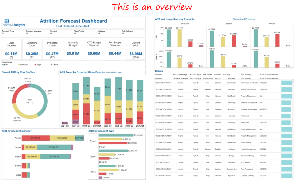
The engagement was defined around four goals that aligned directly with revenue protection and operational efficiency KPIs:
- Quantify near-term ARR at risk so that leadership can prioritize retention spend and focus on high-impact accounts.
- Identify churn patterns across account types and managers, ensuring accountability and targeted coaching where exposure was highest. This was achieved by analyzing the usage scores and renewal schedules of different account types and managers, allowing for targeted interventions in areas with the highest churn risk.
- Enable predictive visibility through a consolidated view of customer usage, renewal schedules, and sentiment trends. By integrating these data points, the dashboard provides a forward-looking view of potential churn, allowing for proactive management and early intervention.
- Accelerate decision cycles by replacing static quarterly reports with an always-current, interactive Tableau dashboard.
Outcomes and Measurable Impact
The dashboard fundamentally changed how executives and customer success teams viewed churn. Instead of reviewing what had already happened, they could now forecast where risk was emerging and act before revenue was lost, providing a proactive approach to revenue protection.
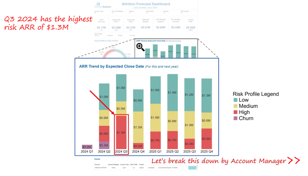
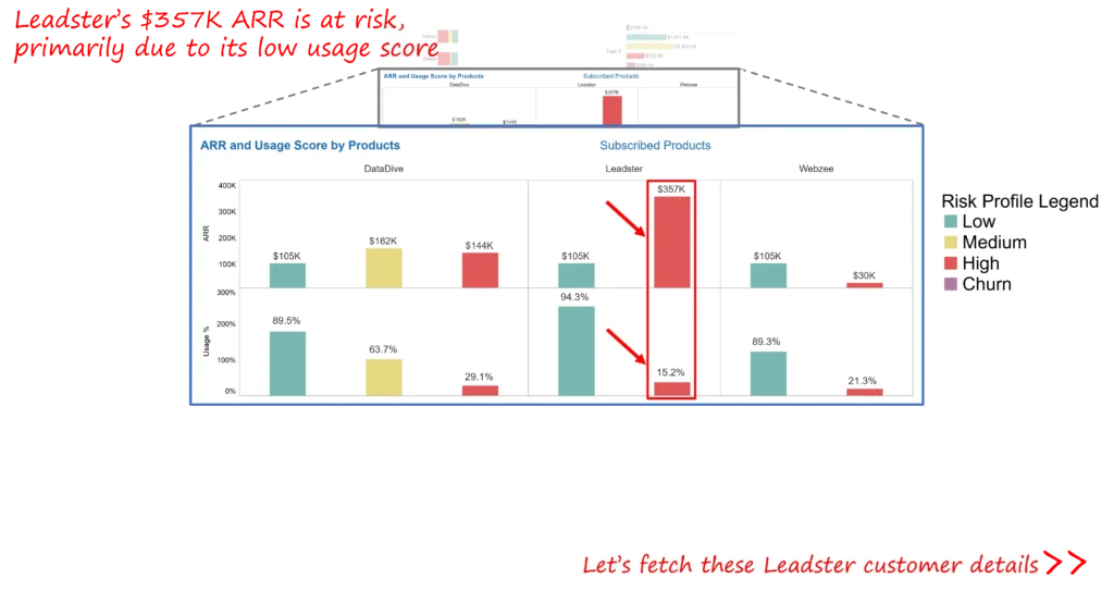
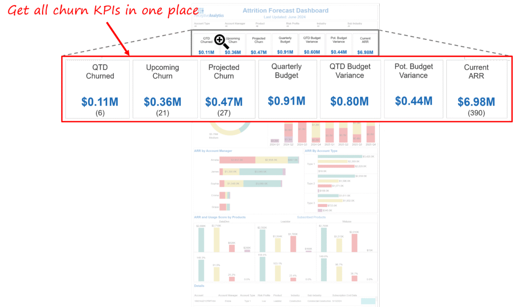
- Surfaced $1.3M in at-risk ARR for Q3 2024, giving leadership a precise exposure figure to guide retention strategy.
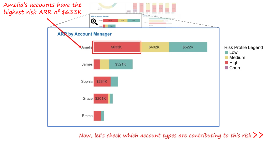
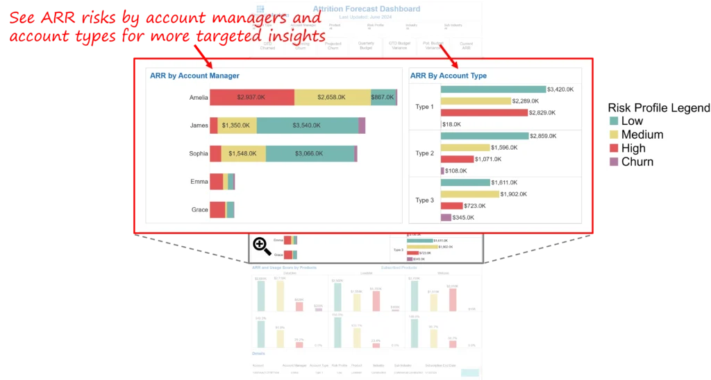
- Pinpointed exposure concentration, revealing that one account manager’s portfolio accounted for $633K of the total at-risk ARR, enabling leadership to direct coaching and resources effectively.
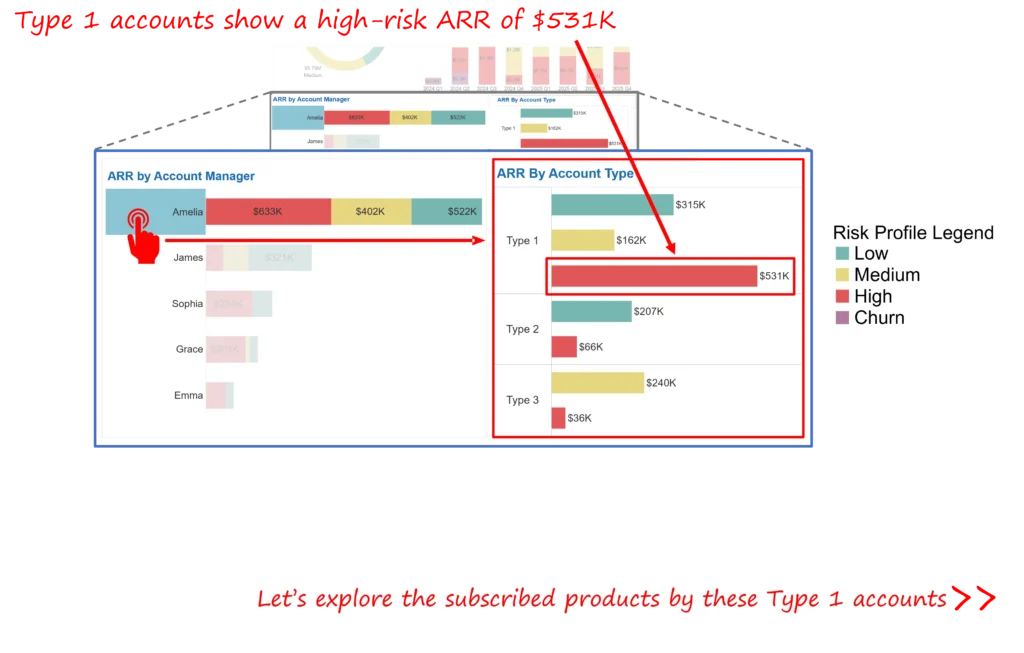
- Identified key customer segments driving churn, including Type 1 accounts with $531K at risk, allowing focused interventions in high-sensitivity areas.
- Highlighted priority accounts, such as Leadster, with $357K ARR at risk due to declining usage, transforming detection into immediate outreach opportunities.
- Reduced data reconciliation and review time by 60%, replacing manual updates with automated data refreshes synced to weekly leadership meetings.
Together, these outcomes made retention management proactive and evidence-based. Thus, converting churn prediction can be converted into measurable ARR protection.
Our Approach
The development followed a structured path centered on the decision-making needs of the executive and customer success teams.
Discovery and KPI Definition
Leadership working sessions defined the key indicators that drive retention decisions:
- Total ARR at risk (by quarter and manager).
- Customer usage score trends by product line.
- Account classification.
- Upcoming renewal dates and risk grades.
These KPIs provided clarity on both revenue exposure and the behavioral signals behind it.
Dashboard Design and Development
The design combined executive simplicity with operational clarity:
- A concise executive summary view displayed headline ARR risk and exposure distribution by cohort.
- Risk leaderboards highlighted account managers and customer segments driving the most considerable exposure.
- Color-coded risk bands (green, amber, red) provided immediate visibility on priority accounts.
- Drill-throughs enabled exploration of account-level usage, renewal schedules, and ownership, all within a single interface.
These design decisions ensured quick comprehension and immediate actionability during leadership reviews.
Data Integration and Testing
The dashboard ingested three core data streams, including CRM records, billing data, and product usage metrics, all consolidated through Tableau Prep. Extensive validation ensured:
- 100% alignment between ARR totals in the dashboard and verified billing records.
- Consistent mapping of account owners and customer IDs.
- Accurate refresh schedules synchronized with weekly leadership meetings.
This created a single, trusted source of truth for all retention decisions.
Iteration and Stakeholder Alignment
Over multiple sprint reviews, the dashboard evolved from a visual summary to a fully operational leadership tool. Initial feedback prioritized ARR visibility; later iterations added account-level cards and embedded outreach suggestions for each high-risk customer. This refinement cycle strengthened executive adoption and aligned updates with customer success workflows.
Key Learnings and Recommendations
- Dollar-based visibility drives focus. The dashboard showed that 20% of accounts represented over 80% of total ARR risk, helping leadership focus on where intervention mattered most.
- Usage data is an early-warning signal. Declines in product engagement consistently preceded churn events, validating investment in adoption tracking.
- Accountability accelerates response. Manager-level visibility fostered healthy competition and faster follow-ups.
- Automation builds trust. Weekly data refreshes aligned perfectly with leadership reviews, ensuring every decision was made on current data.
- Executive simplicity is non-negotiable. Concise metrics, drill-down options, and visual hierarchy kept attention where it mattered, thus achieving the goal of adequate revenue protection.
The Attrition Forecast Dashboard transformed how leadership perceived retention risk, from scattered signals to a unified, predictive command center, significantly impacting their decision-making process.
Each month, we curate the latest updates, insights, and trends for senior leaders in data analytics and AI in our CXO Analytics Newsletter.
Our mission is “to enable businesses to unlock value in data.” For over 20 years, we’ve partnered with more than 100 clients—from Fortune 500 companies to mid-sized firms—to solve complex data analytics challenges. Our services include Advanced Analytics Consulting, Generative AI Consulting, and Business Intelligence (Tableau Consulting, Power BI Consulting and Looker Consulting) turning data into strategic insight. We would love to talk to you. Do reach out to us for a free consultation.
Our Work
Industry
- Industry
Function
- Function
-
Increasing Conversions with Adwords Spend Optimizer
How To Optimize Adwords Budget in Real Time
Free Download
-
Markdown Optimization for Retailers
A Methodology to Track Performance and Maximize Value
Free Download
-
Optimizing Marketing Spend with Marketing Mix Modeling
Using Statistical Modeling and Empirical Methods
Free Download
-
Leveraging Web Analytics for Customer Acquisition
Leveraging Web Analytics for Customer Acquisition
Free Download
*Subscribe to be the first one to know our latest updates
Contact us

You have crafted a powerful analytical tool for us. Thank you.
Alan Benjamin
Principal, Benjamin Realty Advisors

I have been working with Chaitanya and Perceptive Analytics for about 20 months now. They did BI / reporting and excel tool development. Their work helped us in channeling our periodic reports to the senior and operational management. The team exceeded my expectations. Chaitanya would ask thought provoking questions that trigger a new line of thinking. They created good dashboards so our senior team can quickly interpret reports. We were able to make progress because the team knew finance and tools they created were easy to implement.
Samir Lavani
CFO at Pearl Hospitality

Chaitanya and the Perceptive Analytics team worked on multiple strategic projects that involved Tableau data visualizations. Perceptive's work (~ 1 year) led to successful launch of our portal - this was an important milestone for us. Visualizations created were insightful, easy to understand and visually attractive. The team often suggested ways to show data in more intuitive way so our audience can understand it. They also knew Tableau well that helped in customizing it for our purposes. The team worked hard to finish the project on time managing expectations. I look forward to working with Perceptive on other projects.
Haroon Yaqoob
Principal at Nomenclature Inc.