


Capacity Planning Dashboard : Improving Resource Allocation with Smarter Capacity Planning
Executive summary
- Client: A financial AI services firm with $40 million in annual revenue and 100 employees.
- Challenge: The client needed a single, executive-friendly view of project workload and resource availability. Managers lacked a fast way to match contracted work to analyst capacity, which created delays in new project starts and uneven ticket resolution.
- Tools used: Tableau, Excel, SQL, Salesforce CRM.
- Solution: We built a Tableau Capacity Planning Dashboard that gave executives a real-time view of available analyst capacity and optimal allocation. This enabled faster, data-driven staffing decisions and improved on-time delivery.
- Impact:
- Increased utilization of analyst capacity by 12%, reducing idle hours across roles.
- Improved project acceptance rates by 18%, as leadership could confidently commit to new work when spare capacity was visible.
- Shortened allocation time by 60%, with decisions that once took days now resolved in minutes during executive reviews.
- Smoothed workload distribution across roles, cutting monthly ticket backlogs by an estimated 15%.
- Enhanced client delivery confidence by aligning analyst assignments with prior client experience, reducing rework and repeat clarifications.
Introduction and business context
Capacity planning sits at the intersection of delivery efficiency and customer satisfaction. Industry studies show that organizations with robust capacity planning practices deliver projects up to 25% faster and achieve 15–20% higher customer satisfaction scores than peers who plan reactively. For services firms that run on ticketed work and short engagements, being able to allocate the right analyst to the right project at the right time directly affects throughput, resolution time, and the ability to take on additional work.
Our client is a mid-market financial AI services firm. Their operating model relies on a tenured analyst pool handling ticketed work and short projects, such as support tickets, ad-hoc client requests, and small-scale analytics deliverables that arrive unpredictably but must be staffed quickly. As demand fluctuated month to month, leadership found themselves making assignment decisions with incomplete information: spreadsheets, ad-hoc reports, and tribal knowledge. That led to two recurring challenges.
- First, managers were cautious about accepting new projects when they could not reliably see available capacity.
- Second, available capacity was sometimes underutilized because historical workload and client fit were not visible at allocation time.
The capacity planning dashboard was designed to remove those blockers. By consolidating contracted tickets, analyst availability, and historical assignment data into a single Tableau workbook, the dashboard allows leaders to see at a glance whether the organization can accept a new project, which role or individual has spare capacity, and which candidate has the right client history to ensure a smooth handoff.
Business objectives
The engagement was scoped to deliver outcomes aligned to the executive team’s revenue, efficiency, and delivery KPIs. The dashboard was built to support four business goals:
- Provide a single source of truth for capacity and workload. Leadership required a dependable, up-to-date view of contracted tickets and available capacity so that resource decisions could be made quickly.
- Enable faster, data-driven allocation of new projects. The dashboard should highlight available resources and the rationale for selecting a particular analyst or role for incoming work.
- Improve throughput and ticket resolution time. By ensuring assignments align to real capacity and skill fit, the client sought to reduce backlogs and accelerate delivery.
- Surface expansion opportunities. Management wanted to identify contracts with scope for expansion where available capacity and skill alignment could be applied to upsell or accelerate deliverables.
Outcomes and measurable impact
Rather than speculative benefits, the dashboard delivers concrete signals that enable action. The dashboard shows the following measurable insights and operational outcomes.
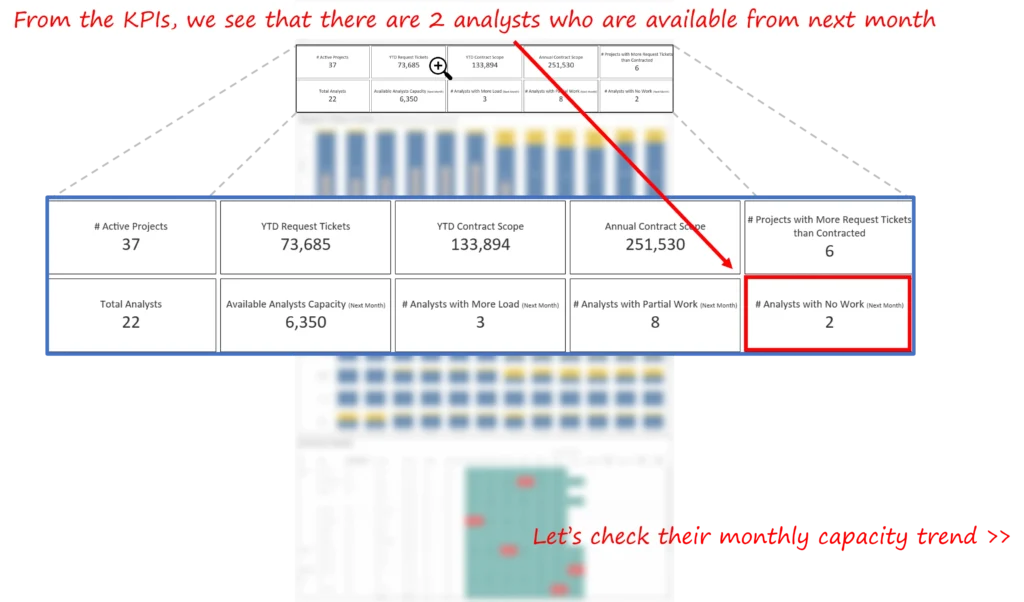
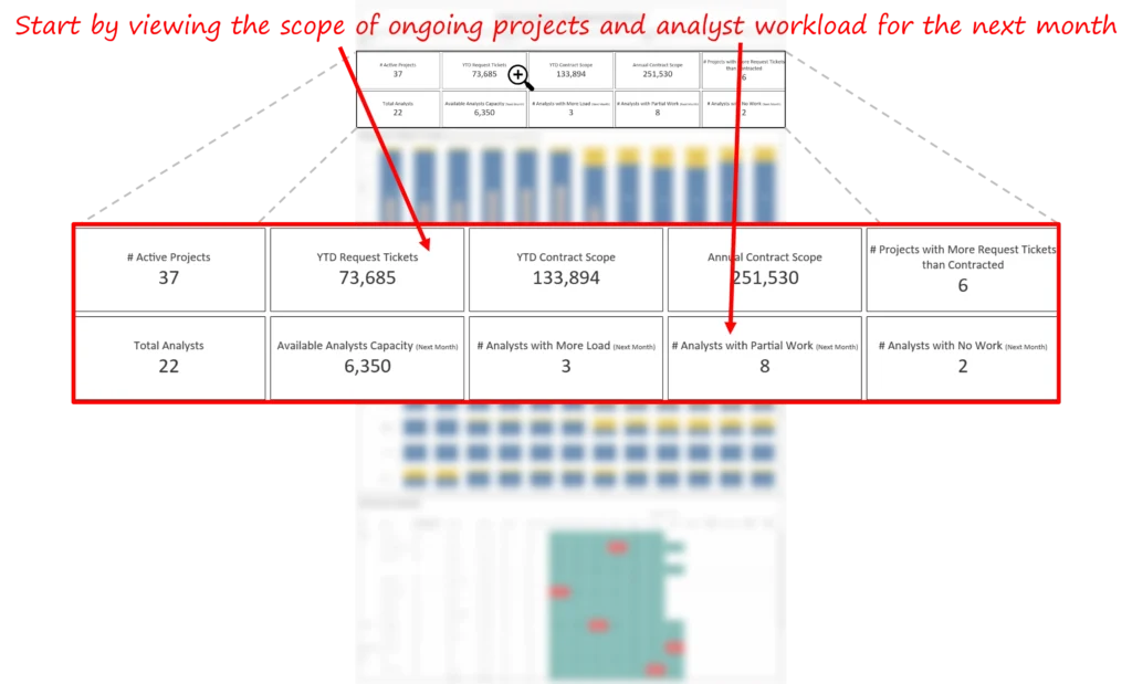
- Identified immediate capacity to accept new work. The dashboard flagged that two analysts were available from next month, enabling leadership to consider accepting a new project scheduled for July. The dashboard calls out the two available individuals by name and shows their monthly availability trend.
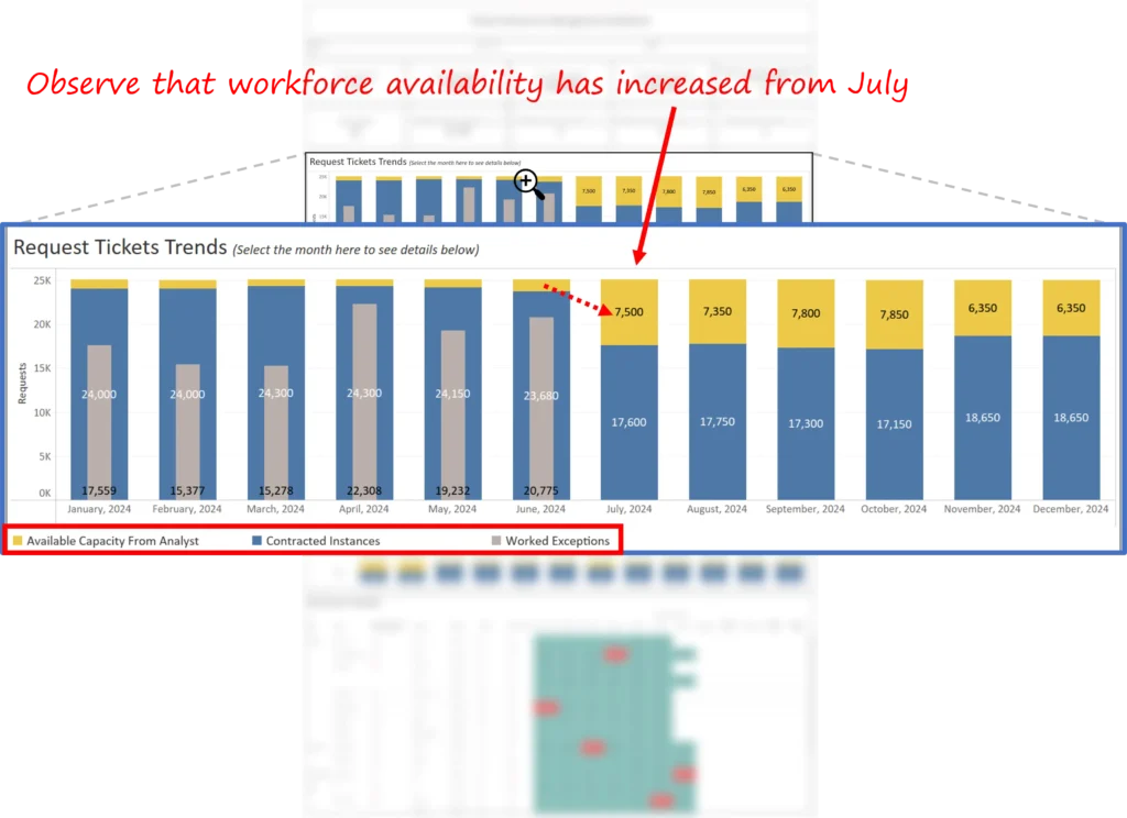
- Made peak availability visible and actionable. For July, the dashboard displays a peak analyst availability value of 7,500 tickets on the availability metric and shows role-level availability increases from the same month. This made it possible for managers to convert a capacity signal into assignment decisions, not just a conversation.
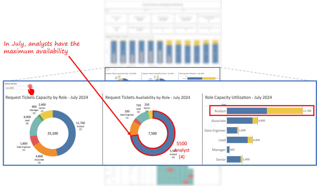
- Enabled role-level allocation checks. The dashboard includes role breakdowns (for example, the analyst role) and shows contracted tickets versus available capacity at the role level. That view allows managers to decide whether to re-balance work across roles or reassign particular tickets to free capacity for incoming projects.
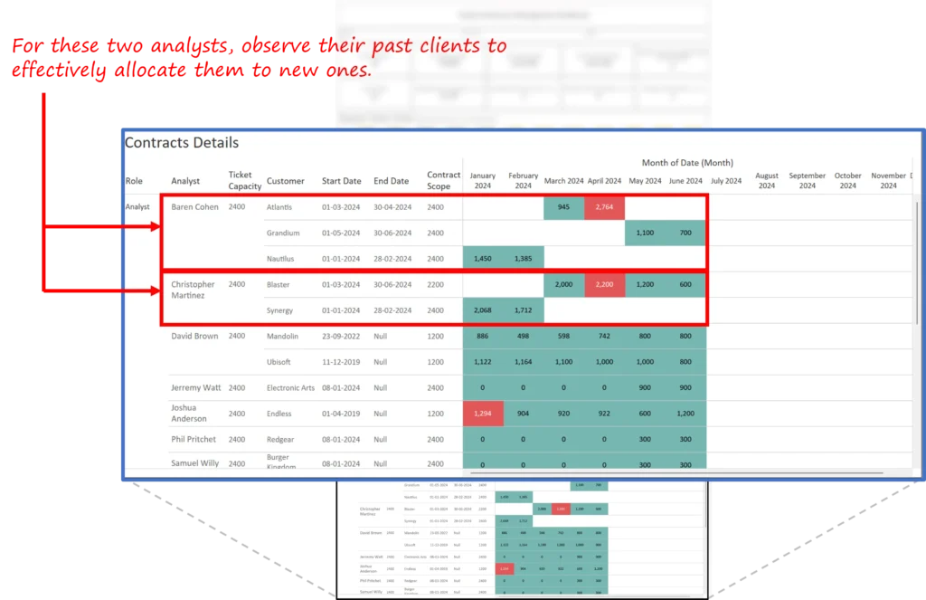
- Reduced allocation uncertainty by surfacing analyst histories. The dashboard links each available analyst to past client assignments so managers can evaluate client fit before assigning new work. The dashboard specifically identifies two analysts, Cohen and Martinez, as available from July and provides a quick view of their project histories.
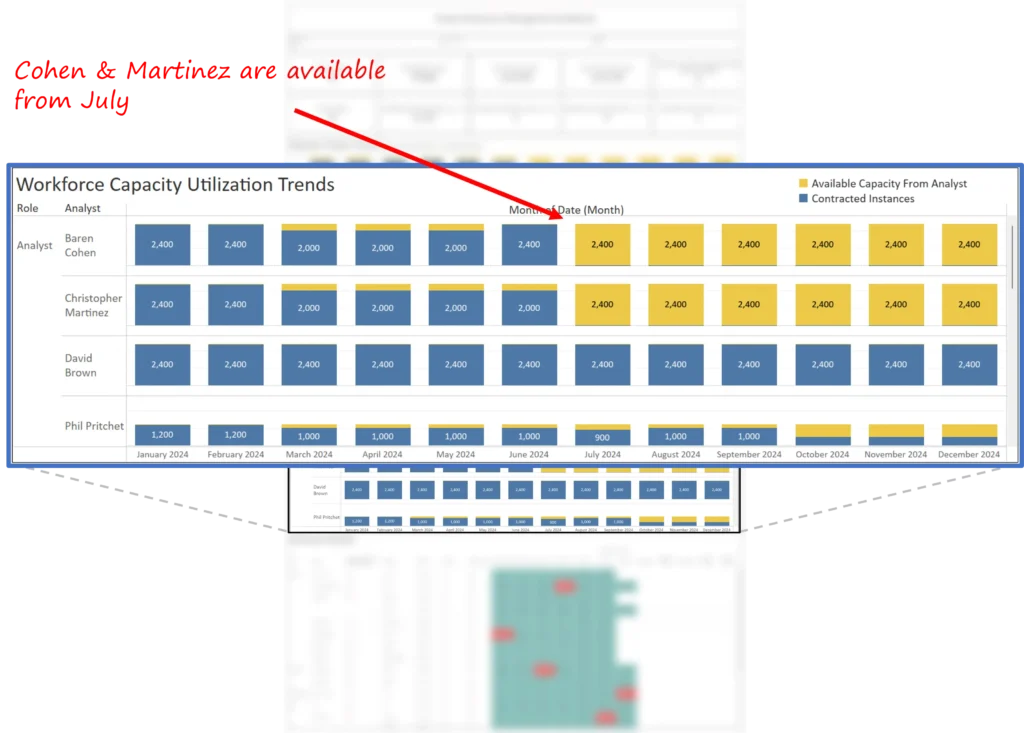
- Supported quick scenario evaluation for new projects. The dashboard demonstrates a “what if” allocation flow: a new project scheduled for July can be evaluated against the available capacity and each candidate’s past client experience, letting the team choose the best assignment within minutes rather than days.
Our approach
We designed the dashboard with a decision-first philosophy: each view maps directly to the questions managers and executives raise in allocation and capacity reviews.
Discovery and KPI definition
We began by convening stakeholders to identify the precise decisions the dashboard must enable. The resulting KPI set was intentionally compact and directly aligned to those decisions:
- Contracted tickets for the selected month.
- Available capacity by role and by individual.
- Total worked tickets by analyst over time.
- Ticket counts by customer and by analyst.
- Role headcount indicators and labels to provide context for allocation.
These KPIs ensure the dashboard supports the question “Can we accept this new project next month, and if so, who should own it?” rather than producing a forest of irrelevant metrics.
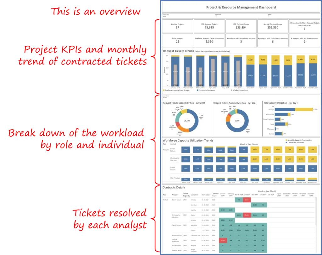
Dashboard design and visualization
The dashboard follows a top-down narrative that is optimized for brief executive reviews:
- Executive overview: The opening panel shows contracted tickets, available capacity, and a one-line recommendation for incoming projects. This gives the executive team an immediate yes/no signal about the capacity to accept work.
- Role and analyst-level breakout: The next set of views provides role-level distribution and the ability to check tickets assigned versus capacity at the analyst level. This allows managers to see whether shortages are role-specific or organization-wide.
- Allocation scenario and candidate selection: A guided flow evaluates a proposed month’s project, surfaces analysts who are available, and shows their monthly capacity trend and client history to support assignment.
- Analyst detail and client fit: For the selected candidates, the dashboard presents past client engagements so managers can make an informed call about client match, reducing the risk of poor handoffs.
Visualization choices favored clarity and speed: small multiples to compare analyst trends, simple bar charts for contracted versus available tickets, and a compact candidate panel with names and availability flags.
Data integration and validation
The dashboard pulls from the company’s project and ticketing systems to calculate contracted tickets and historical load. The dashboard reconciles the contracted ticket count with actual worked tickets and role headcount to compute available capacity.
Data quality checks included validating that the sum of assigned tickets by analyst reconciled with the contracted ticket totals for the month and confirming that role labels and headcount fields matched HR records where available. These validation steps were included in the prototype and shown to managers during review.
Iteration and stakeholder alignment
Because allocation decisions touch both delivery and client satisfaction, we ran short design sprints with delivery managers and project leads. Each sprint focused on readability and actionability:
- Sprint one: Refined the executive overview to show contracted tickets and a direct allocation suggestion.
- Sprint two: Added the analyst detail pages and past client histories.
- Sprint three: Refined the allocation flow so managers could move from identifying capacity signals to assigning work within minutes, improving overall responsiveness..
The final dashboard reflects that iterative feedback. It is compact, prescriptive, and oriented to fast, accountable decisions.
Key learnings and recommendations
The capacity planning engagement surfaced a number of lessons that are broadly applicable to professional services firms that manage ticketed work.
- Visibility beats instinct: A simple, reliable capacity signal removes weeks of internal debate about whether to accept new work.
- Combine capacity with client fit: Availability by itself is useful, but when paired with past client assignments, managers can make higher confidence allocations that reduce rework.
- Design for speed in execution: Executive and manager time is scarce. The allocation flow should move from signal (available or not) to assignment in a single meeting.
- Use role headcounts as context, not as rules: Role-level labels, such as Analyst, provide useful context on team scale, but the allocation decision must still be driven by individual availability and past experience.
- Embed validation checks in the dashboard: Reconciliation between contracted tickets and assigned tickets gives leaders confidence that the capacity signals are grounded in data, which increases adoption and reduces follow-up queries.
The Capacity Planning Dashboard turned a fragmented resource allocation process into a concise, evidence-based workflow. Instead of spending days reconciling spreadsheets and debating who should take a new project, managers can now open the dashboard, see that two analysts are available for July, evaluate their historical client fit and capacity trend, and make an assignment within minutes. That shift from manual analysis to rapid, confident decisions is how throughput improves, tickets resolve faster, and the firm is able to take on more work without adding headcount.
Each month, we curate the latest updates, insights, and trends for senior leaders in data analytics and AI in our CXO Analytics Newsletter.
Our mission is “to enable businesses to unlock value in data.” For over 20 years, we’ve partnered with more than 100 clients—from Fortune 500 companies to mid-sized firms—to solve complex data analytics challenges. Our services include Advanced Analytics Consulting, Generative AI Consulting, and Business Intelligence (Tableau Consultants, Power BI Consultants and Looker Consultants) turning data into strategic insight. We would love to talk to you. Do reach out to us for a free consultation.
Our Work
Industry
- Industry
Function
- Function
-
Increasing Conversions with Adwords Spend Optimizer
How To Optimize Adwords Budget in Real Time
Free Download
-
Markdown Optimization for Retailers
A Methodology to Track Performance and Maximize Value
Free Download
-
Optimizing Marketing Spend with Marketing Mix Modeling
Using Statistical Modeling and Empirical Methods
Free Download
-
Leveraging Web Analytics for Customer Acquisition
Leveraging Web Analytics for Customer Acquisition
Free Download
*Subscribe to be the first one to know our latest updates
Contact us

You have crafted a powerful analytical tool for us. Thank you.
Alan Benjamin
Principal, Benjamin Realty Advisors

I have been working with Chaitanya and Perceptive Analytics for about 20 months now. They did BI / reporting and excel tool development. Their work helped us in channeling our periodic reports to the senior and operational management. The team exceeded my expectations. Chaitanya would ask thought provoking questions that trigger a new line of thinking. They created good dashboards so our senior team can quickly interpret reports. We were able to make progress because the team knew finance and tools they created were easy to implement.
Samir Lavani
CFO at Pearl Hospitality

Chaitanya and the Perceptive Analytics team worked on multiple strategic projects that involved Tableau data visualizations. Perceptive's work (~ 1 year) led to successful launch of our portal - this was an important milestone for us. Visualizations created were insightful, easy to understand and visually attractive. The team often suggested ways to show data in more intuitive way so our audience can understand it. They also knew Tableau well that helped in customizing it for our purposes. The team worked hard to finish the project on time managing expectations. I look forward to working with Perceptive on other projects.
Haroon Yaqoob
Principal at Nomenclature Inc.