


Driving Feature Adoption with a Product Analytics Dashboard: The Pay using QR Case Study
Executive Summary
The client is a global B2B payments platform serving over one million customers across more than 100 countries. As part of its product expansion strategy, the company launched a new “Pay using QR” feature designed to simplify payment collection and reduce friction for both payers and payees. While early usage of the feature showed promise, leadership lacked clear visibility into who was adopting it, how it was being used, and whether it was contributing meaningfully to revenue. Decisions around marketing investment, sales focus, and product enhancements were being made without a consolidated view of adoption and performance. To address this, a comprehensive feature adoption and performance dashboard was developed. The dashboard brought together user behavior, transaction data, and revenue metrics into a single analytical view, enabling teams to understand adoption patterns, compare new and existing users, and identify high-performing channels and segments. This foundation allowed the organization to move from assumption-driven decisions to data-backed growth strategies.Introduction & Business Context
In the competitive world of global payments, reducing friction in payment flows is critical. Customers increasingly expect fast, simple, and flexible ways to send and receive money, especially in B2B and cross-border scenarios. Even small improvements in payment experience can have a significant impact on acquisition, retention, and transaction volumes. To meet these expectations, the client introduced “Pay using QR”, a feature that allows businesses to generate a QR code or payment link that customers can use to complete payments without needing to sign up or log in. The feature was positioned as a low-friction alternative to traditional invoicing and payment requests. However, after launch, teams faced several unanswered questions. While usage numbers were available at a high level, there was no clear understanding of:- Which users were adopting the feature first
- How new users behaved compared to existing customers
- Whether the feature was driving meaningful payment volume and revenue
- Which channels, geographies, or industries were seeing the strongest traction
Business Objectives
The primary goal of the dashboard was to turn raw usage data into actionable insights that could guide product and growth decisions. Specifically, the client wanted to:- Measure adoption of the “Pay using QR” feature across the user base
- Understand differences in behavior between new and existing users
- Track payments, volumes, and revenue generated through the feature
- Identify high-performing acquisition channels and customer segments
- Enable teams to quickly explore data without relying on manual analysis
- Support data-driven decisions around marketing, sales focus, and product improvements
Analytical Approach & Dashboard Methodology
Defining Adoption and Performance Metrics
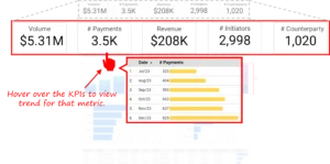
The first step was to clearly define what “success” meant for the Pay using QR feature. Rather than relying on a single adoption metric, the analysis focused on a balanced set of indicators that captured both usage and business impact. Key metrics included:- Feature adoption rate (percentage of users using Pay using QR)
- Number of payments completed using QR
- Total payment volume processed through the feature
- Revenue generated from QR-based payments
- Adoption and usage trends over time
- Contribution from new users versus existing users
Designing the Dashboard Story Flow
The dashboard was designed to guide users through a logical narrative, moving from high-level performance to detailed insights.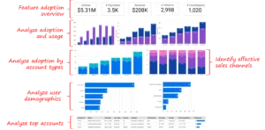


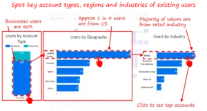
Enabling Segmentation and Drill-Down Analysis
To move from insight to action, the dashboard included segmentation and drill-down capabilities. Users could break down adoption and performance by:- Geography
- Industry
- Account type (business vs individual)
- Acquisition channel
Detailed Account-Level Analysis
Beyond segment-level views, the dashboard enabled account-level analysis, allowing teams to drill into individual customer accounts and their Pay using QR activity. Stakeholders could review:- Number of QR payments per account
- Total payment volume and revenue contribution
- Usage frequency over time
- Comparison of QR usage versus other payment methods
Outcomes, Insights, and Business Impact
The dashboard quickly moved beyond descriptive reporting and became a decision-support tool for product, sales, and growth teams. Several clear patterns emerged once adoption, usage, and revenue were analyzed together.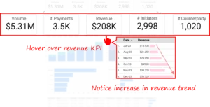
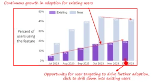
New Users Drove Adoption, Existing Users Drove Revenue
The analysis showed that new users adopted the Pay using QR feature at a significantly higher rate. Nearly half of new sign-ups used the feature early in their lifecycle, accounting for the majority of QR-based payment transactions.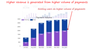
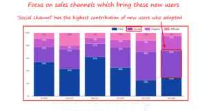
Channel Performance Revealed Clear Growth Levers
By analyzing adoption by acquisition channel, the dashboard highlighted that social channels were the strongest driver of new QR feature adopters. These users were quick to try the feature, validating its positioning as a low-friction entry point for new customers. In contrast, enterprise and referral-driven users showed slower adoption but stronger long-term value. This helped marketing teams recalibrate channel investments based on both short-term activation and long-term revenue potential.Segment-Level Patterns Enabled Targeted Actions
Segmentation by geography, industry, and account type uncovered clear patterns:- Business accounts dominated usage, contributing the majority of successful payments
- US-based users showed the highest adoption and volume
- Retail customers emerged as the most active industry segment
Detailed Account-Level Analysis
This level of detail was critical for explaining anomalies such as sudden spikes, drops, or outlier behavior. Sales and Customer Success teams used these views to validate whether changes were driven by seasonal activity, one-time transactions, or genuine shifts in customer behavior. Account-level visibility also helped teams identify high-potential accounts with early adoption but low volumes, creating opportunities for targeted outreach, education, and upsell. By connecting individual account behavior to broader trends, the dashboard bridged the gap between strategic insight and day-to-day operational action.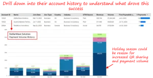
Insights
Several important lessons emerged during the engagement:- Feature adoption metrics must be evaluated alongside volume and revenue to avoid misleading conclusions
- New and existing users often require different activation and engagement strategies
- Aggregated views alone are insufficient; drill-down capability is essential for understanding real user behavior
- Seasonality and external factors can influence adoption and must be interpreted carefully
- Strong collaboration between product, growth, and analytics teams is critical for sustained success
- The ability to drill down to individual accounts proved especially valuable for sales and Customer Success teams. Rather than relying on summary metrics alone, teams could quickly validate which customers were driving trends and take direct action
Strategic Recommendations
Based on the insights generated by the dashboard, several strategic actions were recommended:- Strengthen onboarding journeys for new users to capitalize on early adoption momentum
- Launch targeted campaigns to encourage existing users to increase QR payment usage
- Prioritize high-performing channels, such as social acquisition, while optimizing for downstream value
- Replicate success patterns from high-volume retail and US-based customers across similar segments
- Track post-adoption behavior to understand long-term feature stickiness and retention
- Expand the dashboard framework to monitor additional product features using the same analytical approach
Conclusion
Feature launches succeed not only through innovation, but through continuous measurement and learning. If your organization is looking to improve feature adoption, align product and growth teams, or build analytics frameworks that support data-driven decisions, we’re happy to share best practices and lessons learned from this engagement. Each month, we curate the latest updates, insights, and trends for senior leaders in data analytics and AI in our CXO Analytics Newsletter. Our mission is “to enable businesses to unlock value in data.” For over 20 years, we’ve partnered with more than 100 clients—from Fortune 500 companies to mid-sized firms—to solve complex data analytics challenges. Our services include Advanced Analytics, Generative AI, and Business Intelligence (Tableau, Power BI and Looker) turning data into strategic insight. We would love to talk to you. Do reach out to us for a free consultation.Our Work
Industry
- Industry
Function
- Function
-
Increasing Conversions with Adwords Spend Optimizer
How To Optimize Adwords Budget in Real Time
Free Download
-
Markdown Optimization for Retailers
A Methodology to Track Performance and Maximize Value
Free Download
-
Optimizing Marketing Spend with Marketing Mix Modeling
Using Statistical Modeling and Empirical Methods
Free Download
-
Leveraging Web Analytics for Customer Acquisition
Leveraging Web Analytics for Customer Acquisition
Free Download
*Subscribe to be the first one to know our latest updates
Contact us

You have crafted a powerful analytical tool for us. Thank you.
Alan Benjamin
Principal, Benjamin Realty Advisors

I have been working with Chaitanya and Perceptive Analytics for about 20 months now. They did BI / reporting and excel tool development. Their work helped us in channeling our periodic reports to the senior and operational management. The team exceeded my expectations. Chaitanya would ask thought provoking questions that trigger a new line of thinking. They created good dashboards so our senior team can quickly interpret reports. We were able to make progress because the team knew finance and tools they created were easy to implement.
Samir Lavani
CFO at Pearl Hospitality

Chaitanya and the Perceptive Analytics team worked on multiple strategic projects that involved Tableau data visualizations. Perceptive's work (~ 1 year) led to successful launch of our portal - this was an important milestone for us. Visualizations created were insightful, easy to understand and visually attractive. The team often suggested ways to show data in more intuitive way so our audience can understand it. They also knew Tableau well that helped in customizing it for our purposes. The team worked hard to finish the project on time managing expectations. I look forward to working with Perceptive on other projects.
Haroon Yaqoob
Principal at Nomenclature Inc.