


Pipeline Analysis Dashboard for an AI-Driven Finance Firm: How We Unlocked Deal Visibility, Faster Conversions, and Smarter Forecasting
Executive Summary
- Client: US-based AI Finance Solutions Provider with annual revenue of about $50M annual revenue and 200 employees.
- Challenge: Incomplete visibility into opportunity stages, stagnant pipeline entries, and unpredictable closures.
- Tools: Tableau, Excel, SQL, CRM data integration.
- Solution: Developed an intuitive pipeline analysis dashboard offering detailed stage-wise deal movement, opportunity aging, and monthly trends.
- Impact: Improved win rate tracking, faster opportunity progression, and better strategic forecasting for the sales leadership.
Introduction and Business Context
The client, a growing AI-powered financial services firm, had built a robust lead generation system, but its pipeline management had failed to keep pace. Sales teams spent significant time juggling spreadsheets, CRM exports, and static reports. The absence of a centralized pipeline view created blind spots in opportunity progression, making it difficult to project closure timelines or intervene in stalled deals.
Critical deals would often remain untouched for weeks, and sales leadership lacked an early-warning mechanism to identify inactivity. The result? Forecasts carried low confidence, high-value deals went cold, and sales velocity suffered. As they scaled toward their next funding round, the leadership team knew they needed a dashboard that did more than count deals – it had to surface actionable insights and support boardroom-level forecasting.
The firm’s leadership had ambitious growth goals that demanded not just better sales execution, but tighter alignment between sales planning and revenue projections. Without trustworthy deal-level visibility, missed targets and inaccurate forecasts had become too common to ignore. The solution had to not only improve team-level clarity but also serve as a reliable input into quarterly CXO decision-making.
Business Objectives
- Identify pipeline bottlenecks across opportunity stages
- Monitor opportunity aging and activity gaps in real time
- Visualize month-wise closure trends and active deal health
- Prioritize stalled, high-value opportunities for escalation
- Enable regional and CXO-level visibility for strategy alignment
- Improve the accuracy of revenue forecasting and resource planning
Outcomes and Measurable Impact
The dashboard delivered significant strategic and operational gains:
- 25% reduction in stagnant opportunities within the first quarter post-implementation
- 12% increase in monthly closures from previously inactive opportunities
- Sales team reduced prep time for review meetings by 40%, shifting from decks to live data walkthroughs
- Forecast accuracy improved by 18%, enabling more confident board reporting
- Enabled tracking of deal velocity, aged deal alerts, and stage-to-stage conversion rates
- Empowered sales heads to analyze forecast variance, resource bottlenecks, and sales rep-level opportunity health
- Regional heads flagged 38% of deals in the proposal stage as at-risk based on inactivity and aging
Our Approach
Though outcomes came first, what made them possible was a carefully executed Power BI solution backed by clean data integration, analytical modeling, and stakeholder-driven design. Our process followed a clear logic, balancing technical depth with usability, while aligning closely with business goals.
Discovery and Metric Definition
The project began with collaborative working sessions involving the Sales Ops head, CRM admins, and regional leaders. We mapped the sales cycle, deal progression logic, and CRM taxonomy to define:
- Opportunity stages with the highest drop-offs
- Average time deals spent inactive in each stage
- Deal value distribution by stage and win probability
- Engagement frequency based on CRM update logs
- Win/loss trends and how stalled opportunities impacted quarterly performance
These insights shaped the KPI blueprint, which prioritized opportunity aging, velocity, conversion ratio, and inactivity visibility — not just pipeline volume.
To support strategic scenario planning, we introduced the concept of “deal health scoring” that evaluated each opportunity using weighted metrics, including aging, touchpoints, deal size, and stage.
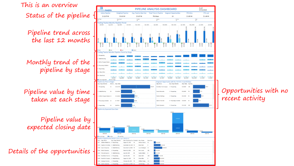
Dashboard Design and UX
Our design followed a “top-down funnel” approach with intuitive navigation:
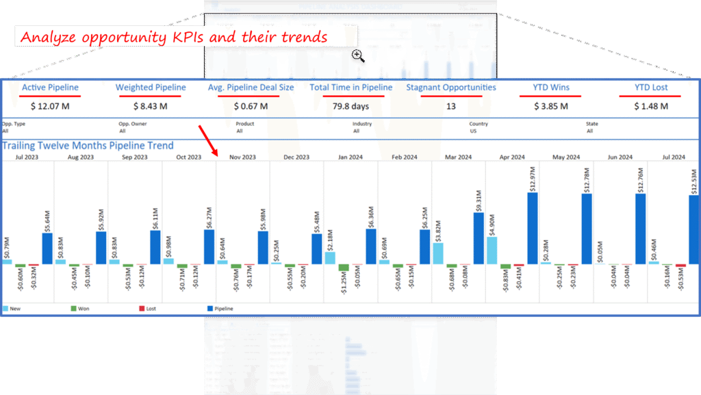
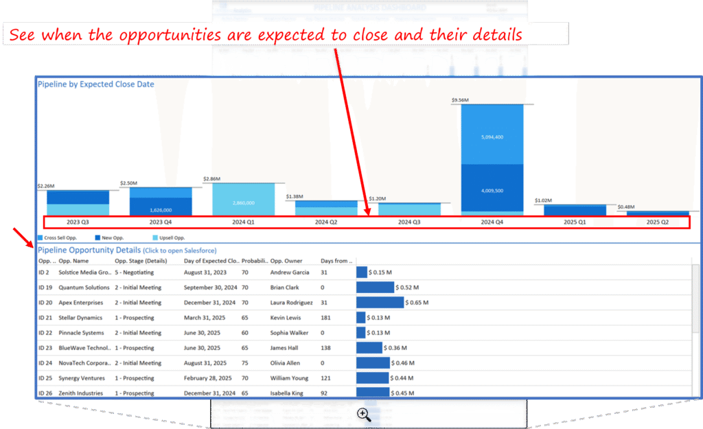
- Top panel: Pipeline snapshot by deal value, count, and monthly trends
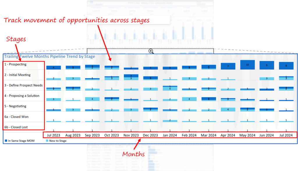
- Mid-section: Stage-wise deal distribution, opportunity age buckets, and inactivity flags
- Bottom: Detailed opportunity list with last modified dates, assigned owners, and expected close windows
Key UX elements included:
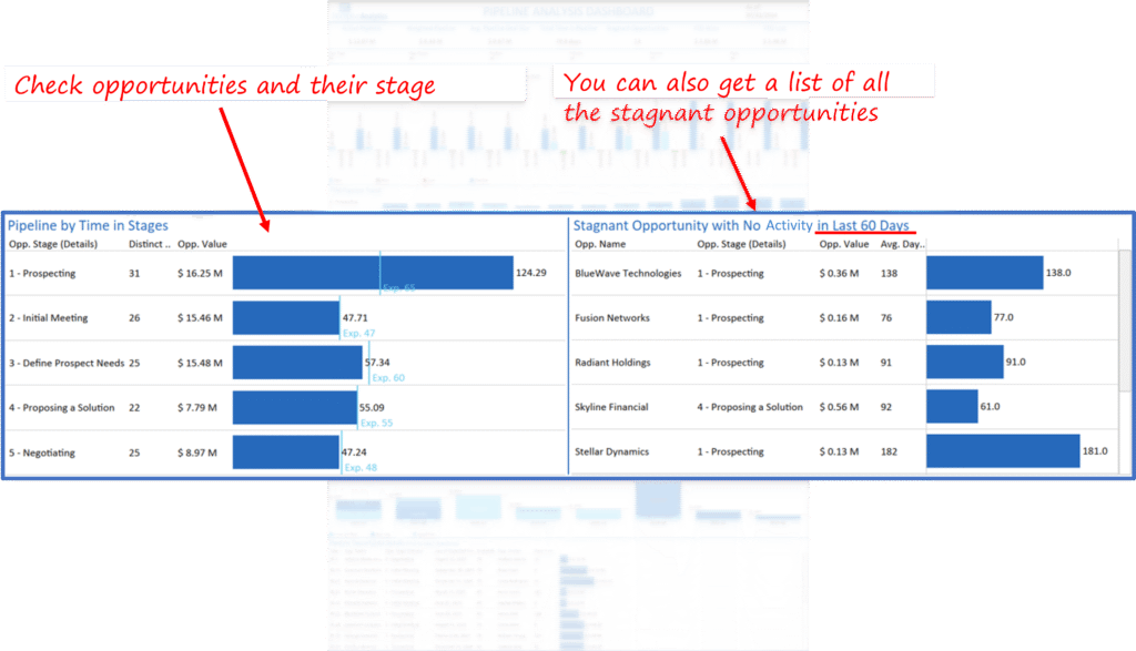
- Conditional formatting to flag red zones (inactive for 15+ days)
- Drill-through filters for sector, region, and sales owner
- Prominent display of expected closures in the next 30/60/90 days
- Visual toggles for segmenting opportunities by stage length and probability score
- Dynamic comparisons for Q-o-Q trends, territory growth rate, and conversion-to-close ratio
Data Integration and Modeling
We ingested CRM data and enriched it with lead scoring metrics, historical opportunity closures, and deal owner-region mappings. Using Power Query and DAX, we modeled:
- Stage-to-stage conversion rates
- Deal progression velocity (avg. days per stage)
- Forecast accuracy by region
- Value-weighted win rates
- Stagnation index for deals over 30 days idle
- Expected closure windows based on weighted averages
We also created custom measures for:
- Deal Dormancy Index: to score opportunity risk
- Forecast Variance Delta: to track deviation from projected targets
- Pipeline Health Score: holistic metric considering aging, probability, activity, and value
User Adoption and Refinement
Following initial rollout, we conducted two structured feedback sprints with sales leadership and frontline managers. Insights from real-time usage led to the following enhancements:
- Added tooltips with CRM notes and contact history for context during hover
- Simplified aging indicators with traffic light logic (green: <15 days, amber: 15-30, red: >30 days)
- Made dashboard sections collapsible for quarterly vs monthly view toggles
- Introduced segment-specific dashboards for enterprise vs mid-market teams
Sales managers reported a 55% increase in time-to-insight when preparing QBRs. Senior leadership highlighted that they could now triage stalled deals 3x faster than before.
Key Learnings and Strategic Recommendations
- Not all pipeline issues are about low volume — inactive high-value deals often drive the largest losses.
- Pipeline aging matters more than pipeline size. Deals over 30 days idle have under 25% closure likelihood.
- CXOs should monitor forecast variance monthly as an early indicator of pipeline health.
- Dashboard adoption is not just about design; it must tie directly into decision-making cadences like QBRs and forecast calls.
- Recommend monthly pipeline health checks, quarterly aging audits, and territory-level tracking of conversion velocity.
- For scaling firms, a deal scoring system can help prioritize coaching, redistribute accounts, and optimize resource allocation.
Each month, we curate the latest updates, insights, and trends for senior leaders in data analytics and AI in our CXO Analytics Newsletter.
Our mission is “to enable businesses to unlock value in data.” For over 20 years, we’ve partnered with more than 100 clients—from Fortune 500 companies to mid-sized firms—to solve complex data analytics challenges. Our services include Advanced Analytics Consulting, Generative AI Consulting, and Business Intelligence (Tableau Consultants, Power BI Consultants and Looker Consultants) turning data into strategic insight. We would love to talk to you. Do reach out to us for a free consultation.
Our Work
Industry
- Industry
Function
- Function
-
Increasing Conversions with Adwords Spend Optimizer
How To Optimize Adwords Budget in Real Time
Free Download
-
Markdown Optimization for Retailers
A Methodology to Track Performance and Maximize Value
Free Download
-
Optimizing Marketing Spend with Marketing Mix Modeling
Using Statistical Modeling and Empirical Methods
Free Download
-
Leveraging Web Analytics for Customer Acquisition
Leveraging Web Analytics for Customer Acquisition
Free Download
*Subscribe to be the first one to know our latest updates
Contact us

You have crafted a powerful analytical tool for us. Thank you.
Alan Benjamin
Principal, Benjamin Realty Advisors

I have been working with Chaitanya and Perceptive Analytics for about 20 months now. They did BI / reporting and excel tool development. Their work helped us in channeling our periodic reports to the senior and operational management. The team exceeded my expectations. Chaitanya would ask thought provoking questions that trigger a new line of thinking. They created good dashboards so our senior team can quickly interpret reports. We were able to make progress because the team knew finance and tools they created were easy to implement.
Samir Lavani
CFO at Pearl Hospitality

Chaitanya and the Perceptive Analytics team worked on multiple strategic projects that involved Tableau data visualizations. Perceptive's work (~ 1 year) led to successful launch of our portal - this was an important milestone for us. Visualizations created were insightful, easy to understand and visually attractive. The team often suggested ways to show data in more intuitive way so our audience can understand it. They also knew Tableau well that helped in customizing it for our purposes. The team worked hard to finish the project on time managing expectations. I look forward to working with Perceptive on other projects.
Haroon Yaqoob
Principal at Nomenclature Inc.