


How Automated Data Quality Monitoring Improved Accuracy and Trust Across Systems
Executive Summary
Client Background This case study is a continuation of the ETL integration implemented for a global B2B payments platform serving 1M+ customers across 100+ countries. Following the successful synchronization of CRM and data warehouse systems, leadership turned its focus to ensuring the ongoing reliability of data flowing through this new ETL foundation. Challenge While the ETL implementation consolidated customer data from Snowflake into the CRM and BI systems, leadership recognized that data quality is not a one-time fix. As data volumes grew and updates continued weekly, inconsistencies such as invalid values, missing attributes, and freshness gaps began to surface. Manual checks were no longer scalable, and teams lacked visibility into where issues were occurring, how frequently they appeared, and which problems required immediate attention. Solution To address this, we designed and implemented a data monitoring dashboard that systematically tracked data quality across key dimensions—validity, completeness, consistency, and freshness by comparing post-ETL data between Snowflake and CRM records. The dashboard provided a single, centralized view of data health, enabling teams to move from reactive troubleshooting to proactive monitoring. Business Impact (CXO Perspective)- Improved trust in customer and operational data, reducing decision risk
- Reduction in time spent diagnosing data issues, freeing up analytics and operations teams. Reduced 3 hours of manual data quality checking tasks.
- Stronger governance and accountability across data-producing and data-consuming teams with clear insights into which data quality areas which need improvement
- Sustained data reliability at scale, supporting growth and downstream analytics. QA times for further analytics reduced by 50% due to quantitative data elements reliability metrics.
Introduction & Business Context
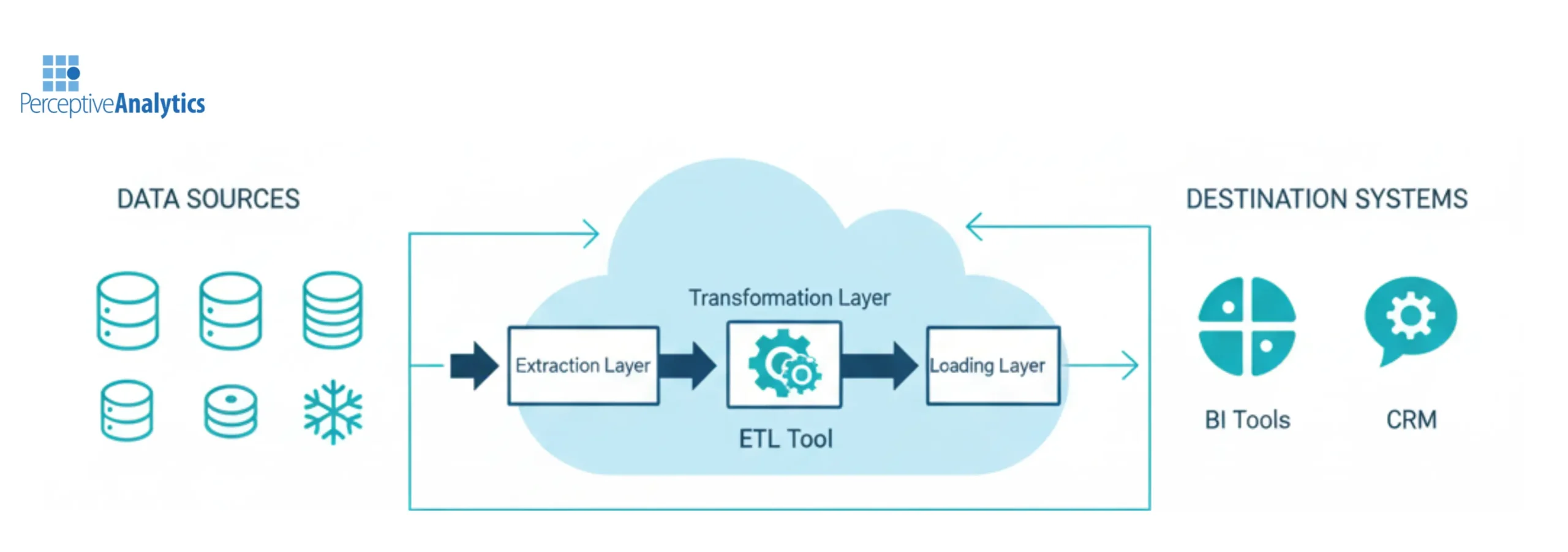
In the fast-moving world of global payments, accurate and timely customer information is critical. Every interaction, from onboarding and approvals to issue resolution depends on having consistent data across systems. When CRM data does not match what is stored in the data warehouse, teams struggle to coordinate, dashboards lose credibility, and customer experience suffers. As described in the previous ETL case study, the client initially faced this exact challenge. The CRM and Snowflake data warehouse operated independently, forcing teams to rely on manual exports and reconciliation. This resulted in inconsistent customer profiles, delayed updates, high manual effort, and limited visibility across teams. This is the reason we implemented ETL from Snowflake to HubSpot CRM. With millions of records being updated weekly, even small inconsistencies like invalid formats, missing values, or delayed updates could accumulate into significant operational risk. Preventing issues from occurring, and detecting them early when they did, required continuous data quality monitoring. This led to the next phase of the initiative: building a dashboard that would ensure data reliability.Business Objectives
The dashboard was designed to achieve the following objectives:- Continuously monitor data quality after ETL execution
- Track trends in data issues to identify systemic problems
- Provide feature-level visibility to help teams prioritize fixes
- Improve accuracy and consistency in CRM and reporting systems
- Reduce dependence on manual data checks
- Speed up diagnosis and resolution of data inconsistencies
Analytical Approach & Dashboard Methodology
Unlike a traditional reporting dashboard, this solution was built as an analytical control layer—designed to explain why data issues occur, where they originate, and how they evolve over time.5.1 Identifying Data Quality Dimensions
We began by defining the dimensions of data quality that mattered most to business users and downstream systems:- Validity – Are values in the correct format and within expected ranges?
- Completeness – Are required fields populated, or are values missing or mismatched?
- Consistency – Do values align across systems after ETL execution?
- Freshness – Is the data updated within the expected time window?
5.2 Designing the Dashboard Structure (Story-Driven Analysis)
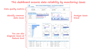 The dashboard was structured to guide users from high-level awareness to root-cause diagnosis, rather than overwhelming them with raw metrics. Top-Level Data Health Metrics At the top, summary metrics provide a quick view of overall data health. This allows leaders to immediately assess whether data quality is improving, stable, or deteriorating.
 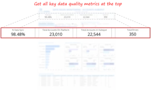 Trend Analysis Over Time Trend charts show how data issues evolve week over week. These visuals help identify abnormal spikes, recurring problem periods, or steady improvements—answering the critical question: Is the situation getting better or worse?
 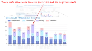 Issue Categorization by Type Breaking issues into validity, completeness, and mismatch categories helps teams understand what kind of problems dominate the data landscape. This informs whether fixes should focus on input validation, transformation logic, or upstream processes.
 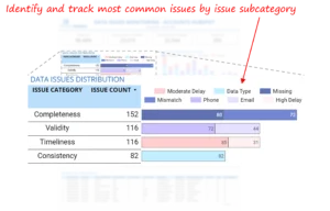 Feature-Level Drill-Down Once issue types are identified, users can see which fields contribute most to the problem. This is where prioritization happens, teams can focus on fixing the highest-impact attributes instead of spreading effort thin.
 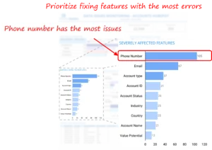 Record-Level Diagnosis Finally, users can drill down to individual records. This enables fast root cause analysis, reduces back-and-forth between teams, and supports targeted remediation.
 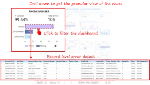 Together, these layers turn the dashboard into a guided investigation tool rather than a static report.
5.3 Data Pipeline for Quality Metrics
The dashboard was built using data already flowing through the ETL architecture:- Snowflake acted as the central source of truth
- Post-ETL CRM data (replicated back into Snowflake) enabled direct comparison between warehouse and CRM states
- Validation rules were applied to identify mismatches, missing values, and invalid formats
- Issues were tagged by type, field, and timestamp
- Aggregations were created for weekly trend analysis
5.4 Visualization & Interaction Design
Interactivity was designed to improve analysis efficiency, not just aesthetics.- Click-to-filter enabled users to isolate problem areas instantly
- Drill-down paths reduced investigation time from hours to minutes
- Highlighted spikes drew attention to high-risk periods
- Simple navigation ensured non-technical teams could use the dashboard independently
5.5 Stakeholder Feedback Loop
The dashboard was refined through continuous collaboration with:- Customer Success teams validating customer-facing fields
- Operations teams identifying process-related gaps
- Data Engineering teams refining validation logic
Outcomes, Insights, and Business Impact
- Improved Data Quality Across Key Dimensions By monitoring validity, completeness, consistency, and freshness on a recurring basis, the organization gained measurable visibility into data health. Data issues were identified earlier, trends became visible over time, and recurring problems were addressed before impacting operations.
- Faster Identification and Resolution of Data Issues The monitoring dashboard reduced the time required to detect and diagnose data issues. Feature-level and record-level drill-downs enabled teams to move from problem identification to root cause analysis much faster than manual checks.
- Better Prioritization of High-Impact Issues The dashboard highlighted that a small number of fields contributed to most data quality problems. This allowed teams to focus efforts on high-impact attributes instead of spreading resources across low-value fixes.
- Increased Trust in CRM and Analytics Outputs With consistent quality metrics and historical trends, stakeholders gained greater confidence in CRM data and BI reports, reducing data-related escalations and rework.
- Reduced Manual Monitoring Effort Automated data quality tracking replaced ad hoc checks and manual investigations, lowering operational overhead and ensuring data quality monitoring scaled with data volume.
Challenges and Lessons Learned
Several lessons emerged during the engagement:- Data quality issues often originated upstream and could not be solved by ETL alone
- Clear definitions of validity and completeness were critical for consistent monitoring
- Without trend visibility, recurring issues remained hidden until they became operational risks
- Data quality requires continuous monitoring rather than periodic reviews
- Cross-functional collaboration was essential to resolve systemic issues effectively
Strategic Recommendations for Data Quality & Monitoring
To build on these improvements, we recommend:- Establish regular data quality reviews with shared ownership across teams
- Track data quality trends, not just individual errors
- Prioritize fixes based on business impact rather than issue volume alone
- Introduce upstream validation to reduce recurring data issues
- Automate alerts for spikes, regressions, and schema changes
- Treat data quality as an ongoing capability, not a one-time initiative
Conclusion
If your organization has invested in ETL but still struggles with data reliability, a structured monitoring layer can bridge the gap between data movement and data trust. Each month, we curate the latest updates, insights, and trends for senior leaders in data analytics and AI in our CXO Analytics Newsletter Our mission is “to enable businesses to unlock value in data.” For over 20 years, we’ve partnered with more than 100 clients—from Fortune 500 companies to mid-sized firms—to solve complex data analytics challenges. Our services include Advanced Analytics, Generative AI, and Business Intelligence (Tableau, Power BI and Looker) turning data into strategic insight. We would love to talk to you. Do reach out to us for a free consultation.Our Work
Industry
- Industry
Function
- Function
-
Increasing Conversions with Adwords Spend Optimizer
How To Optimize Adwords Budget in Real Time
Free Download
-
Markdown Optimization for Retailers
A Methodology to Track Performance and Maximize Value
Free Download
-
Optimizing Marketing Spend with Marketing Mix Modeling
Using Statistical Modeling and Empirical Methods
Free Download
-
Leveraging Web Analytics for Customer Acquisition
Leveraging Web Analytics for Customer Acquisition
Free Download
*Subscribe to be the first one to know our latest updates
Contact us

You have crafted a powerful analytical tool for us. Thank you.
Alan Benjamin
Principal, Benjamin Realty Advisors

I have been working with Chaitanya and Perceptive Analytics for about 20 months now. They did BI / reporting and excel tool development. Their work helped us in channeling our periodic reports to the senior and operational management. The team exceeded my expectations. Chaitanya would ask thought provoking questions that trigger a new line of thinking. They created good dashboards so our senior team can quickly interpret reports. We were able to make progress because the team knew finance and tools they created were easy to implement.
Samir Lavani
CFO at Pearl Hospitality

Chaitanya and the Perceptive Analytics team worked on multiple strategic projects that involved Tableau data visualizations. Perceptive's work (~ 1 year) led to successful launch of our portal - this was an important milestone for us. Visualizations created were insightful, easy to understand and visually attractive. The team often suggested ways to show data in more intuitive way so our audience can understand it. They also knew Tableau well that helped in customizing it for our purposes. The team worked hard to finish the project on time managing expectations. I look forward to working with Perceptive on other projects.
Haroon Yaqoob
Principal at Nomenclature Inc.