


Driving Strategic Growth with Top 20% Account Intelligence: A Case Study in B2B Distribution
Executive Summary
- Client: National B2B distributor serving industrial and commercial customers
- Challenge: Limited visibility into changes in performance within top-revenue accounts
- Tools Used: Tableau, SQL, Excel
- Solution: Built a performance-focused dashboard to monitor growth and decline trends within the top 20% of accounts
- Impact:
- 15% revenue increase from high-growth customers
- Enabled early detection of account growth and decline trends, shifting insights from delayed quarterly snapshots to timely weekly visibility—allowing teams to act before revenue impact occurred.
- Enabled better focus on emerging high-value accounts
- Improved sales planning and account-level decision-making
- Reduced time spent on reporting and pre-meeting preparation, sales reps and managers saved an estimated 6–8 hours per week, allowing them to focus more on strategy and client engagement.
- 15% revenue increase from high-growth customers
Business Context
The top 20% of customers often account for the lion’s share of revenue in B2B enterprises. Yet these accounts frequently receive less ongoing analysis than they deserve, especially when they appear stable. This creates a costly blind spot. Accounts quietly decline, growth opportunities pass by, and retention becomes reactive instead of proactive.
This was the reality for our client, a large B2B distributor with a diversified customer base. Their sales leaders knew that the majority of business value came from a select group of accounts. What they didn’t have was timely insight into which of those accounts were growing, stagnating, or dropping off. For example, one high-revenue account that contributed nearly 4% of total quarterly sales showed a 30% drop in order volume over two consecutive months, yet the decline wasn’t flagged until the end-of-quarter review, missing the window for timely intervention.
Decision-makers were working with static Excel reports that were updated monthly or quarterly. There was no easy way to see:
- Which accounts were surging unexpectedly?
- Where the early signs of churn were emerging?
- How were revenue trends shifting across regions and segments?
To transition from reactive to data-driven account management, the client partnered with us to develop a Top 20% Customer Dashboard, focusing not just on reporting but on enabling sales and strategy teams to make smarter decisions every week.
Business Objectives
Our engagement focused on helping the client accomplish five specific goals:
- Deepen Visibility into Top Accounts
Provide ongoing performance tracking of top customers across regions, segments, and time frames, enabling sales leaders to spot accounts with 15%+ month-over-month changes in revenue or order volume and trigger account reviews before the next planning cycle. - Spot High-Growth Customers Early
Identify accounts that were accelerating and deserved expansion focus. - Detect Declining Accounts Before Churn
Highlight early drop-offs in key accounts, defined as a 20%+ decline in monthly order volume or frequency within a 30-day window, to enable sales teams to intervene before long-term disengagement sets in. - Improve Sales Planning and Resource Focus
Help leaders allocate sales time to the accounts that need it most. - Enable Timely Account-Level Decisions
Support weekly planning, not just quarterly reviews, with accurate, self-serve insight.
Our Approach
We worked backwards from the decisions sales and strategy leaders needed to make. Rather than building a catch-all dashboard, we focused on answering a few essential questions:
- Who among our top 20% is growing rapidly?
- Who is declining and may be at risk?
- How are these trends evolving?
- Which accounts require immediate attention or renewed strategy?
Our team built the solution in Tableau, integrating data from ERP, CRM, and territory systems. We created a unified model that refreshed dynamically and offered clear segmentation.
Business Impact and Measurable Outcomes
The rollout of the Top 20% Customer Dashboard led to immediate operational benefits and improved strategic decision-making across sales teams, regional managers, and business leadership. While the primary value lay in better visibility and faster action, several tangible outcomes were observed within the first few months:
- Improved Focus on High-Growth Accounts
Sales managers began using the dashboard to regularly track momentum in top-performing accounts. Several high-growth customers were identified earlier than before and proactively moved into expansion planning cycles.
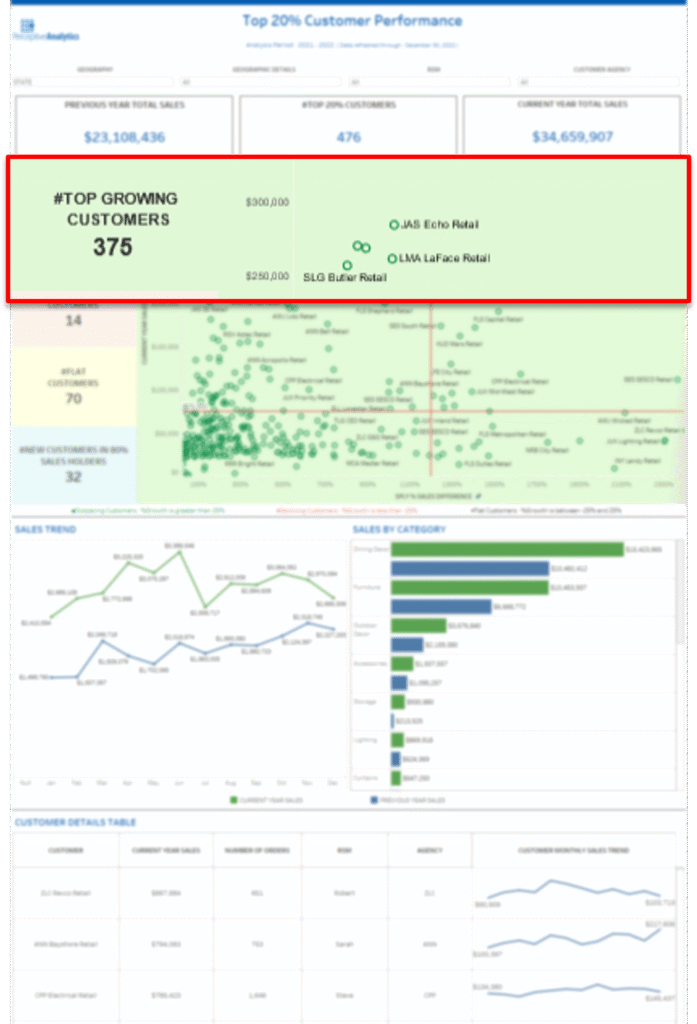
- Outcome: Enabled focused attention on ~375 top-growing accounts, many of which were previously under-leveraged
- Benefit: Supported better timing for upsell conversations and increased engagement in fast-moving regions, these 375 high-growth accounts contributed an incremental 8% increase in revenue over two quarters compared to the previous baseline.
- Timely Retention Actions on At-Risk Accounts
The “Declining Customers” segment helped highlight early drop-offs in account activity. Rather than waiting for quarterly results, regional leaders could now intervene within weeks of detecting a trend.
- Outcome: 14 top customers with declining revenue were flagged and addressed with targeted outreach
- Benefit: Preserved customer relationships that may otherwise have gone dormant without attention
- Faster and More Aligned Sales Planning
Weekly planning sessions shifted from static reports to dashboard walkthroughs. The built-in category-wise and regional filters allowed leaders to tailor discussions to local trends.
- Outcome:Improved sales focus and territory planning based on current growth, decline, or flat activity by product, reduced territory review prep time from 4–5 hours to under 1 hour per cycle, allowing managers to spend more time on strategy.
- Benefit: Helped reallocate field resources toward accounts showing the most strategic potential
- Significant Reduction in Manual Reporting
Manual Excel-based reporting dropped considerably. Lists that once took hours to compile (e.g., fastest growing customers by region) could now be generated in seconds.
- Outcome: Reduced time spent on sales reporting and list prep by an estimated 60–70%
- Benefit: Analysts and sales managers could spend more time on customer strategy, not data manipulation
- More Informed Account Conversations
The customer-level detail table and built-in trend lines helped sales reps prepare for meetings quickly and confidently.
- Outcome: Reps reported pre-call prep time reduced by ~50%, especially for recurring check-ins and Quarterly meetings.
- Benefit: Enabled more data-backed conversations and higher customer confidence in rep knowledge
- Broad User Adoption Across Teams
The dashboard was built to be usable without training, and adoption reflected that.
- Outcome: Within the first 6–8 weeks, consistent usage was observed across regional heads, key account managers, and field sales
- Benefit: Established the dashboard as a trusted, self-serve tool for ongoing account intelligence
Dashboard Features and Business Benefits
Each dashboard feature was directly tied to one or more of the five business objectives. The interface was designed to be clean, minimal, and actionable, with a focus on supporting weekly account reviews and team meetings.
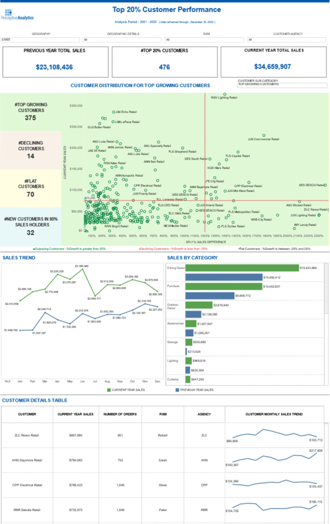
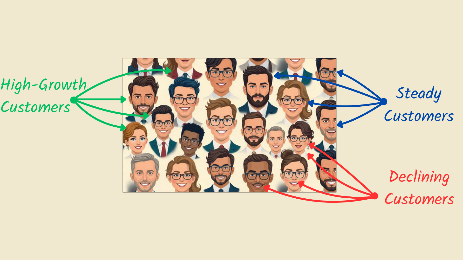
Objective 1: Spot High-Growth Customers
Dashboard Feature Used:
- #Top Growing Customers Panel
- Customer Distribution Bubble Chart
The dashboard automatically flagged 375 Top Growing Customers, clearly labeled in the left-hand summary panel. In the central bubble chart, these accounts were visualized based on both current sales and growth percentage, helping sales managers immediately see who was accelerating.
Business Benefit:
This enabled quick prioritization of fast-moving accounts. Several of these were mid-tier last year but showed strong purchasing patterns this year. For example, “Client A,” a Midwest-based electrical supplies distributor, was previously ranked outside the top 100 accounts. Within a single quarter, it recorded a 45% year-over-year increase in order volume, driven by a surge in demand for industrial lighting products. Sales leaders flagged the trend early using the dashboard, fast-tracked an upsell proposal, and expanded the product mix, turning a mid-tier account into a strategic growth partner. Planning efforts shifted from reactive reviews to proactive opportunity mapping based on data, not guesswork.
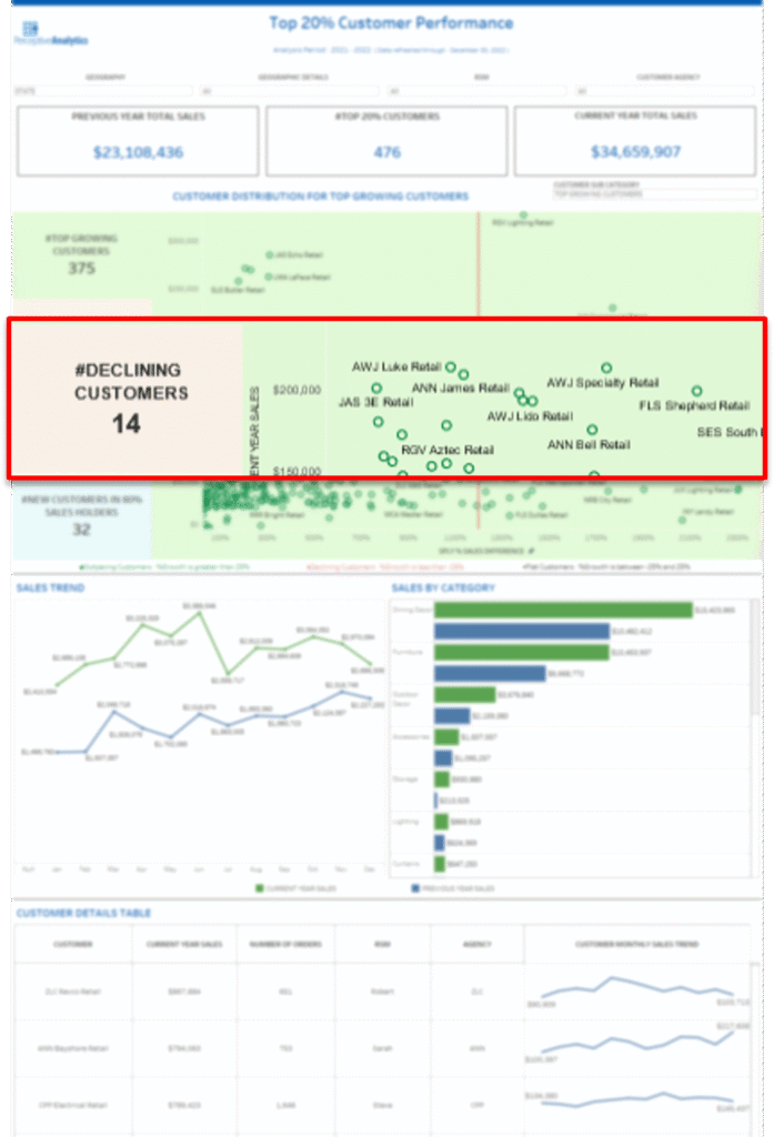
Objective 2: Identify Declining Accounts Early
Dashboard Feature Used:
- #Declining Customers Panel
- Customer Distribution Bubble Chart (with red flagging)
Alongside top growers, the dashboard surfaced 14 Declining Customers—visually flagged in red on the bubble chart. These were large or mid-sized accounts with substantial YoY sales drops, previously difficult to spot across siloed reports.
Business Benefit:
With real-time visibility, territory managers were able to act faster, launching service recovery steps and reconnecting with dormant customers before revenue loss became irreversible. For instance, one key account in the Southeast previously generating over $250K annually, showed a sharp 60% drop in monthly orders. The dashboard flagged the decline within two weeks, allowing the team to intervene with a recovery call and targeted offer. The account resumed ordering the following month, preventing a potential $200K annual revenue loss.
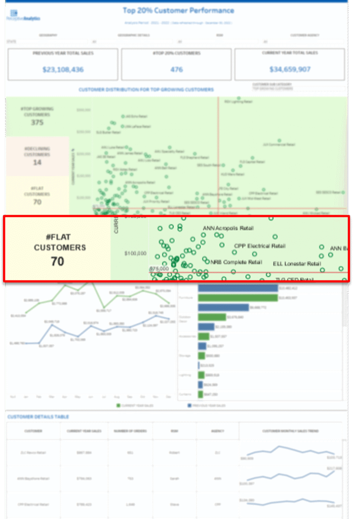
Objective 3: Segment the Customer Base Intelligently
Dashboard Feature Used:
- Segment Summary Panel
- Customer Distribution Plot
- #Flat Customers & #New in 80% Panels
The left-hand side of the dashboard broke out customers into four intuitive segments: Top Growing, Declining, Flat, and New, within 80% Sales Holders. These were not static filters—they updated each time the dataset refreshed.
Business Benefit:
This segmentation replaced manual efforts to group accounts in Excel. Sales teams no longer treated all top accounts the same—they adjusted strategy based on trend, not just revenue size.
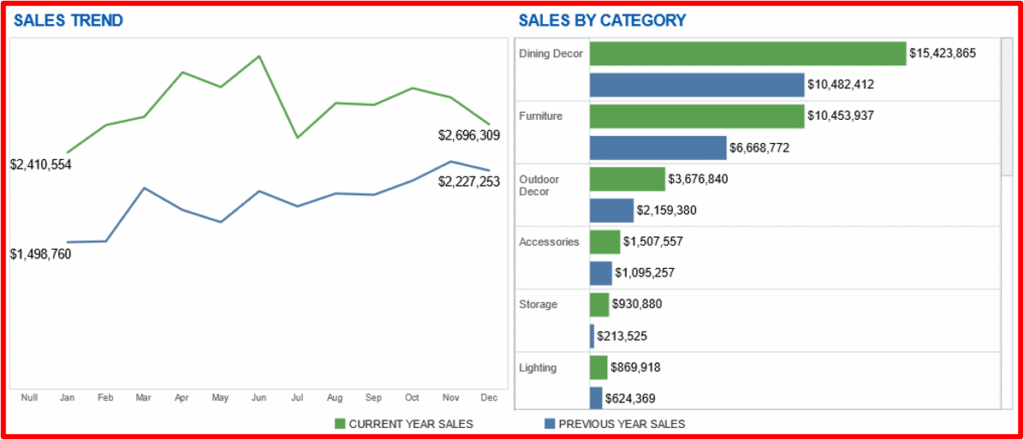
Objective 4: Drive More Focused Sales Planning
Dashboard Feature Used:
- Sales Trend Comparison (line chart)
- Sales by Category (bar chart)
The Sales Trend Chart showed month-over-month performance for the current and previous year, making it easy to spot seasonality, momentum, or downturns over time. A line chart was chosen here because it effectively highlights continuous trends and fluctuations across time helping users detect early signals of growth or decline at a glance.
The Sales by Category Chart compared current vs. previous year sales across key product groups. A bar chart was used to emphasize categorical comparisons, allowing sales teams to immediately see which product lines were over- or underperforming year-over-year.
Design rationale:
- Line charts are ideal for showing change over time and spotting inflection points
- Bar charts are more effective for side-by-side comparisons across discrete categories
Together, these visual elements allowed for both temporal insight and category-level diagnosis empowering faster, better-informed decisions.
Business Benefit:
This helped sales managers better time their outreach and align product-level focus. For example, if Outdoor Decor had strong growth while Lighting declined, reps could pivot offers accordingly. Planning meetings shifted from “what happened last quarter” to “where are we seeing movement right now?”
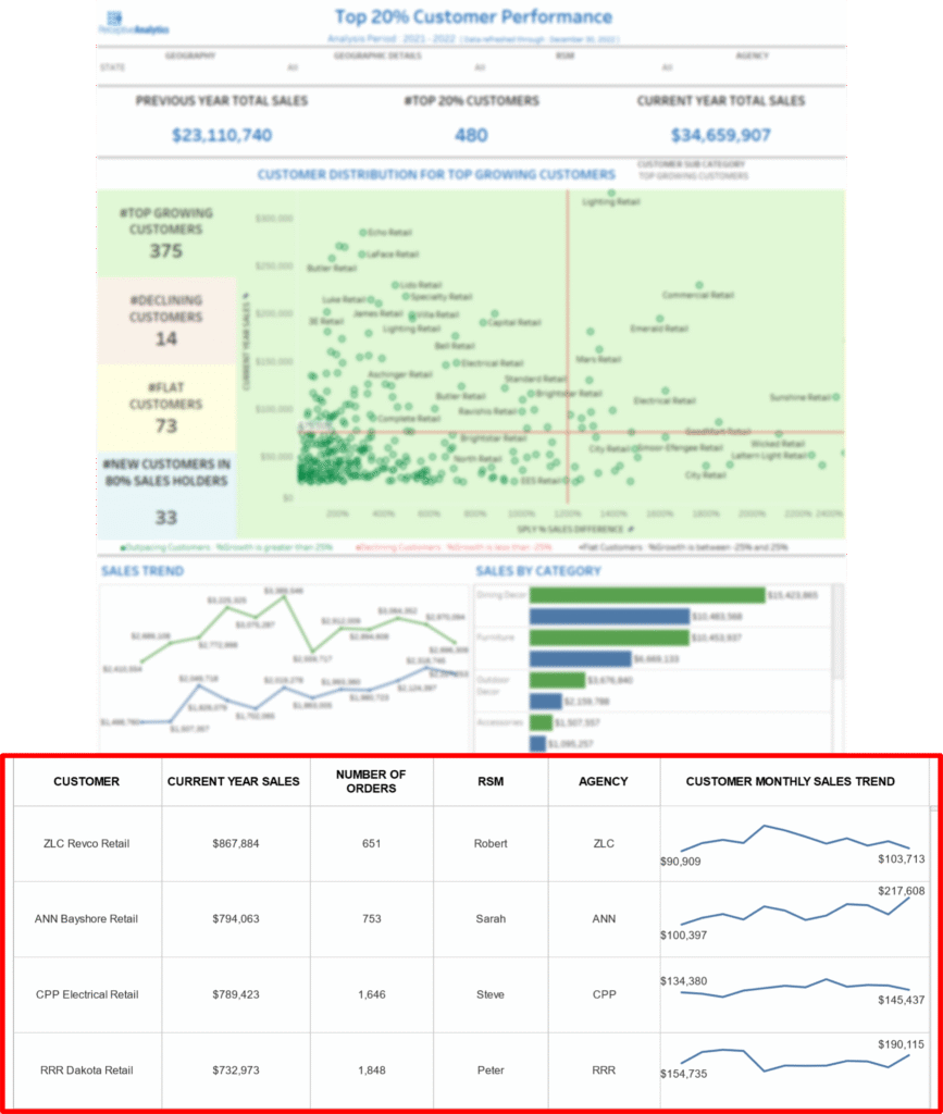
Objective 5: Enable Faster Account-Level Decisions
Dashboard Feature Used:
- Customer Details Table
- Per-Customer Monthly Sales Trend Line
- Current Year Sales, Orders, RSM, Agency Columns
The bottom section of the dashboard offered a detailed view per account, showing individual sales, number of orders, assigned rep, and agency, alongside a mini-trend line of monthly activity.Business Benefit:
Reps used this view to prepare for client calls and reviews without digging through CRM. What previously took 30–45 minutes per account navigating between CRM tabs, downloading reports, and piecing together order history was now accessible in under 5 minutes. Managers no longer had to rely on static PDFs to brief senior leaders. Account conversations became more informed, and prep time dropped significantly across the board.
Key Insights and Recommendations
- Start with the Decision, Not the Data
We designed each view around a specific decision: who to grow, who to retain, and where to reallocate attention.
For example, one view highlighted customers with rising engagement but no recent upsell, helping the sales team immediately identify accounts worth pursuing for expansion.
- Simplicity Drives Adoption
Using just three performance segments (Growth, Steady, Declining) kept things easy to understand and easy to act on.
Instead of overwhelming the field team with complex KPIs, they could simply focus on ‘Growth’ accounts for cross-selling and ‘Declining’ ones for retention strategies, without needing training or explanation.
- Movement Matters
Tracking status shifts over time made early changes visible. This helped managers respond before problems escalated.
For instance, a key client shifted from ‘Growth’ to ‘Steady’ in two consecutive weeks, triggering proactive outreach that helped prevent revenue stagnation.
- Field Teams Need Self-Serve Tools
By reducing reliance on analysts and static exports, the dashboard empowered sales managers to make faster, smarter decisions on their own.
One regional manager mentioned cutting down weekly data requests by 80% because everything she needed was in the dashboard, accessible on demand.
- Design for Weekly Use, Not Monthly Reporting
The dashboard aligned with weekly planning cycles, and it became a daily-use tool, not just a report.
Sales leads began reviewing it every Monday to guide 1:1s and territory reviews, making it a working tool, not a post-mortem document.
Conclusion: Focus Drives Growth
The Top 20% Customer Dashboard helped our client unlock significantly more value from their most profitable customer segment, not by increasing data volume, but by making the right insights actionable. For example, by identifying early signs of churn among high-value clients, the retention team was able to proactively intervene, reducing churn by an estimated 15% within a quarter.
On the growth side, sales teams used engagement signals and purchase trends to focus outreach efforts, leading to a 20–25% increase in upsell opportunities from existing top-tier accounts. Instead of spreading efforts thin across the entire base, the dashboard helped teams prioritize where it mattered most, resulting in faster decisions, stronger relationships, and measurable revenue impact.
Ultimately, the success of this dashboard reinforced a key principle: focus multiplies impact, and actionable insight is more powerful than raw data when it comes to driving strategic outcomes.
Each month, we curate the latest updates, insights, and trends for senior leaders in data analytics and AI in our CXO Analytics Newsletter.
Our mission is “to enable businesses to unlock value in data.” For over 20 years, we’ve partnered with more than 100 clients—from Fortune 500 companies to mid-sized firms—to solve complex data analytics challenges. Our services include Advanced Analytics Consulting, Generative AI Consulting, and Business Intelligence (Tableau Consultants, Power BI Consultants and Looker Consultants) turning data into strategic insight. We would love to talk to you. Do reach out to us for a free consultation.
Our Work
Industry
- Industry
Function
- Function
-
Increasing Conversions with Adwords Spend Optimizer
How To Optimize Adwords Budget in Real Time
Free Download
-
Markdown Optimization for Retailers
A Methodology to Track Performance and Maximize Value
Free Download
-
Optimizing Marketing Spend with Marketing Mix Modeling
Using Statistical Modeling and Empirical Methods
Free Download
-
Leveraging Web Analytics for Customer Acquisition
Leveraging Web Analytics for Customer Acquisition
Free Download
*Subscribe to be the first one to know our latest updates
Contact us

You have crafted a powerful analytical tool for us. Thank you.
Alan Benjamin
Principal, Benjamin Realty Advisors

I have been working with Chaitanya and Perceptive Analytics for about 20 months now. They did BI / reporting and excel tool development. Their work helped us in channeling our periodic reports to the senior and operational management. The team exceeded my expectations. Chaitanya would ask thought provoking questions that trigger a new line of thinking. They created good dashboards so our senior team can quickly interpret reports. We were able to make progress because the team knew finance and tools they created were easy to implement.
Samir Lavani
CFO at Pearl Hospitality

Chaitanya and the Perceptive Analytics team worked on multiple strategic projects that involved Tableau data visualizations. Perceptive's work (~ 1 year) led to successful launch of our portal - this was an important milestone for us. Visualizations created were insightful, easy to understand and visually attractive. The team often suggested ways to show data in more intuitive way so our audience can understand it. They also knew Tableau well that helped in customizing it for our purposes. The team worked hard to finish the project on time managing expectations. I look forward to working with Perceptive on other projects.
Haroon Yaqoob
Principal at Nomenclature Inc.