


Reviving Customer Growth with Targeted Analytics: A Case Study in the Electronics Industry
Executive Summary
- Client: A leading global manufacturer in the electronics and lighting solutions space
- Challenge: Limited visibility into customer segments, behavior, and growth potential
- Tools Used: Tableau, Excel, SQL
- Solution: Developed an interactive customer analytics dashboard to improve decision-making
- Impact: Increased repeat sales, revived inactive accounts, supported customer retention, and improved sales planning efficiency
Introduction and Business Context
In enterprise organizations, customer data can be both an asset and a liability. While data is collected at every stage, from prospecting to post-sale support, it’s only useful if the right people can access, interpret, and act on it quickly.
Our client, a globally recognized electronics manufacturer with a robust product portfolio in lighting and consumer electronics, had no shortage of data. What they lacked was customer intelligence. Without clear visibility into purchasing behavior, segment-level trends, and account health, their sales teams were operating reactively. Without unified visibility, sales teams often relied on intuition, for example, prioritizing customers they had recent conversations with, rather than those showing actual growth potential, leading to missed upsell opportunities and slow re-engagement with declining accounts.
Customer information was scattered across CRM, order management, and finance systems, which made it difficult to understand customer journeys or act on churn signals.. For example, a customer flagged as inactive in the CRM might still be placing small orders in the ERP, confusing outreach planning. In other cases, finance had marked a key account as high value due to historical revenue, but sales teams were unaware that recent order volume had sharply declined, resulting in missed opportunities to intervene. While the business had grown steadily, leadership knew that more was possible, particularly in customer retention, reactivation, and revenue per customer.
To move from fragmented visibility to focused growth, the organization partnered with us to create a centralized dashboard that could turn customer data into strategic action.
Business Objectives
The goal was not just to build a dashboard with visually appealing charts; it was to drive meaningful change in how the business engaged with its customers. After detailed scoping and discussion, the following five objectives were defined:
- Identify Key Customer Segments
Classify and group customers based on characteristics such as size, activity, and value, to help guide sales and marketing strategies. - Analyze Customer Buying Behavior
Understand how customers purchase, frequency, recency, volume, and uncover meaningful patterns across the customer base. - Target High-Value Customers
Empower teams to focus on customers who contribute the most to growth and retention. - Identify Growth Opportunities
Highlight regions, segments, or behavior patterns, such as repeat purchases, higher average order value, or shortened reorder cycles, where there is potential to increase sales or deepen engagement.
Business Impact and Measurable Outcomes
- Increase in Repeat Sales
The dashboard surfaced high-frequency buyers who hadn’t been targeted in recent campaigns. Within the first three months of targeted outreach, the client saw a 12% increase in repeat sales from these segments.
- Revived Dormant Customers
Using the “Inactive Last 6 Months” filter, regional managers developed targeted outreach programs that reactivated over 300 dormant customers, contributing to nearly 7% of the quarterly revenue growth.
- Improved Strategic Focus
Sales teams used the dashboard in weekly standups to plan account coverage. This resulted in reduced time spent on low-value accounts and increased alignment across teams.
- Reduction in Reporting Time
Manual report generation across teams dropped significantly. By switching to self-serve dashboards, each regional sales manager saved approximately 8–10 hours per week, reducing dependency on analysts for day-to-day insights and freeing up time for more strategic activities.
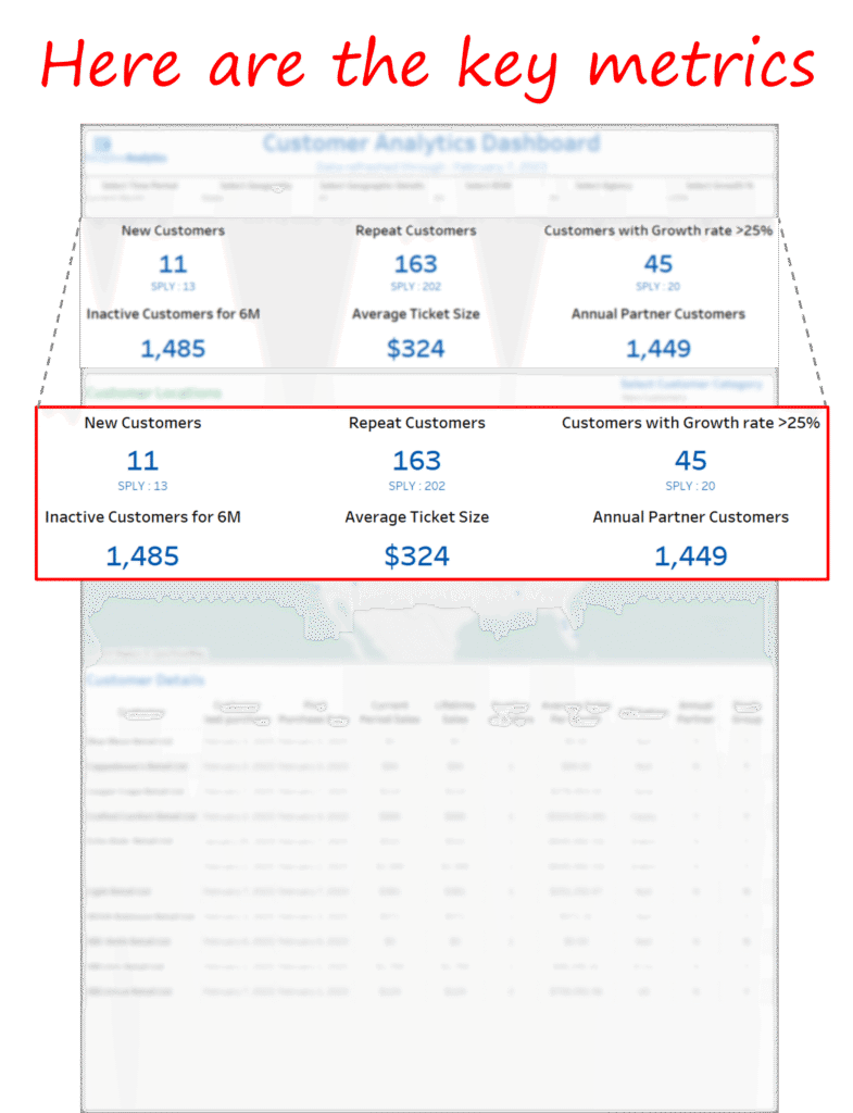
Key Features of the Dashboard
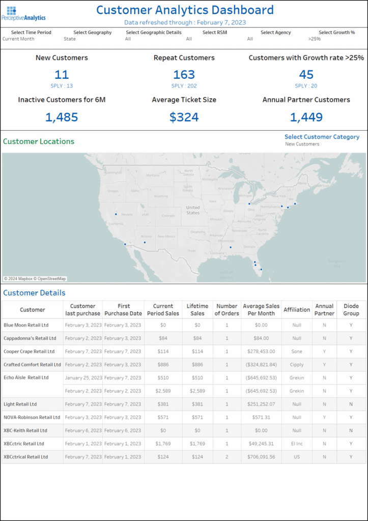
The dashboard was developed using Tableau and designed for daily use by sales reps, account managers, and regional leaders. It’s structured around clear, intuitive features that directly serve real business tasks.
Each of these features was intentionally designed to support one or more of the four core business objectives- segmenting customers, analyzing behavior, targeting high-value accounts, and identifying growth opportunities.
Here’s how each feature helped the client gain a competitive edge:
1. Customer Segmentation Panel
What it did:
This section of the dashboard allowed users to instantly view and explore customer segments, like high-growth customers, repeat buyers, and inactive accounts.
Why it helped:
Instead of creating manual filters or combing through rows of data, users could now view meaningful groups with one click.
Business impact:
- Sales reps focused their outreach on the most valuable segments
- Strategy teams used the breakdowns for campaign planning.
Customer lifecycle tracking became faster and more accurate, with clear visibility into when customers shifted from active to dormant status, enabling timely re-engagement before accounts went cold.
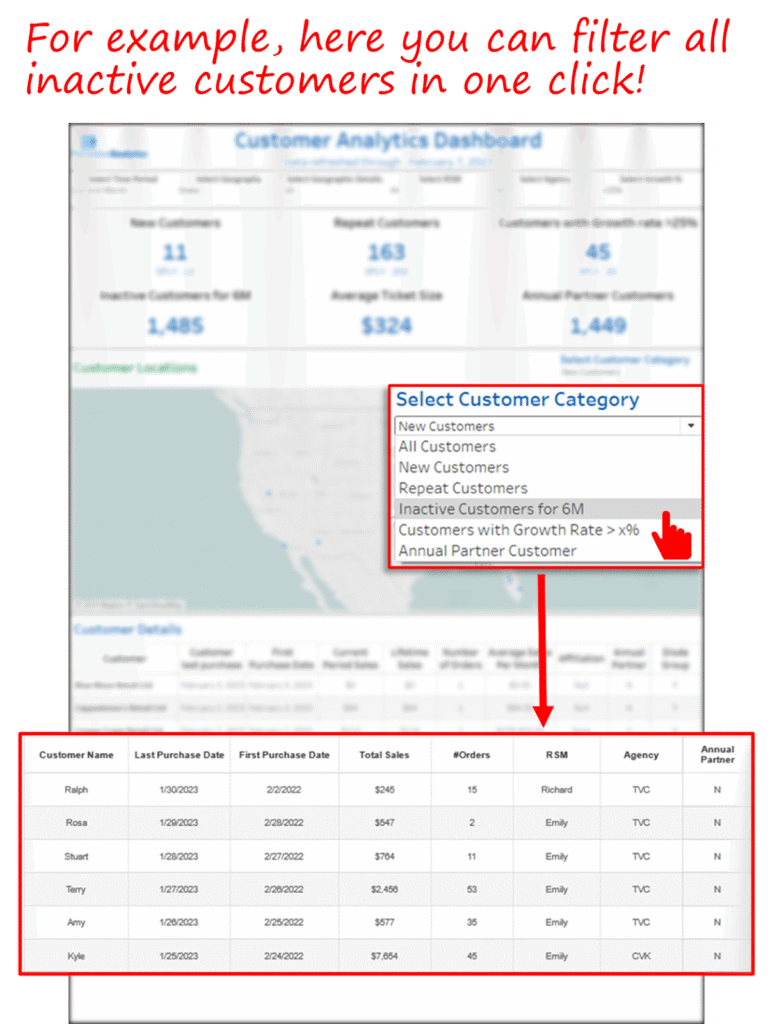
2. One-Click Filters for Inactive and High-Growth Customers
What it did:
The dashboard offered predefined filters, like “Inactive Customers” or “High-Growth Customers,” available as single-click toggles. These segments could instantly surface across all views.
Why it helped:
Previously, identifying dormant or high-growth accounts required 2–3 hours per week of manual work per rep, extracting data, cleaning lists, and applying filters in Excel. With the dashboard, these lists could be generated in under a minute, allowing reps to act faster and more frequently.
Business impact:
- Re-engagement campaigns targeted the right accounts
- High-growth customers were prioritized for account development.
- Team time spent on analysis dropped dramatically.
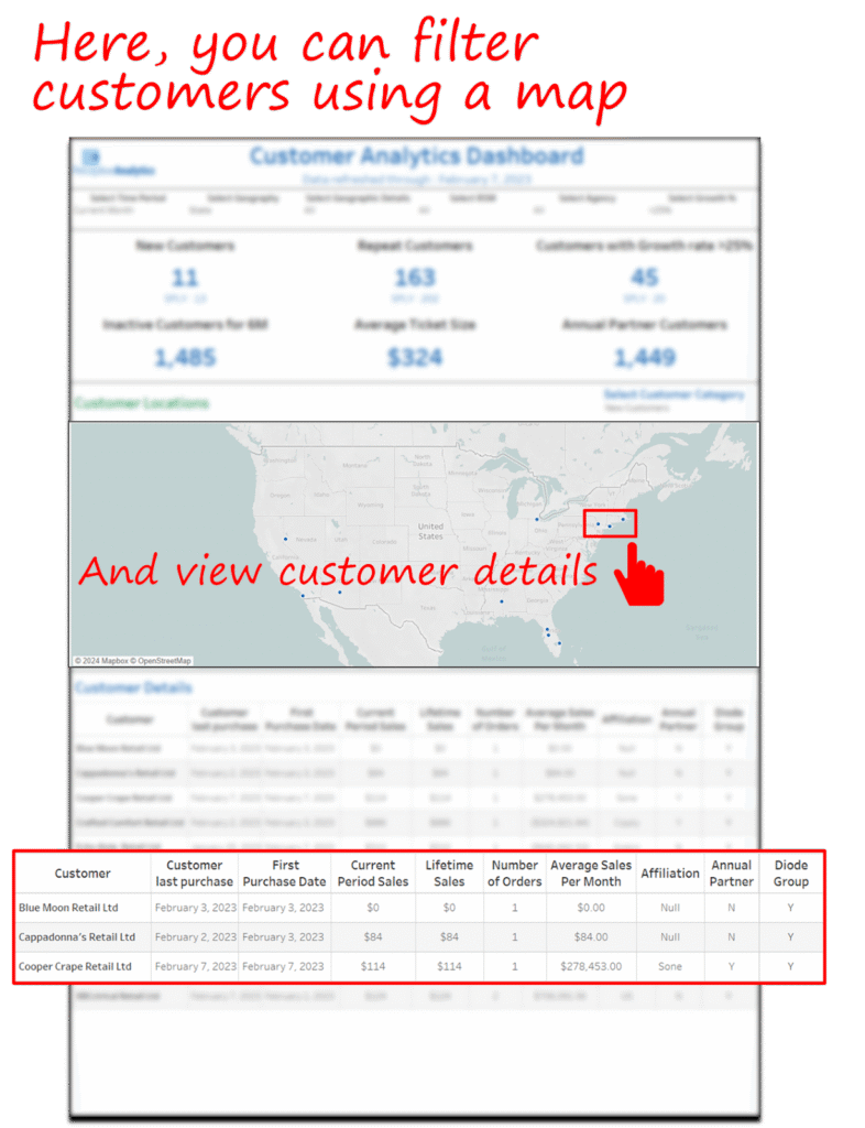
3. Map-Based Geographic Filtering
What it did:
An interactive map allowed users to drill down by state or region and view customer trends specific to that geography. All views – segment counts, purchase behavior, and trends are updated automatically based on region selection.
Why it helped:
Sales leaders often work with regional teams. This feature allowed them to quickly assess performance in their area and make decisions based on local behavior.
Business impact:
- Regional sales strategies became data-driven
- Territory gaps and regional strengths were visualized, for instance, sales leaders identified a cluster of high-growth customers in a mid-tier region that had previously received minimal attention, leading to a reallocation of sales resources and increased outreach in that area.
Local teams received better insights without analyst support.
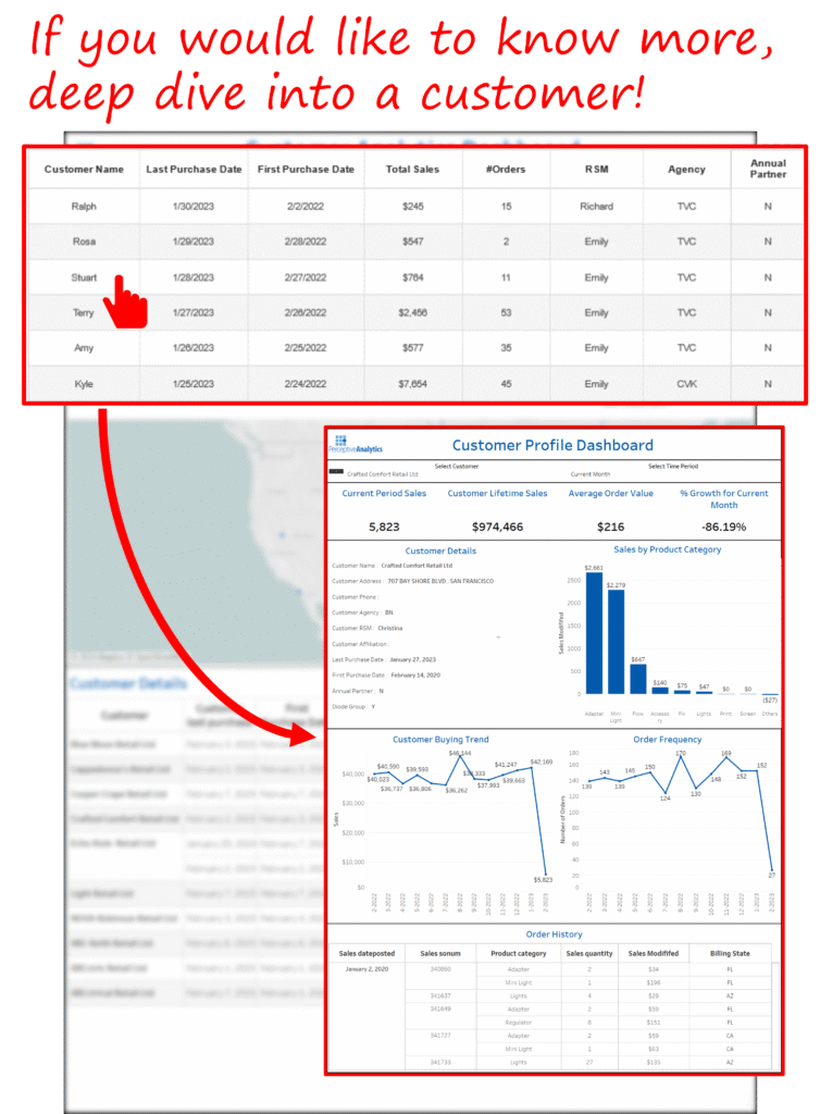
4. Deep Dive Customer View
What it did:
Users could click on any customer to bring up a full profile, including their purchase history, behavior pattern, current segment, and recent activity.
Why it helped:
Sales reps needed complete information before making outreach. Previously, they had to gather this from multiple systems. Now, they had a 360-degree view in seconds.
Business impact:
- Stronger, more personalized client interactions
- Better account-level planning
- The Deep Dive Customer View reduced pre-call preparation time by 40–50%, giving relationship managers immediate access to purchase history, segment status, and recent activity all in one screen, instead of gathering data from multiple reports and systems.
Key Insights and Recommendations
Our work on this engagement reinforced some valuable lessons for organizations pursuing customer analytics:
- Start with Decisions, Not Dashboards
The most successful analytics projects begin by identifying decisions that need to be supported, not by showcasing what data is available. In this case, one of the earliest priorities was helping sales leaders decide which inactive accounts to target each quarter. That single decision guided how we structured filters, segmented customers by last activity date, and prioritized visibility of dormant accounts in the dashboard.
- Segment Visibility Drives Action
Providing real-time access to meaningful customer segments made it easier for teams to act. For example, when high-growth customers were made visible through a one-click filter, regional sales leads began using those lists to plan account expansion and resource allocation, something that previously required time-consuming Excel analysis.
- Visual Simplicity Encourages Use
Well-designed dashboards don’t overwhelm users. A clean, minimalist approach with clear actions leads to higher engagement. In this project, the use of six focused views within a single dropdown menu allowed users to navigate different insights without jumping between dashboards, resulting in faster adoption and more consistent use during weekly sales planning.
- Enablement Is Critical
The rollout isn’t complete when the dashboard is live. Training sessions, documentation, and usability testing play a huge role in driving adoption. For this engagement, we conducted a 2-hour live onboarding session for regional teams, provided quick-reference guides, and gathered early user feedback to improve usability, ensuring the tool became a daily habit, not just a launch event.
- Measure the Impact of Analytics
From reactivation rates to time saved, it’s essential to track how analytics tools contribute to actual business outcomes. In this case, the client reported a 12% increase in repeat sales, reactivation of over 300 dormant accounts, and a 70% reduction in manual reporting time, clear evidence that the dashboard delivered tangible value.
Our Approach
Our solution was designed not just to answer today’s questions, but to scale for tomorrow’s needs. Here’s how we approached it:
- Discovery and KPI Alignment
Before jumping into design or development, we invested time in understanding the client’s needs. These sessions helped align the broader business strategy with analytics goals.
We worked closely with regional sales leaders, national account managers, and the BI team to understand:
- How accounts were currently prioritized
- Where sales teams were spending the most time
- What reports were used to evaluate performance
- Where they felt blind spots existed
These sessions highlighted several recurring pain points:
- Sales teams struggled to identify which customers to focus on
- Inactive customers were difficult to track without manual work.
- Reporting was fragmented and time-consuming.
- No single source existed for segment-level visibility or geographic analysis.
Based on these inputs, we defined a focused list of dashboard capabilities, ensuring every feature aligned with a real business need.
- Data Preparation and Integration
With goals defined, we turned to the data infrastructure.
The client’s sales data was distributed across several systems, each with its own structure and standards. Order history was stored in the ERP, customer contact and territory data lived in the CRM, and incentive programs were tracked separately.
Our team:
- Extracted and merged data from multiple systems using SQL
- Standardized naming and categorization, resolving mismatches such as inconsistent customer IDs, regional naming variations, and duplicated account entries across systems
- Created derived fields such as activity status, customer segment, and order frequency to support dashboard logic
- Validated historical data across a 12-month window, ensuring accuracy in trends and comparisons
How we validated:
- Cross-checked key metrics (e.g., monthly sales, active customers) against existing internal reports to ensure consistency
- Performed reconciliation tests across systems to confirm totals matched at both summary and detail levels
- Flagged and resolved missing data or outliers, such as negative values or abnormal gaps in customer activity
- Reviewed random samples of transformed data with business stakeholders to confirm accuracy and alignment with expectations
We also implemented dynamic date filters and lifecycle flags (e.g., active, dormant, newly reactivated) to track customer movement over time and enable time-based segmentation within the dashboard.
- Dashboard Design and Development
Designing for adoption was a top priority. Many dashboards fail because they’re built for analysts, not business users.
Our Tableau dashboard prioritized clarity, interactivity, and speed:
- Testing and Iteration
Once the first version was live, we initiated a three-week review period with a small group of regional sales leads. Their feedback helped refine the solution.
Conclusion
This project demonstrates the tangible value of embedding customer intelligence into daily decision-making. With a clear view of customer activity and a powerful segmentation engine, the client moved from reactive to proactive sales management, reclaiming lost revenue and building stronger customer relationships.
In a world where data is abundant but insight is rare, organizations that invest in clarity, alignment, and actionability will be best positioned for growth.
In this case, analytics drove a 12% increase in repeat sales, reactivated over 300 dormant accounts, and reduced reporting time by 70%, proving that the right visibility can unlock measurable business outcomes.
Each month, we curate the latest updates, insights, and trends for senior leaders in data analytics and AI in our CXO Analytics Newsletter.
Our mission is “to enable businesses to unlock value in data.” For over 20 years, we’ve partnered with more than 100 clients—from Fortune 500 companies to mid-sized firms—to solve complex data analytics challenges. Our services include Advanced Analytics Consulting, Generative AI Consulting, and Business Intelligence (Tableau Consultants, Power BI Consultants and Looker Consultants) turning data into strategic insight. We would love to talk to you. Do reach out to us for a free consultation.
Our Work
Industry
- Industry
Function
- Function
-
Increasing Conversions with Adwords Spend Optimizer
How To Optimize Adwords Budget in Real Time
Free Download
-
Markdown Optimization for Retailers
A Methodology to Track Performance and Maximize Value
Free Download
-
Optimizing Marketing Spend with Marketing Mix Modeling
Using Statistical Modeling and Empirical Methods
Free Download
-
Leveraging Web Analytics for Customer Acquisition
Leveraging Web Analytics for Customer Acquisition
Free Download
*Subscribe to be the first one to know our latest updates
Contact us

You have crafted a powerful analytical tool for us. Thank you.
Alan Benjamin
Principal, Benjamin Realty Advisors

I have been working with Chaitanya and Perceptive Analytics for about 20 months now. They did BI / reporting and excel tool development. Their work helped us in channeling our periodic reports to the senior and operational management. The team exceeded my expectations. Chaitanya would ask thought provoking questions that trigger a new line of thinking. They created good dashboards so our senior team can quickly interpret reports. We were able to make progress because the team knew finance and tools they created were easy to implement.
Samir Lavani
CFO at Pearl Hospitality

Chaitanya and the Perceptive Analytics team worked on multiple strategic projects that involved Tableau data visualizations. Perceptive's work (~ 1 year) led to successful launch of our portal - this was an important milestone for us. Visualizations created were insightful, easy to understand and visually attractive. The team often suggested ways to show data in more intuitive way so our audience can understand it. They also knew Tableau well that helped in customizing it for our purposes. The team worked hard to finish the project on time managing expectations. I look forward to working with Perceptive on other projects.
Haroon Yaqoob
Principal at Nomenclature Inc.