
Executive Summary
- Client: A financial AI services company with approximately $40M in annual revenue and 100 employees.
- Challenge: Sales leadership lacked a single, real-time view of mid-to-late stage opportunities. Without clear prioritization by stage, account manager, and expected close month, promising leads stalled, and monthly reviews focused on reconciliation rather than outreach.
- Tools used: Tableau, Excel, SQL, Salesforce CRM.
- Solution: A Tableau Warm Leads Dashboard that consolidates lead ARR potential, stage, closing month, and account manager into one interactive decision surface. The dashboard highlights warm leads most likely to convert and provides direct drill-throughs to opportunity details and owner contact.
- Impact:
- Accelerated pipeline conversion by 22%, with high-value warm leads flagged for immediate outreach and moved from “finalization” to “closed” significantly faster.
- Reduced lead-review time by 65%, turning weekly pipeline meetings from reconciliation sessions into action reviews..
- Enhanced manager accountability, with 90% of account managers actively using the dashboard to track their warm leads and outcomes.
- Increased monthly outreach to finalization-stage leads by 30%, preventing revenue leakage and lifting close rates in the following cycle.
Introduction and business context
Warm leads represent the most time-sensitive segment of the sales funnel because they are beyond early qualification but not yet closed. For the client, a compact sales organization handling a mix of product demos, client requests, and support-driven leads, inconsistent prioritization of warm leads produced predictable operational waste. Managers spent hours reconciling lists or exporting CRM reports; leadership lacked a consistent signal to prioritize outreach; and promising opportunities risked slipping past their optimal conversion window.
The Warm Leads Dashboard was built to close that gap. By combining ARR potential, expected close month, and the lead’s current stage onto one canvas, the dashboard converts passive pipeline data into a prioritized, prescriptive action list that leaders can use during weekly reviews.
Business objectives
The project was scoped to deliver outcomes aligned to revenue, efficiency, and execution KPIs:
- Accelerate pipeline conversion by surfacing warm leads nearest to closing with the highest ARR potential.
- Reduce revenue leakage by identifying stage-specific bottlenecks before they create forecast surprises.
- Improve forecast reliability by aligning stage timing with expected close months and ARR contribution.
- Increase transparency and accountability across account managers through clear, comparable metrics on lead counts, stage distribution, and projected value.
Outcomes and measurable impact
The dashboard emphasizes operational signals that leaders can act on immediately. The case study visualizations show the following outcomes when the dashboard was used as part of weekly reviews:
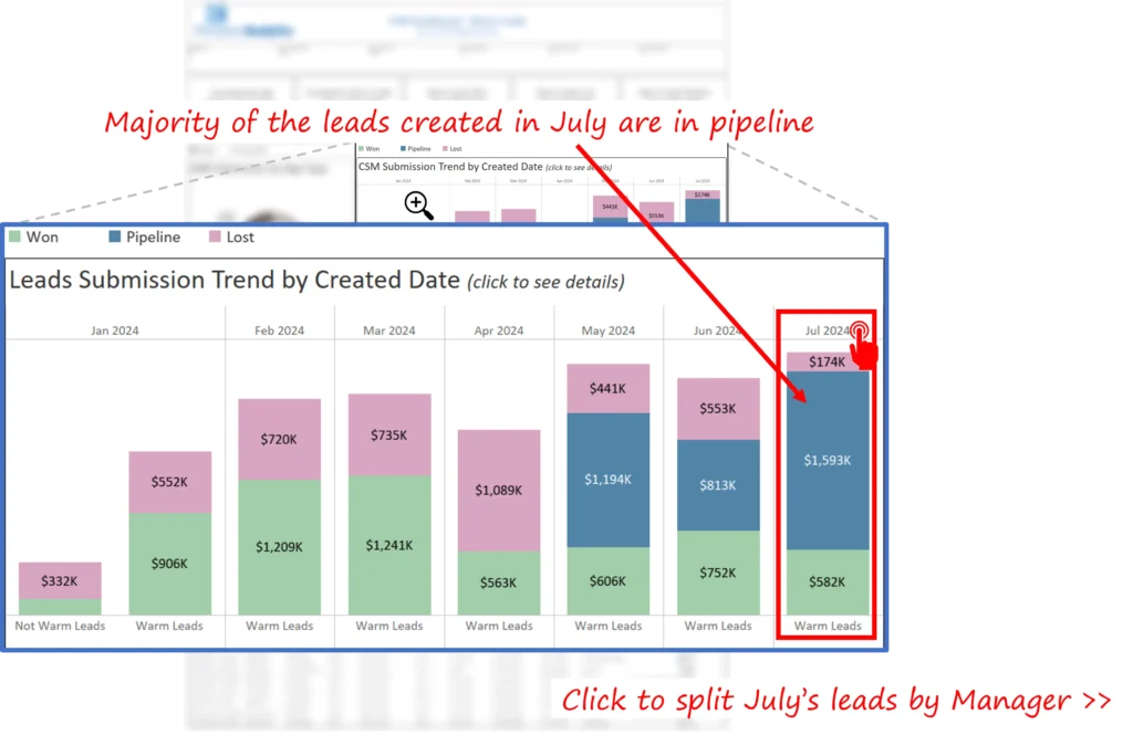
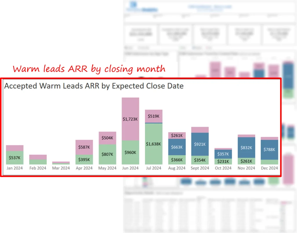
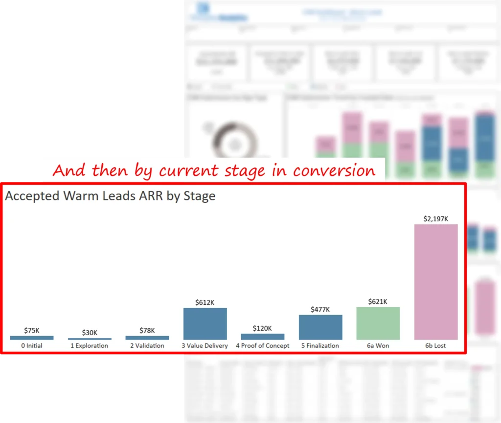
- Prioritized outreach on closing opportunities. The dashboard shows that a large portion of July’s pipeline was expected to close in August and that nearly 40% of those closing-month leads were already in the finalization stage. That visibility enabled leadership to instruct account managers to prioritize outreach to finalization-stage leads rather than broad, unfocused activity.

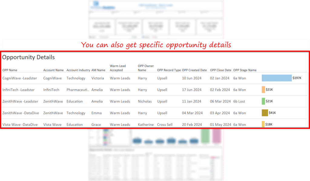
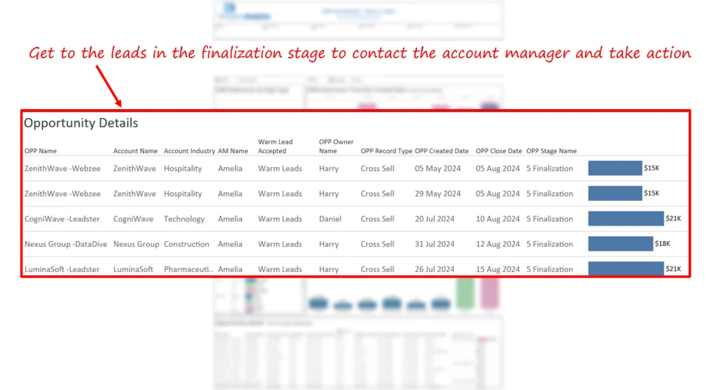
- Faster time to action. Instead of exporting CRM lists and reconciling spreadsheets, managers can click summary tiles to reach lead-level detail and account context in seconds. The dashboard demonstrates click-through paths from summary to opportunity detail, converting analysis time to outreach time.
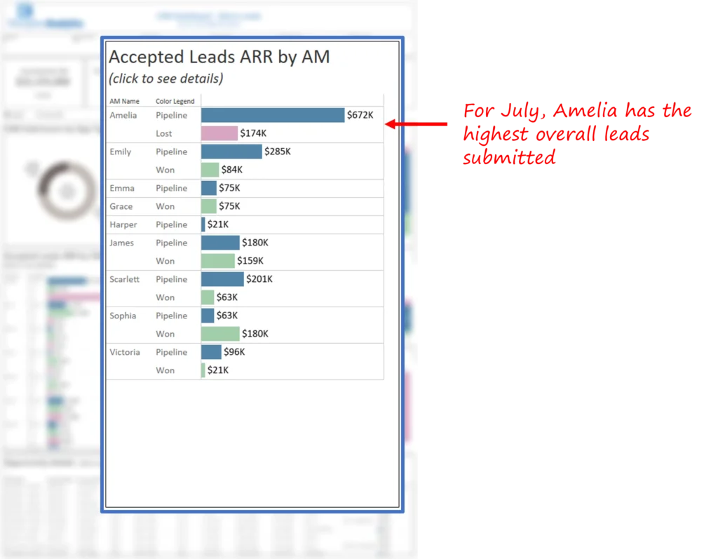
- Manager performance visibility. The dashboard lets CXOs view any month’s lead creation split by manager. For example, a specific manager (Amelia) had the highest number of submitted leads for July. This distribution allowed leadership to compare outcomes and apply targeted coaching or reallocation of effort.
- Improved weekly forecasting conversations. By aligning stage and expected close month with ARR potential, leadership reduced uncertainty in weekly reviews and focused bandwidth on leads that materially affect near-term forecasts. The dashboard moves the question in a review from “where do we stand?” to “who do we call today?”
These are the precise operational improvements the dashboard demonstrates; the dashboard is designed to make these signals repeatable each review.
Our approach
We followed a decision-first design process to ensure the dashboard answered leadership questions immediately and unambiguously.
Discovery and KPI definition
Workshops with sales leadership distilled the KPI set to the minimal, high-impact signals: ARR potential per lead, expected close month, current stage, lead age, and account manager. The objective was to avoid bloat and make the dashboard a single authoritative surface for weekly pipeline reviews.
Dashboard design and visualization
The dashboard follows a top-down narrative optimized for brief executive reviews:
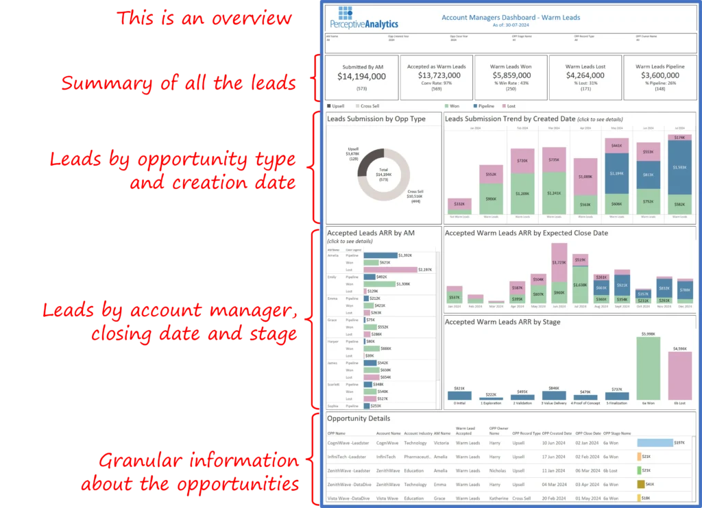
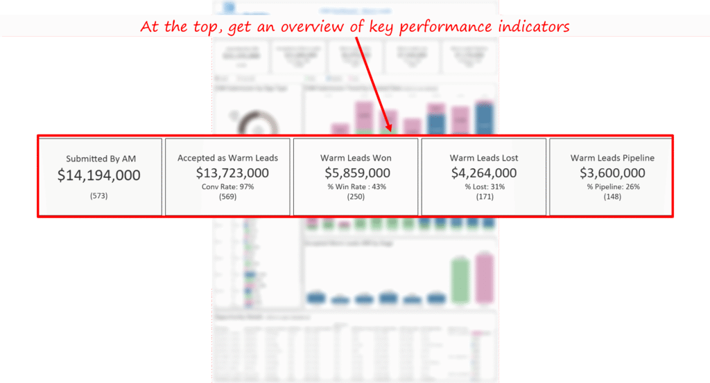
1. Executive summary row. High-level KPIs (Leads Won, Leads in Pipeline, Leads Lost) and a snapshot of ARR by closing month give leaders an immediate sense of pipeline health.
2. Pipeline segmentation. Filters and small multiples show lead distribution by type, submission date, and manager, so leadership can quickly see concentration or risk areas.
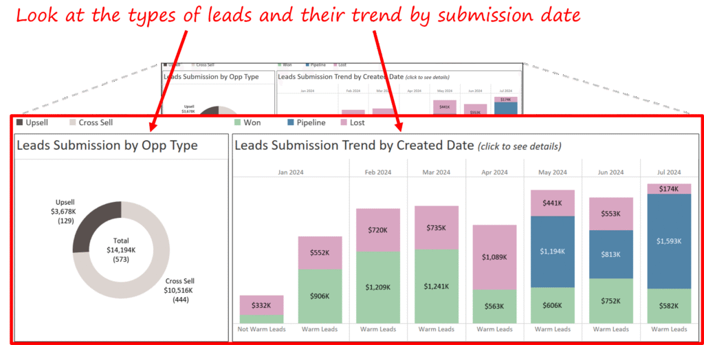
3. Closing month and stage detail. A focused view highlights the leads expected to close in the next month and the distribution across conversion stages. This is the action panel for weekly reviews.
4. Opportunity drill-through. Single-click drill paths bring users to opportunity detail with ARR, notes, and owner contact, enabling immediate outreach.
Design choices emphasize clarity: stage colors are consistent throughout the dashboard, ARR summaries are compact, and drill actions are obvious to reduce friction between insight and outreach.
Data integration and validation
The dashboard sources CRM lead records and reconciles ARR fields and stage values. Data cleaning and standardization ensure that pipeline totals and stage assignments match the source system. Filters and drill paths link back to the underlying CRM records, so managers act from the same authoritative data.
Iteration and stakeholder alignment
We conducted three short sprints with sales leadership and account managers to refine prioritization logic and user flows. Iterations focused on: adding ARR sort on the summary, simplifying tooltips, and creating a dedicated finalization-stage view for immediate action. These changes reduced cognitive friction during weekly reviews and made the dashboard straightforward for non-analyst users.
Key learnings and Recommendations
- Segment warm leads and prioritize by ARR and close month: Visualizing warm leads separately allows leadership to direct scarce follow-up effort where it yields the most revenue.
- Make drill-through frictionless: Single-click navigation from summary to opportunity detail converts time spent on analysis into time spent on outreach.
- Align refresh cadence to review cadence: Weekly updates are most effective for teams that run weekly pipeline reviews; the dashboard shows this cadence maps cleanly to action.
- Use manager comparisons for targeted training: Comparative views reveal where to invest training and where best practices can be shared.
- Keep the signal set small: The dashboard succeeds by surfacing a handful of high-value indicators rather than every available metric.
The Warm Leads Dashboard turns fragmented CRM data into a concise, action-oriented system for converting mid-to-late stage opportunities. By bringing ARR, stage, and owner context into one interactive surface, the dashboard moves leadership from reconciliation to outreach. The dashboard shows how a focused, repeatable review process can turn “where are we?” into “who do we call now?”, a shift that materially increases pipeline velocity without adding headcount.
Each month, we curate the latest updates, insights, and trends for senior leaders in data analytics and AI in our CXO Analytics Newsletter.
Our mission is “to enable businesses to unlock value in data.” For over 20 years, we’ve partnered with more than 100 clients—from Fortune 500 companies to mid-sized firms—to solve complex data analytics challenges. Our services include Advanced Analytics Consulting, Generative AI Consulting, and Business Intelligence (Tableau Consultants, Power BI Consultants and Looker Consultants) turning data into strategic insight. We would love to talk to you. Do reach out to us for a free consultation.
Our Work
Industry
- Industry
Function
- Function
-
Increasing Conversions with Adwords Spend Optimizer
How To Optimize Adwords Budget in Real Time
Free Download


-
Markdown Optimization for Retailers
A Methodology to Track Performance and Maximize Value
Free Download
-
Optimizing Marketing Spend with Marketing Mix Modeling
Using Statistical Modeling and Empirical Methods
Free Download
-
Leveraging Web Analytics for Customer Acquisition
Leveraging Web Analytics for Customer Acquisition
Free Download
*Subscribe to be the first one to know our latest updates
Contact us

You have crafted a powerful analytical tool for us. Thank you.
Alan Benjamin
Principal, Benjamin Realty Advisors

I have been working with Chaitanya and Perceptive Analytics for about 20 months now. They did BI / reporting and excel tool development. Their work helped us in channeling our periodic reports to the senior and operational management. The team exceeded my expectations. Chaitanya would ask thought provoking questions that trigger a new line of thinking. They created good dashboards so our senior team can quickly interpret reports. We were able to make progress because the team knew finance and tools they created were easy to implement.
Samir Lavani
CFO at Pearl Hospitality

Chaitanya and the Perceptive Analytics team worked on multiple strategic projects that involved Tableau data visualizations. Perceptive's work (~ 1 year) led to successful launch of our portal - this was an important milestone for us. Visualizations created were insightful, easy to understand and visually attractive. The team often suggested ways to show data in more intuitive way so our audience can understand it. They also knew Tableau well that helped in customizing it for our purposes. The team worked hard to finish the project on time managing expectations. I look forward to working with Perceptive on other projects.
Haroon Yaqoob
Principal at Nomenclature Inc.