


If you’re building or improving sales dashboards, this collection is a solid place to start. We’ve handpicked 10 of the most effective dashboards from Tableau Public and the Power BI Gallery — the ones that truly stand out in practice. And instead of just showcasing what’s out there, we’ve added something more valuable: our perspective.
- What’s good in this dashboard — what we believe is working well in the dashboard
- How to sharpen it further — our take on what could make it even more effective and action-driven
Whether you’re leading a sales team or reviewing performance from the C-suite, this breakdown of top sales dashboards will help you cut through the clutter and focus on what really drives revenue. You’ll get practical takeaways you can put to work right away, whether that’s in building dashboards or using them to guide sales conversations.
To make it easy to scan, we’ve started with a quick summary table of the 10 dashboards and their key takeaways. After that, you’ll find the detailed breakdown of what’s working best and where each one could improve.
| No. | Dashboard | Key takeaway — why this matters for sales leaders |
| 1. | Sales Pipeline Dashboard | Helps you instantly spot stalled high-value deals, so they don’t slip through the cracks |
| 2. | Sales Forecast Dashboard | Gives an early read on whether you’ll hit quota and show how the forecast shifts quarter by quarter |
| 3. | Sales Funnel Dashboard | Reveals exactly where deals are dropping off in the funnel, so you can plug the leaks and improve conversions |
| 4. | Sales Team Performance Dashboard | Makes it clear which reps and channels are really driving results, perfect for coaching and resource allocation |
| 5. | Sales Summary Dashboard | Shows if you’re pacing toward quota this quarter and what’s actually driving or dragging performance |
| 6. | Sales Executive Dashboard | Rolls up sales into a boardroom-ready view, making it easy for execs to track progress against targets |
| 7. | Sales Lead Tracker Dashboard | Surfaces which accounts and contacts are truly engaged, so reps know where to focus right now |
| 8. | CRM Dashboard | Provides a clear indication of deal volume, size, and stage progression, allowing you to pinpoint the true source of growth |
| 9. | Product Performance Dashboard | Highlights top and bottom products at a glance, helping you double down on winners and cut losses fast |
| 10. | Sales Territory Dashboard | Puts territory health in context by showing current spend vs pipeline making it clear where to invest or intervene |
The table was the quick scan. Let’s now take our time and analyze each dashboard to see what is working well and what could be improved.
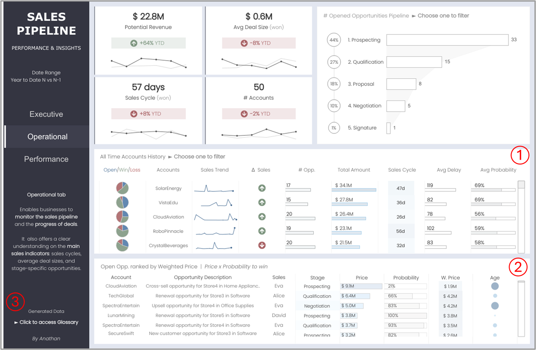
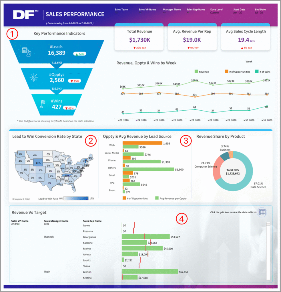
1. Sales Pipeline Dashboard 🔗Tableau Public
Sales teams uses this dashboard to track pipeline health, deal progress, and account-level momentum across the lead stages
What’s good in this dashboard:
① It highlights top accounts by revenue potential, along with sales cycle lengths and delays—super helpful when prioritizing follow-ups
② You can quickly spot whether reps are sitting on deals too long or pushing things forward efficiently
③ The access to the glossary helps users understand the metrics in context, reducing confusion and ensuring consistent interpretation across the team
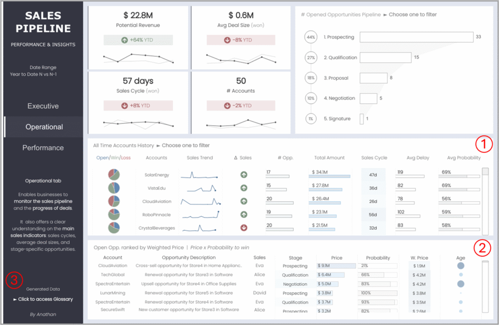
To sharpen it further:
- Adding risk alerts like “stalled high-value deals” or “overdue close dates” could shift this dashboard from passive tracking towards proactive decision-making
- A simple “days since last activity” flag could help catch stalled deals before they go cold
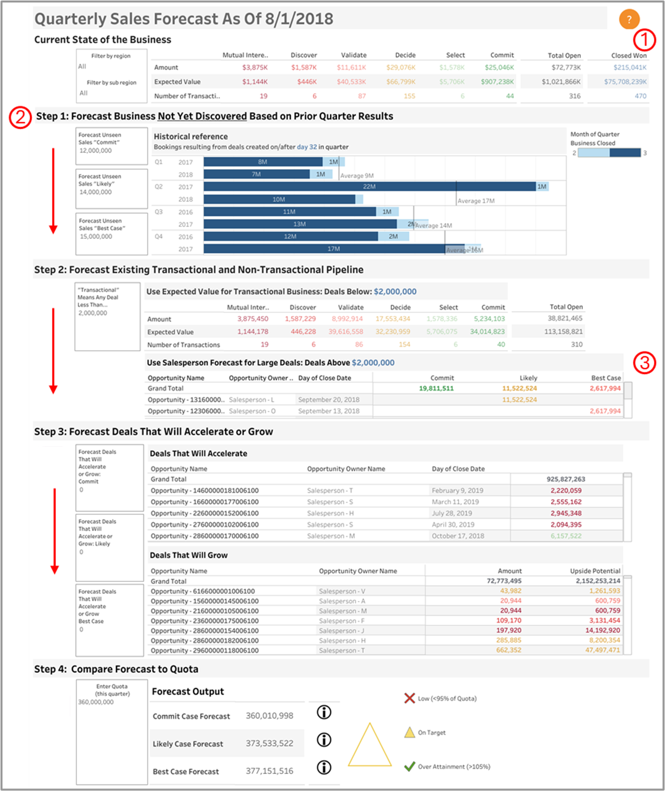
2. Sales Forecast Dashboard 🔗Tableau Public
Sales teams use this dashboard to forecast their performance and improve their understanding of whether they will hit quota.
What’s good in this dashboard:
① Wondering if your team is going to hit quota? This dashboard gives you a pretty good idea early on
② The dashboard is divided into 4 clear steps (Forecast Not Yet Discovered → Existing Pipeline → Deals That Accelerate/Grow → Compare to Quota). This guided flow is excellent for sales teams because it mirrors the sales forecasting thought process, reducing cognitive load
③ Highlighting “large deals” separately enables leadership to focus on high-impact opportunities that may need special attention
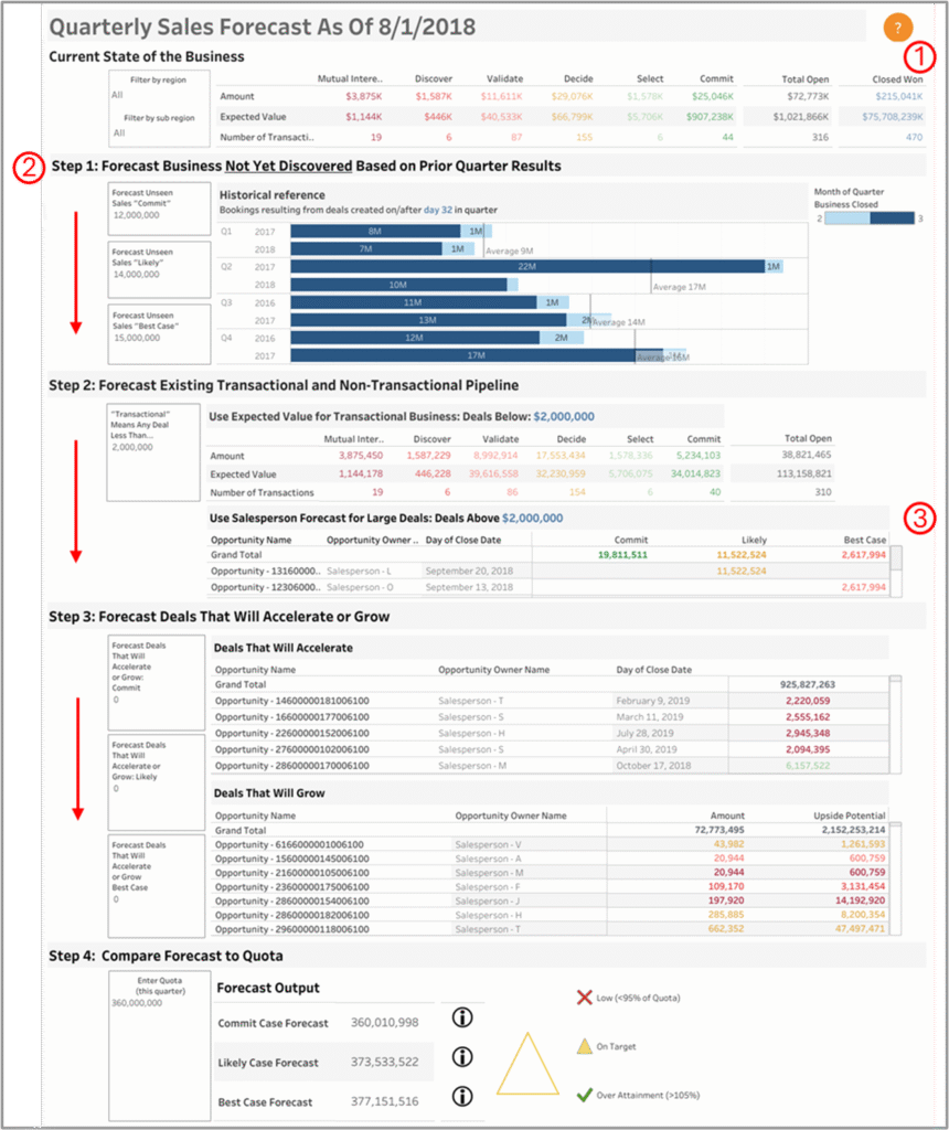
To sharpen it further:
- Add a monthly trend tooltip in the Current state of business visual, so users can track the full-quarter forecast while also seeing how Commit, Likely, and Best Case numbers are shifting month by month
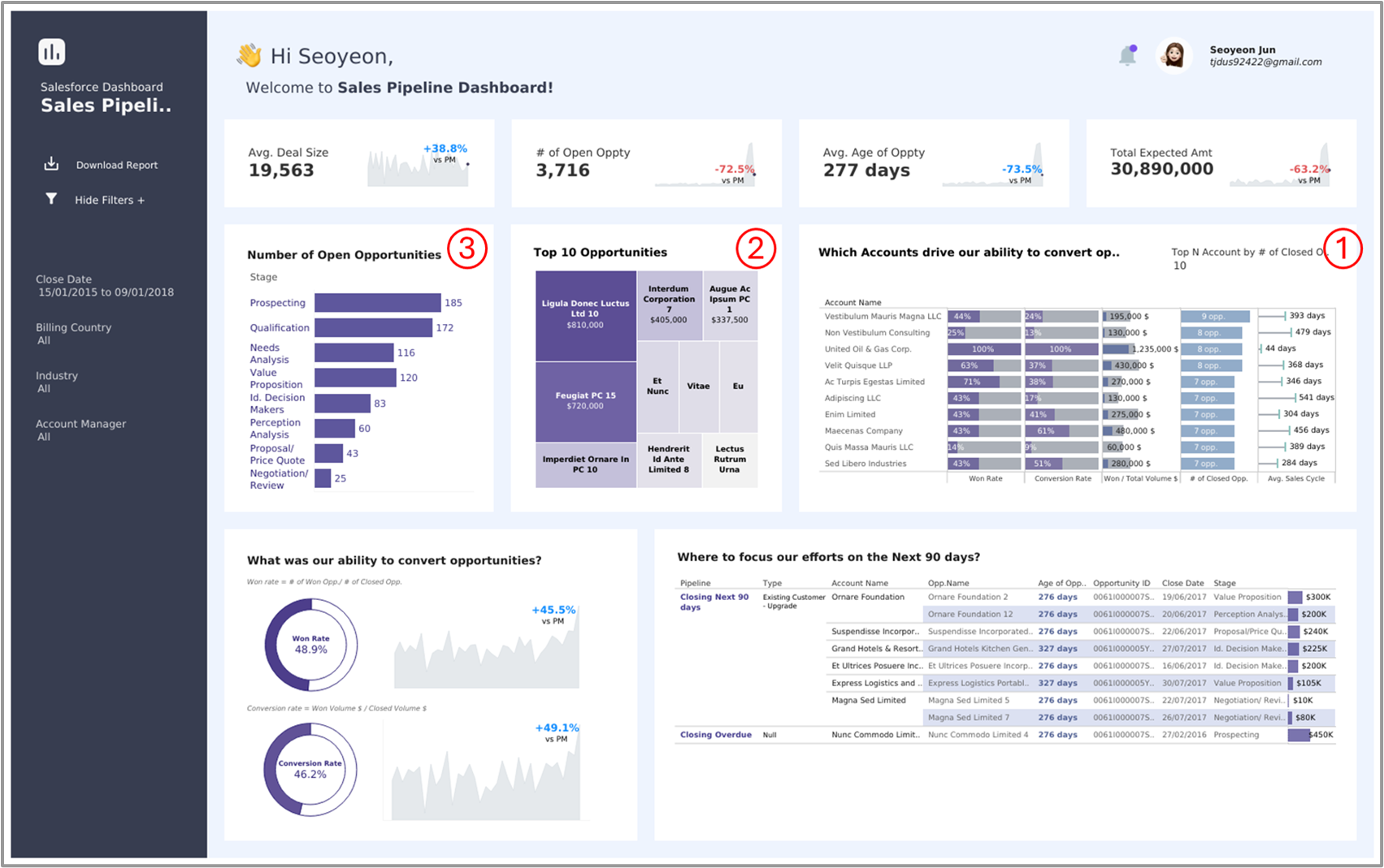
3. Sales Funnel Dashboard 🔗Tableau Public
Sales managers and revenue teams utilize this dashboard to track funnel movement, identify drop-offs, and enhance lead-to-deal conversions.
What’s good in this dashboard:
① The “Which Accounts drive our ability to convert opportunities” section is highly effective for focusing sales strategy, as it connects conversion rates, deal value, and sales cycle length directly to specific accounts
② The dashboard feels well put together. The visuals are clear, the layout makes everything easy to scan, and the color choices guide your attention without being distracting. For example, the “Top 10 Opportunities” section, with its heatmap-style layout, is a smart shift from the usual table — it helps users spot high-value deals quickly, which is super helpful in fast-paced review meetings
③ The bar chart for “Number of Open Opportunities” by stage offers clear visibility into pipeline health. It helps sales managers identify potential bottlenecks (e.g., high volume in early stages like “Prospecting” but low progression to later stages)
To sharpen it further:
- It’s great that we can see how many deals are sitting in each stage, but we’re missing how much those deals are actually worth. If we had the value too, it’d be way easier to spot if something big is getting held up and needs a nudge
- We could apply conditional formatting to the 90-day pipeline section at the bottom right, like using red for overdue deals and orange for ones closing soon. It helps users instantly spot what needs urgent attention just by glancing at the visual
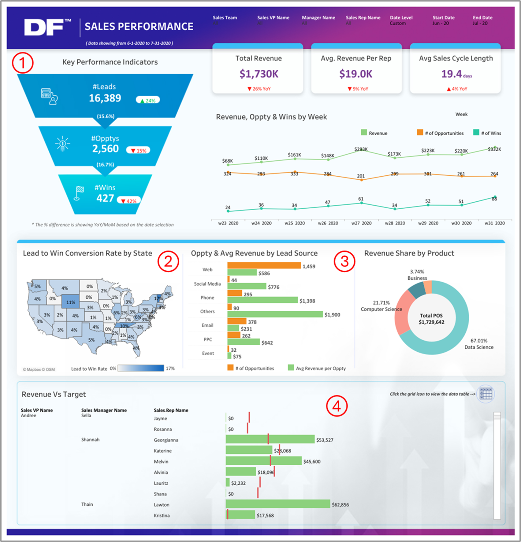
4. Sales Team Performance Dashboard 🔗Tableau Public
Sales managers use this dashboard to monitor rep performance, spot conversion gaps, and identify high-impact channels driving revenue
What’s good in this dashboard:
① The top section does a great job of highlighting key metrics without feeling cluttered. Showing YoY changes right next to the KPIs gives you instant context, and placing weekly trends for revenue, opportunities, and wins just below keeps things easy to track over time
② The map makes it super easy to spot where conversions are strong and where there’s room to grow. Instead of digging through a long list of states, regional sales leads can just glance at it and instantly see which areas are performing and which ones need more attention
③ Showing both the number of opportunities and the average revenue by source helps highlight which channels are pulling their weight. Like in this case, “Web” source brings in a lot of volume but not much value, while “Social media” source is the opposite—fewer opportunities, but much higher returns. It gives you a clear picture of where to double down to get better results ④ The bottom section helps pinpoint who’s hitting targets and who’s lagging. This is a direct conversation starter for managers during pipeline or performance reviews
To sharpen it further:
- Win rates by rep are missing, and adding them would give a much clearer view of who’s actually closing deals. Revenue on its own doesn’t tell you who’s consistently converting, and that’s a key piece of the puzzle
- Monthly trend tooltips on the KPIs would make them a lot more insightful. They’d help you quickly tell if a drop in leads, opportunities, or wins is just a one-time dip or part of a bigger pattern, so you can respond more effectively
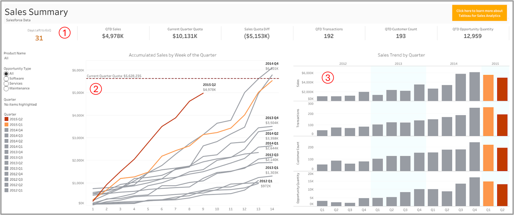
5. Sales Summary Dashboard 🔗Tableau Public
Sales teams use this dashboard to track performance against quota relative to prior quarters
What’s good in this dashboard:
① The line chart in the center helps track how we’re pacing this quarter. You can instantly see 2015 Q2 lagging just under the red quota line, which is a good cue to step things up
② That “31 days left to EoQ” callout does a nice job setting urgency without shouting. It’s the kind of subtle nudge that keeps reps aware of the clock
③ The vertical bars on the right are a great snapshot. You’re not just seeing sales trends — you also get transactions, customer count, and opportunity volume side-by-side. Makes it easy to spot if growth in one area isn’t matching the others
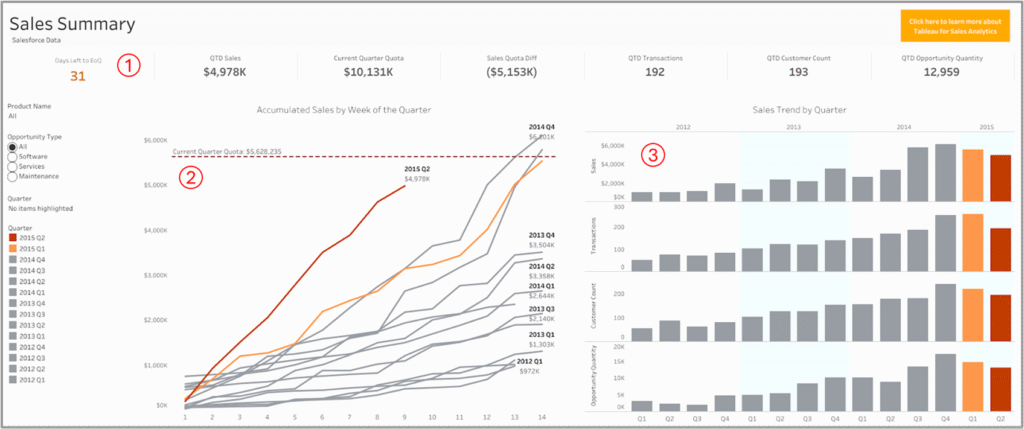
To sharpen it further:
- Right now, it’s hard to see which products are actually driving the sales. Even a simple breakdown by product would make it clear what’s performing well and what needs more attention
- Also, instead of showing just the dollar gap to quota, a “% to target” stat would make things faster to read. It’d save people from having to guess how far we actually are from the finish line
6. Sales Executive Dashboard 🔗Tableau Public
Executives use this dashboard to track overall sales performance, category trends, and regional contributions against annual targets
What’s good in this dashboard:
① The layout is well-balanced, with summary KPIs, time trends, category breakdowns, and regional views logically arranged, helping executives maintain context as they scan across performance dimensions
② The Sales vs. Target bar chart packs monthly performance, target comparison and variance labels in a tight space without overwhelming the viewer—super-efficient for executives who want the “what” and “how much” at a glance
③ The map and Top 5 States list complement each other nicely. Even though the map includes many states, key markets like California and New York still stand out clearly because of the ranking on the side
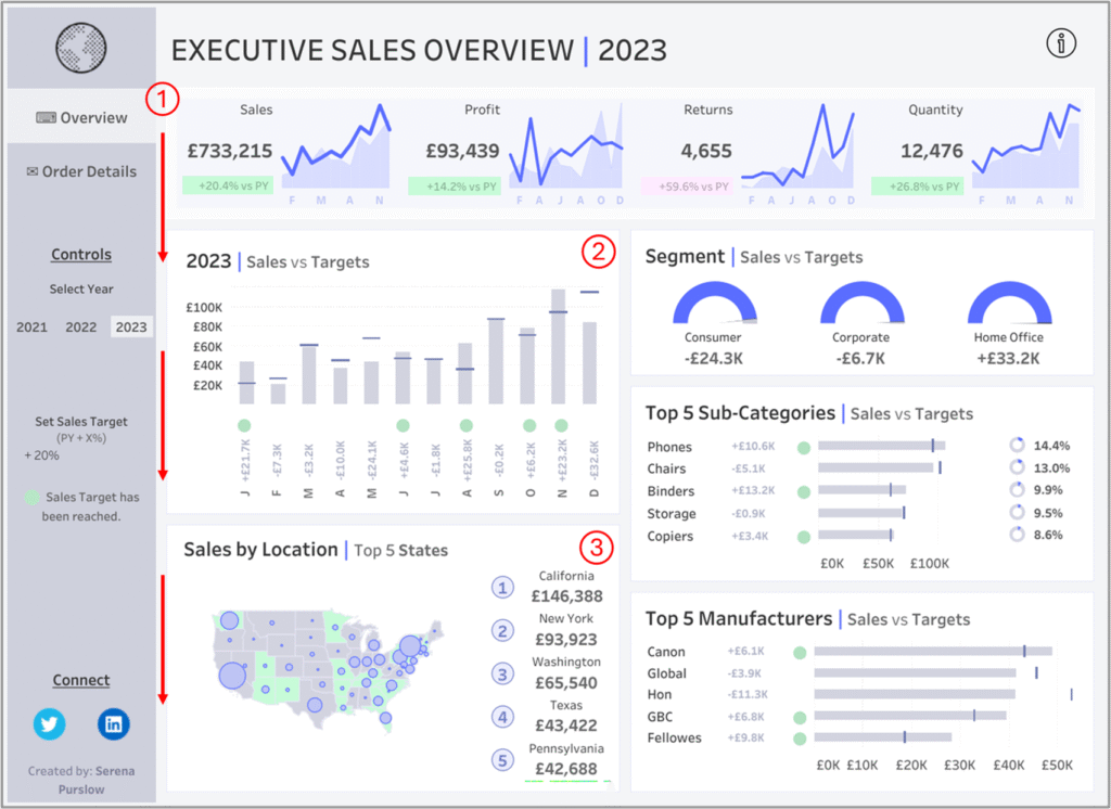
To sharpen it further:
- Add a tooltip to the Segment Sales vs. Target visual with monthly trends, giving executives instant context to see whether performance shifts are one-off or part of a recurring pattern
- Showing the % difference from the target for each segment would also make this section more actionable. Right now, it’s not immediately obvious how far each one is from where it should be
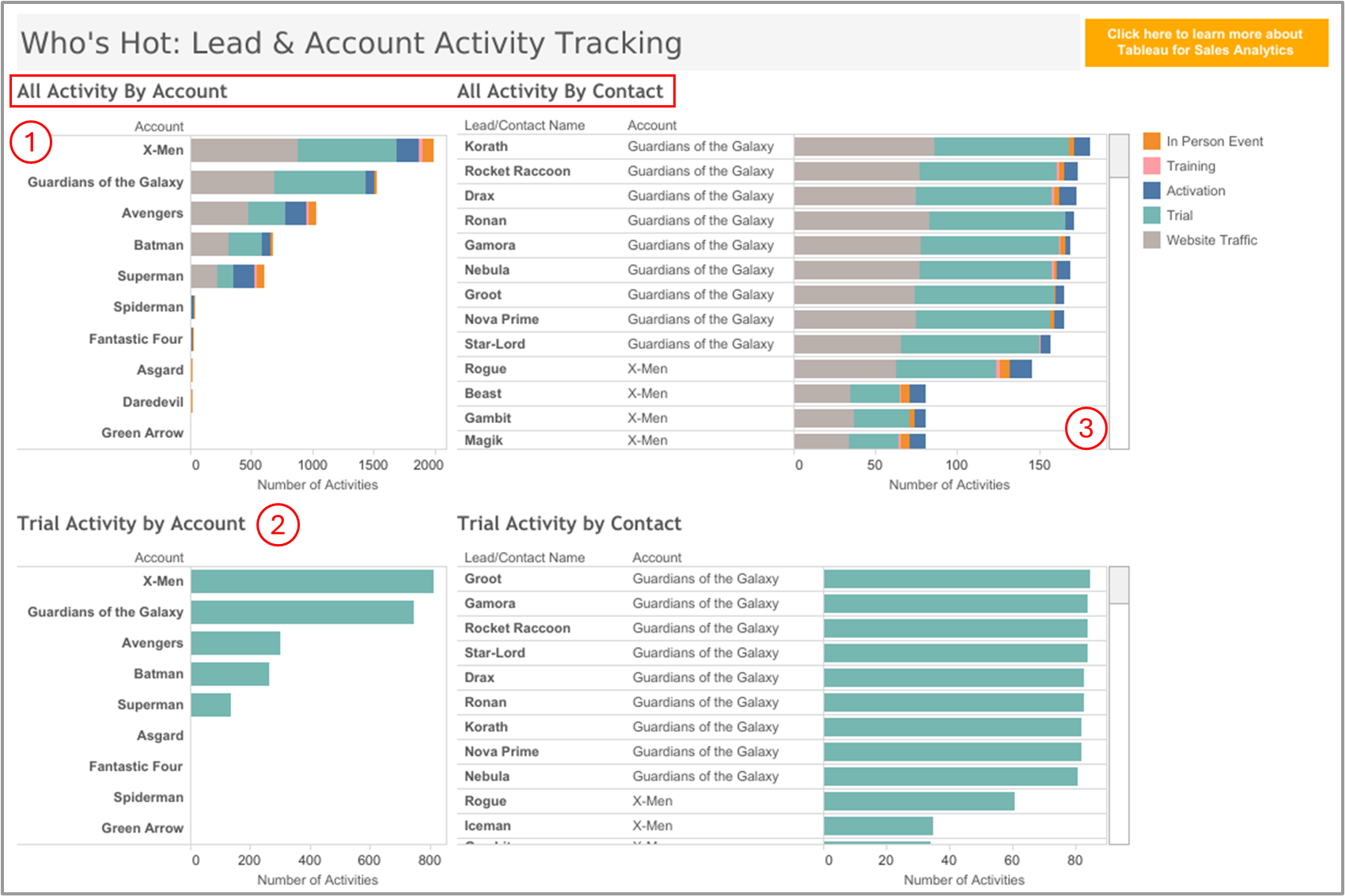
7. Sales Lead Tracker Dashboard 🔗Tableau Public
Sales team uses this dashboard to track lead and account engagement across channels and spot which contacts are most sales-ready
What’s good in this dashboard:
① The way it shows both account-level and contact-level activity works really well. You get the big picture and the people behind it, all in one place
② Separating trial activity from overall engagement is a smart move. It helps teams tell the difference between folks who are just browsing and those actually trying things out ③ Showing named contacts under each account is super useful. It makes it easier for sales to figure out who’s really leaning in and worth following up with
To sharpen it further:
- It would be really helpful to add a KPI for the trial-to-activation rate. That way, teams aren’t just looking at busy accounts but can actually see which ones are making real progress
- There’s no time element in the view. Even a simple “last 7 days” or “most recent touch” would help reps focus on who’s active right now.
- That contact list gets long fast. Adding a way to sort or just highlight top movers would make it way easier to act on
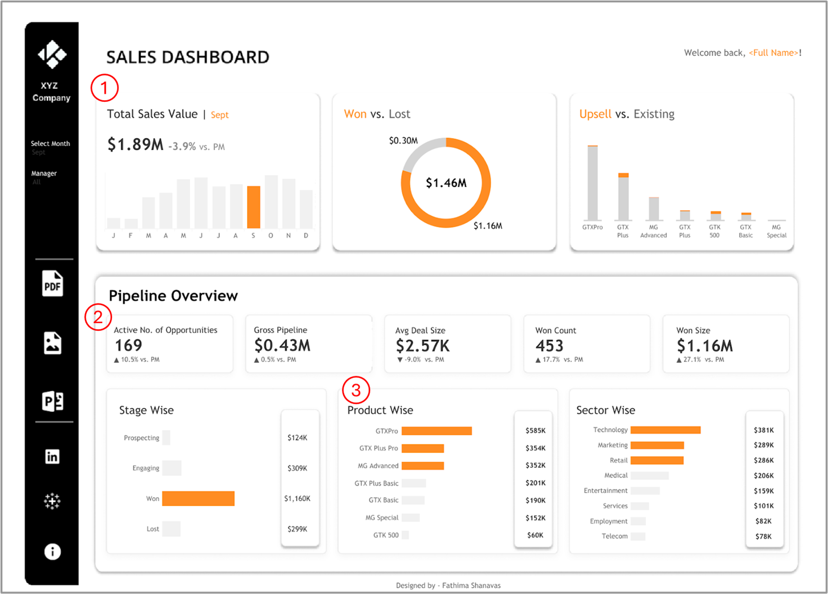
8. CRM Dashboard 🔗Tableau Public
Sales team uses this dashboard to track pipeline health, deal performance, and revenue drivers at a glance for faster, more focused selling
What’s good in this dashboard:
① The top KPIs are well picked. You can quickly see how much revenue came in, how many deals were won, and how much of that came from upsells — no digging needed
② Showing deal count, average deal size, and pipeline value side by side is really helpful. It makes it easy to tell if results are coming from more deals or just bigger ones
③ The product and sector charts clearly show what’s selling and where. That’s a solid way to help teams focus on the right markets or offerings
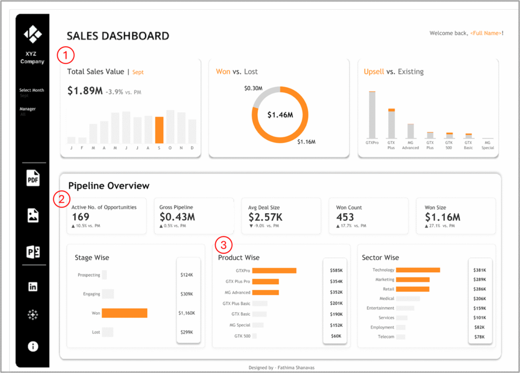
To sharpen it further:
- Adding a visual that shows how long deals sit in each stage would bring much-needed context. It helps the team quickly spot bottlenecks and understand where deals are getting stuck
- It’d be really helpful to show monthly trends right in the KPI tooltips. That way, users can quickly tell if things like pipeline value or win rate are going up or slipping, without needing to look anywhere else
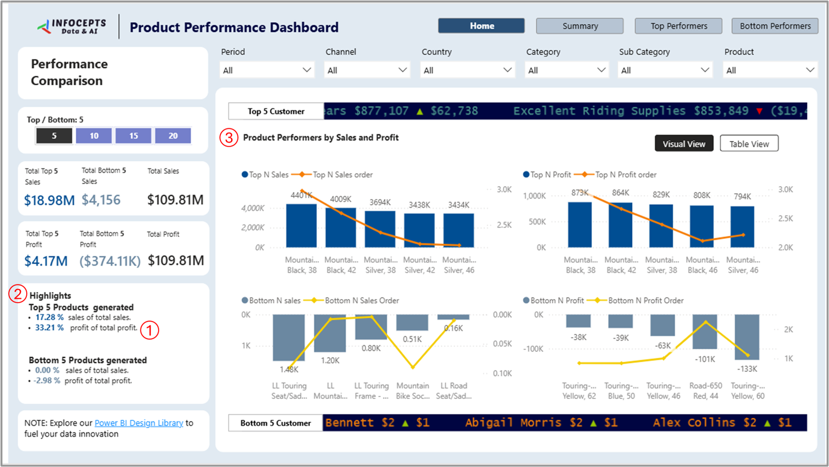
9. Product Performance Dashboard 🔗Power BI Gallery
Sales team uses this dashboard to track product-level sales, profit contribution, and identify top and bottom products at a glance
What’s good in this dashboard:
① Just look at the left panel — it tells you straight away that the top 5 products made up $18.9M in sales and $4.17M in profit. That’s 17% of total sales and 33% of total profit. So even without going into charts, you already know these few products are doing a lot of the work
② The Highlights box is a nice touch. For example, instead of making us compare bars manually, it clearly says that the bottom 5 products contributed almost nothing to sales and even caused a $374K loss. That’s a strong signal to deprioritize or revisit those SKUs
③ Having the top and bottom charts shown side by side helps you spot patterns easily. For instance, you can see that “Mountain Bike, Black, 38” not only sold the most but also brought in the highest profit. On the flip side, “Touring Frame – Yellow, 60” had negative profit, even though it sold a fair amount. That’s something to dig into
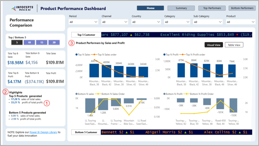
To sharpen it further:
- The view right now feels like a snapshot in time. Adding a trend over weeks or months would show if a product is on the rise or just had a random spike
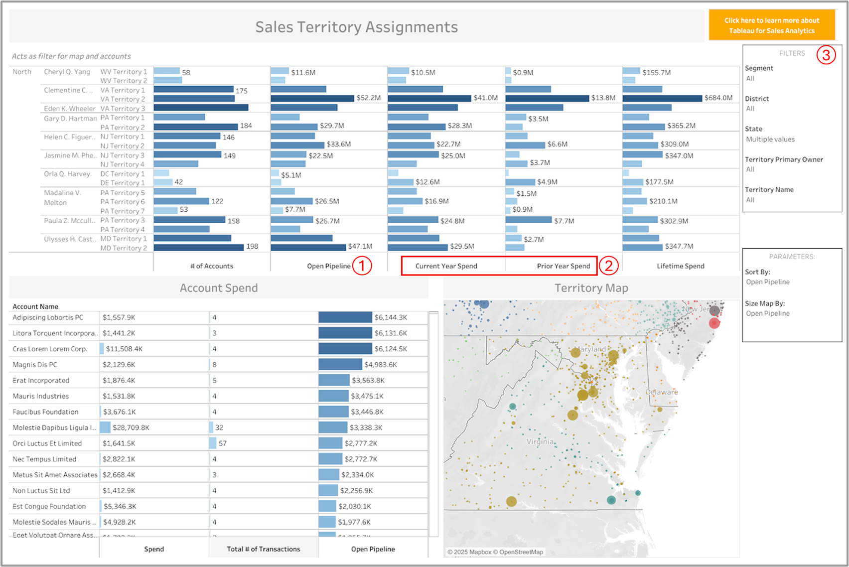
10. Sales Territory Dashboard 🔗Tableau Public
Sales teams use this dashboard to quickly see which territories are bringing in spend, where the pipeline is building up, and where attention is slipping
What’s good in this dashboard:
① You can easily compare how each territory is doing this year versus last — for instance, Clementine’s VA Territory 2 saw a strong $41M this year compared to $13.8M last year, which clearly signals growth
② Having an open pipeline right next to the current spend shows if the momentum will likely continue — Eden Wheeler’s VA Territory 3 has $52M in pipeline, suggesting more wins ahead, while Cheryl Yang’s WV Territory 1 has just $0.9M in pipeline, which might be a red flag ③ The region, manager, and segment filters make this dashboard a tactical tool. Sales leads can quickly drill into underperforming zones and adjust coaching, support, or coverage strategy accordingly
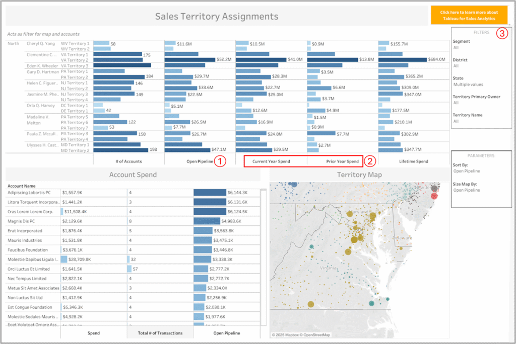
To sharpen it further:
- There’s no time-based context for pipeline activity. Without deal aging or time-in-pipeline by territory, you can’t tell if deals are fresh and moving or stale and clogging up the funnel
- We don’t see how effectively the pipeline is being converted into spend. Adding a pipeline-to-spend ratio or tracking deal progression would expose whether reps are just building volume or actually closing
Each month, we curate the latest updates, insights, and trends for senior leaders in data analytics and AI in our CXO Analytics Newsletter.
Our mission is “to enable businesses to unlock value in data.” For over 20 years, we’ve partnered with more than 100 clients—from Fortune 500 companies to mid-sized firms—to solve complex data analytics challenges. Our services include Advanced Analytics Consulting, Generative AI Consulting, and Business Intelligence (Tableau Consultants, Power BI Consultants and Looker Consultants) turning data into strategic insight. We would love to talk to you. Do reach out to us for a free consultation.