


Introduction
In modern enterprises, technology is no longer a support function, it is the backbone of business continuity, customer trust, and competitive growth. For CIOs and technology leaders, visibility into system reliability, security posture, operational efficiency, and cost control is indispensable. This article curates the Top IT Dashboards that translate complex technology operations into boardroom-ready insights. From project portfolio performance and multi-cloud spending to cybersecurity threats and SLA compliance, these dashboards spotlight the metrics that matter most. Together, they provide executives with a unified view of IT health, enabling faster decisions that balance reliability, security, and business value.
| Sr. No | Dashboard | Key takeaway — why this matters for CIOs |
| 1 | IT Compass Dashboard (Enterprise Project Portfolio & Delivery Tracker) | Provides a consolidated view of IT delivery, budget, service quality, and vendor accountability, ensuring IT spend aligns with business value |
| 2 | Cybersecurity Threat Intelligence Dashboard | Links incidents to financial impact and attack vectors, enabling executives to prioritize defences and allocate resources effectively |
| 3 | IT Operations’ Data Analysis Dashboard | Tracks ticket volumes, resolution speed, and workload, surfacing bottlenecks to improve IT service delivery |
| 4 | IT System Downtime Analysis Dashboard | Consolidates downtime data to highlight root causes and high-impact areas, safeguarding uptime and business continuity |
| 5 | Multi-Cloud Cost Optimization Dashboard | Provides visibility into multi-cloud spending by provider and service, enabling cost control and anomaly detection |
| 6 | Project & Resource Management Dashboard | Aligns IT workload, analyst capacity, and contract obligations, preventing delivery risks and resource misallocation |
| 7 | Application Performance Monitoring Dashboard | Monitors app throughput, latency, and resource usage in real time, protecting customer experience and reliability |
| 8 | SLA Dashboard | Surfaces compliance with service-level commitments, spotlighting breaches and reinforcing IT accountability |
| 9 | IT Risk & Compliance Dashboard | Maps risks by likelihood and impact while tracking compliance frameworks, strengthening governance and audit readiness |
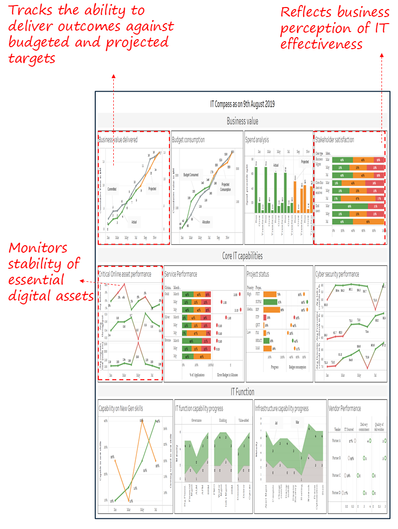
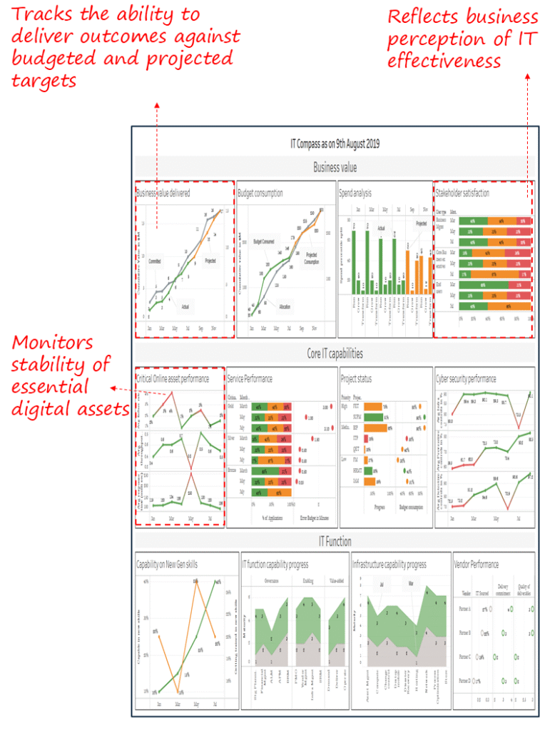
1. IT Compass Dashboard – Enterprise Project Portfolio & Delivery Tracker
Industry Fit
Cross-industry; most relevant for large enterprises with diverse IT portfolios and significant digital service delivery obligations.
Most Relevant For
CIOs, CTOs, IT Directors, and Enterprise Program Management Leaders.
Objective
Provide a consolidated executive view of IT performance across value delivery, budget consumption, service quality, and vendor accountability, enabling leaders to balance cost, reliability, and business impact.
What’s Good About This Dashboard
- Links business value delivered directly to budget consumption and committed targets.
- Integrates service performance, cybersecurity, and critical asset health into one canvas.
- Surfaces stakeholder satisfaction alongside project and vendor status for a balanced view.
- Tracks capability progress in IT functions and infrastructure to guide long-term planning.
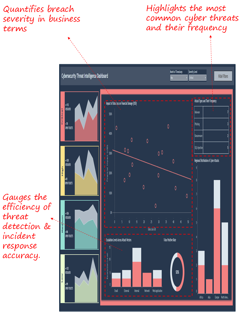
2. Cybersecurity Threat Intelligence Dashboard
Industry Fit
All industries with digital operations and sensitive data exposure, particularly financial services, healthcare, and retail.
Most Relevant For
CIOs, CISOs, Cybersecurity Directors, SOC Managers, and Risk Committees.
Objective
Provide real-time visibility into cyber incidents, their financial and operational impact, and the most common attack vectors, enabling executives to assess exposure and prioritize defences.
What’s Good About This Dashboard
- Links data loss directly to estimated financial damage, giving executives a business lens on cyber risk.
- Categorizes attack types and frequency for better resource allocation and defence prioritization.
- Surfaces escalation patterns and false positive rates, balancing vigilance with operational efficiency.
- Provides regional breakdown of attacks for geographic risk awareness.

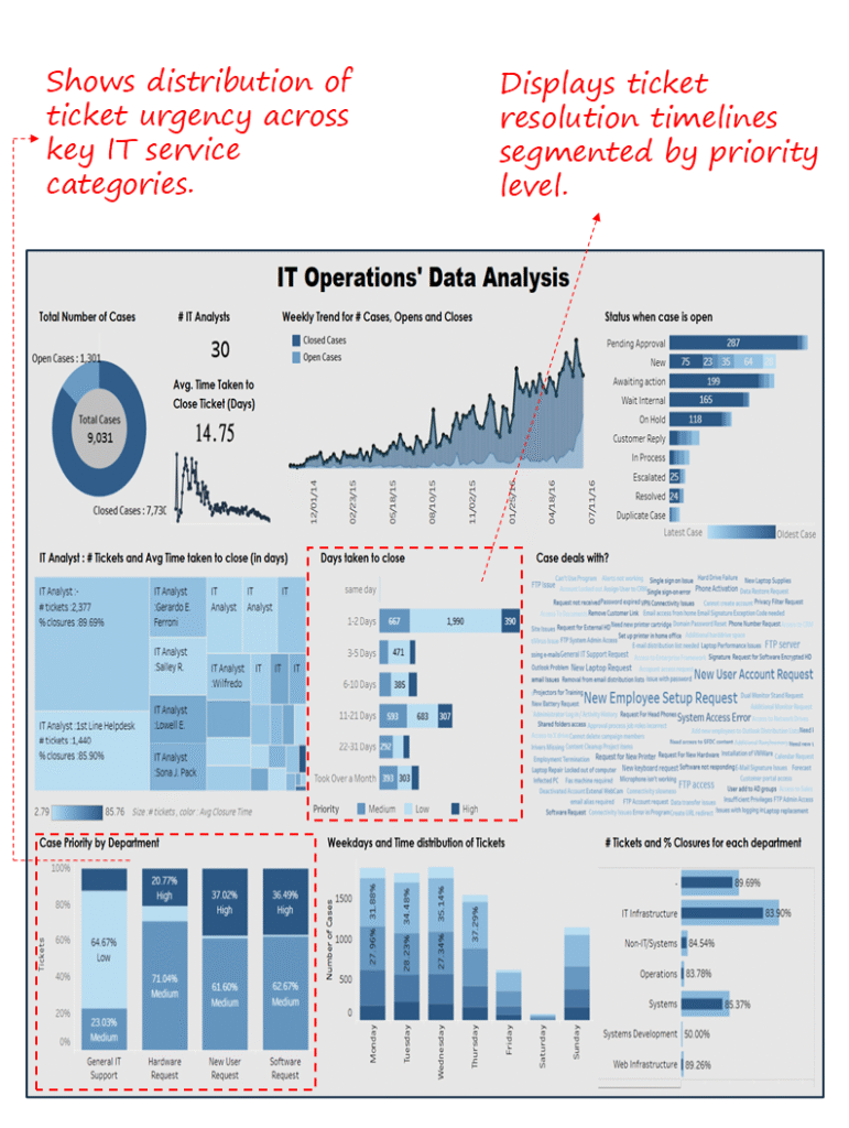
3. IT Operations’ Data Analysis Dashboard
Industry Fit
Cross-industry; most relevant for enterprises with significant IT service management functions.
Most Relevant For
CIOs, IT Service Managers, and Infrastructure Operations Leaders.
Objective
Monitor IT operations efficiency by tracking ticket volumes, resolution timelines, departmental workload, and closure performance, enabling executives to identify bottlenecks and improve service delivery.
What’s Good About This Dashboard
- Consolidates case volumes, open vs. closed trends, and analyst workload.
- Tracks ticket resolution speed, surfacing operational bottlenecks.
- Highlights departmental priorities and case distribution for resource balancing.
- Surfaces closure performance by IT function to ensure accountability.
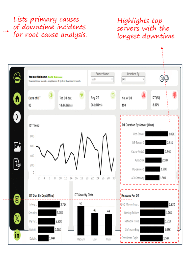
4. IT System Downtime Analysis Dashboard
Industry Fit
Cross-industry; relevant for any organization reliant on IT infrastructure and digital platforms.
Most Relevant For
CIOs, IT Infrastructure Managers, and System Administrators.
Objective
Track downtime incidents, identify high-impact servers and departments, and uncover root causes to improve uptime and ensure business continuity.
What’s Good About This Dashboard
- Consolidates downtime metrics (days, duration, percentage) for a complete reliability view.
- Highlights downtime by server and department to prioritize fixes where business impact is greatest.
- Surfaces primary causes (configuration, backup, software issues) to guide remediation strategies.
- Tracks severity levels for informed prioritization of recovery efforts.
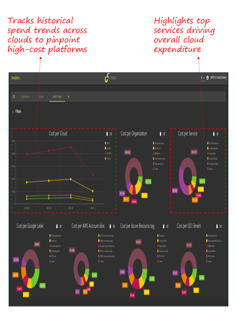
5. Multi-Cloud Cost Optimization Dashboard
Industry Fit
Cross-industry; highly relevant for organizations leveraging hybrid or multi-cloud environments (AWS, Azure, Google Cloud, Oracle).
Most Relevant For
CIOs, Cloud Architects, and IT Finance Managers.
Objective
Provide executives with a consolidated view of cloud costs across providers, services, and organizational units, enabling budget control, anomaly detection, and cost allocation aligned to business objectives.
What’s Good About This Dashboard
- Tracks spending by provider to identify cost-heavy platforms and optimize vendor mix.
- Breaks down costs by organization, service, and account for accountability.
- Surfaces tagging insights across AWS, Azure, and Google for accurate attribution.
- Enables monitoring of trends to detect anomalies and forecast future usage.

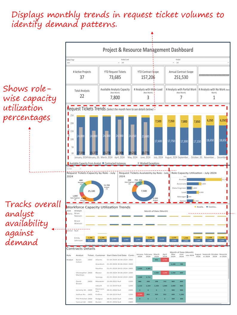
6. Project & Resource Management Dashboard
Industry Fit
Cross-industry; particularly valuable for enterprises managing large IT portfolios, multiple contracts, and distributed analyst teams.
Most Relevant For
CIOs, IT Program Managers, PMOs, and Delivery Leaders.
Objective
Provide visibility into workload distribution, ticket demand, contract scope, and analyst capacity, ensuring IT resources are aligned to business priorities and delivery commitments.
What’s Good About This Dashboard
- Consolidates ticket demand, role availability, and utilization into one view.
- Surfaces workload imbalances across analysts to enable proactive reallocation.
- Tracks long-term request trends for accurate demand forecasting.
- Connects contract obligations with workforce availability to prevent delivery risks.

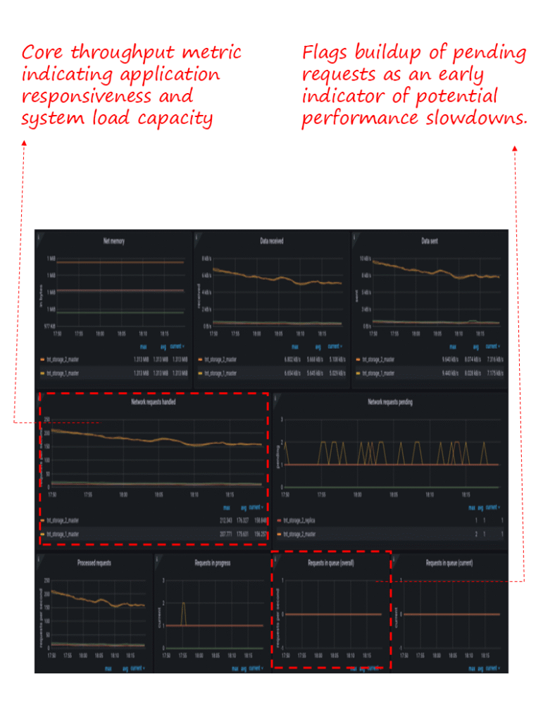
7. Application Performance Monitoring Dashboard
Industry Fit
Cross-industry; critical for organizations with customer-facing platforms, digital applications, or high-volume transaction systems.
Most Relevant For
CIOs, CTOs, Application Owners, and Digital Transformation Leaders.
Objective
Track real-time application health by monitoring throughput, latency, and system resource usage, ensuring reliable user experience and proactive issue resolution.
What’s Good About This Dashboard
- Monitors memory, data transfer, and throughput to surface bottlenecks.
- Tracks processed, pending, and queued requests for visibility into load handling.
- Provides a consolidated view of app-level reliability to safeguard customer experience.
- Enables early detection of performance degradation for faster intervention.
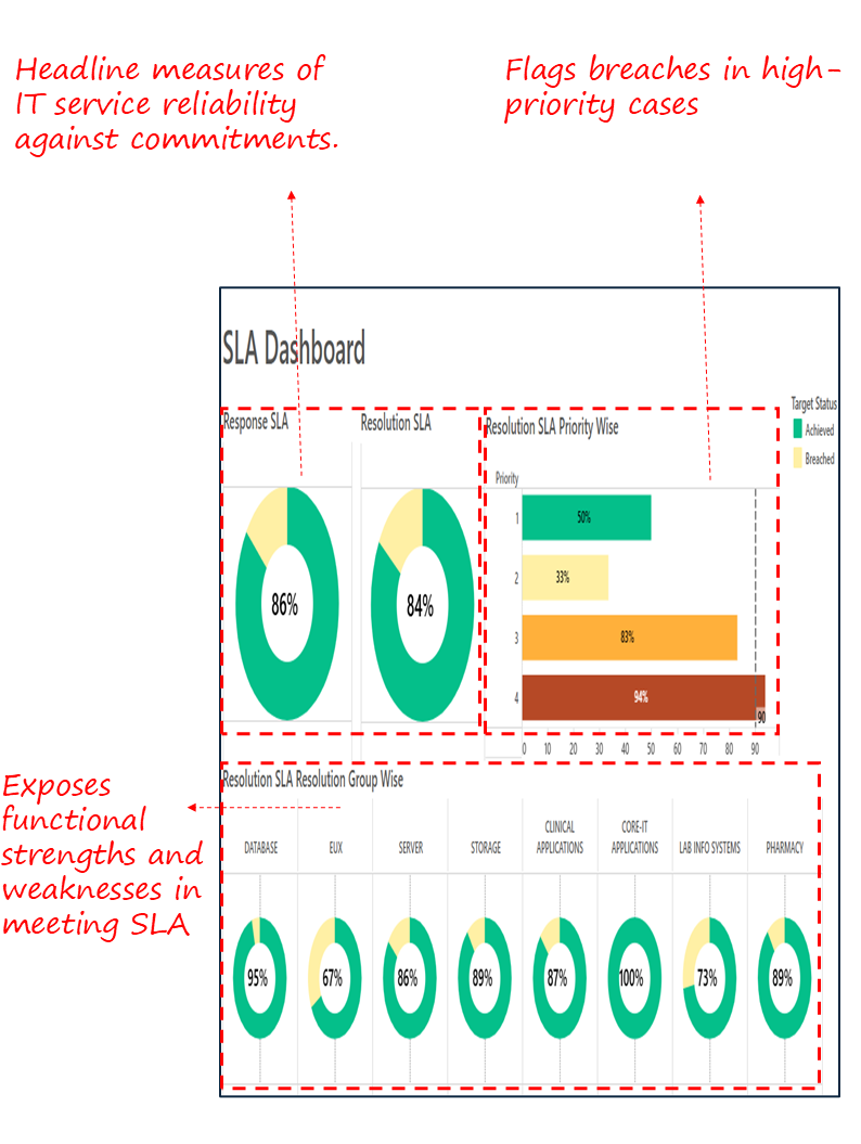
8. SLA Dashboard
Industry Fit
Cross-industry; essential for organizations with formal service commitments and vendor performance obligations.
Most Relevant For
CIOs, CTOs, IT Service Managers, and Vendor Management Leaders.
Objective
Track compliance with service-level agreements across response and resolution times, priority levels, and functional groups, ensuring IT reliability and accountability to the business.
What’s Good About This Dashboard
- Provides an executive snapshot of SLA compliance (response and resolution) in one view.
- Highlights breaches by priority, showing where critical risks are concentrated.
- Breaks down SLA performance by department and service group to pinpoint accountability.
- Reinforces IT’s ability to meet contractual and business commitments.

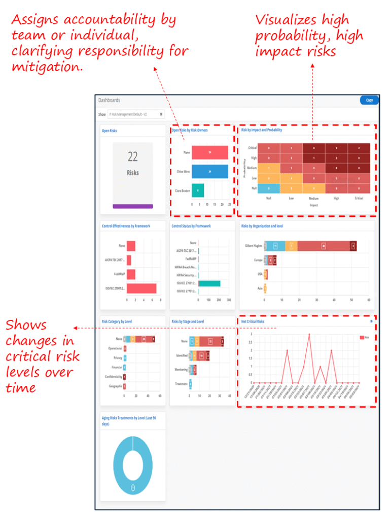
9. IT Risk & Compliance Dashboard
Industry Fit
Cross-industry; vital for regulated sectors such as financial services, healthcare, and government, as well as any enterprise with high IT risk exposure.
Most Relevant For
CIOs, CISOs, Risk and Compliance Leaders, and Audit Committees.
Objective
Provide executives with a consolidated view of IT risks, their likelihood and impact, ownership, and compliance posture against frameworks, enabling proactive risk mitigation and regulatory alignment.
What’s Good About This Dashboard
- Uses a heatmap to show risks by impact and probability, making exposure clear at a glance.
- Tracks open risks and ownership to drive accountability across teams.
- Links risks to frameworks (HIPAA, ISO, FedRAMP) to ensure audit readiness and compliance.
- Monitors critical risk trends over time for forward-looking governance.
Closing Note
In today’s digital-first enterprises, IT performance defines business resilience and growth. The dashboards presented here translate complex technology operations into clear executive insights, covering reliability, security, cost control, and user experience. Together, they equip CIOs and technology leaders with the ability to measure outcomes, identify risks, and allocate resources with precision.
By focusing on the metrics that matter most, from uptime and SLA compliance to cloud spending and risk posture, these dashboards enable informed decision-making at the highest level. For executives, they are not just reporting tools but strategic instruments to ensure that IT delivers reliability, security, and business value in equal measure.
IT leaders typically engage Tableau Consultants or hire Power BI consultants when building operational dashboards to ensure incident tracking, SLA monitoring, and infrastructure data are accurate, secure, and actionable.
Each month, we curate the latest updates, insights, and trends for senior leaders in data analytics and AI in our CXO Analytics Newsletter.
Our mission is “to enable businesses to unlock value in data.” For over 20 years, we’ve partnered with more than 100 clients—from Fortune 500 companies to mid-sized firms—to solve complex data analytics challenges. Our services include Advanced Analytics Consulting, Generative AI Consulting, and Business Intelligence (Tableau Consultants, Power BI Consultants and Looker Consultants) turning data into strategic insight. We would love to talk to you. Do reach out to us for a free consultation.