


TABLEAU FILTERING ACTIONS MADE EASY
This is a guest post provided by Vishal Bagla, Chaitanya Sagar, and Saneesh Veetil of Perceptive Analytics.
Tableau is one of the most advanced visualization tools available on the market today. It is consistently ranked as a ‘Leader’ in Gartner’s Magic Quadrant. Tableau can process millions of rows of data and perform a multitude of complex calculations with ease. But sometimes analyzing large amounts of data can become tedious if not performed properly. Tableau provides many features that make our lives easier with respect to handling datasets big and small, which ultimately enables powerful visualizations.
Tableau’s filtering actions are useful because they create subsets of a larger dataset to enable data analysis at a more granular level. Filtering also aids user comprehension of data. Within Tableau data can be filtered at the data source level, sheet level or dashboard level. The application’s filtering capabilities enable data cleansing and can also increase processing efficiency. Furthermore, filtering aids with unnecessary data point removal and enables the creation of user defined date or value ranges. The best part is that all of these filtering capabilities can be accessed by dragging and dropping. Absolutely no coding or elaborate data science capabilities are required to use these features in Tableau.
At Perceptive Analytics, our Tableau consultants have helped clients across industries simplify data analysis and dashboard development. Whether you’re working with a Tableau expert, contractor, or a freelance Tableau developer, understanding filtering actions is key to effective storytelling with data.
In this article, we will touch upon the common filters available in Tableau and how they can be used to create different types of charts. After reading this article, you should be able to understand the following four filtering techniques in Tableau:
- Keep Only/Exclude Filters
- Dimension and Measure Filters
- Quick Filters
- Higher Level Filters
We will use the sample ‘Superstore’ dataset built in Tableau to understand these various functions.
1. Keep Only/Exclude Filters in Tableau
These filters are the easiest to use in Tableau. You can filter individual/multiple data points in a chart by simply selecting them and choosing the “Keep Only” or “Exclude” option. This type of filter is useful when you want to focus on a specific set of values or a specific region in a chart.
While using the default Superstore dataset within Tableau, if we want to analyze sales by geography, we’d arrive at the following chart.

However, if we want to keep or exclude data associated with Washington state, we can just select the “Washington” data point on the map. Tableau will then offer the user the option to “Keep Only” or “Exclude”. We can then simply choose the option that fits our need.

2. Dimension and Measure Filters
Dimension and measure filters are the most common filters used while working with Tableau. These filters enable analysis at the most granular level. Let’s examine the difference between a dimension filter and a measure filter.
Dimension filters are applied to data points which are categorical in nature (e.g. country names, customer names, patient names, products offered by a company, etc.). When using a dimension filter, we can individually select each of the values that we wish to include or exclude. Alternatively, we can identify a pattern for the values that we wish to filter.
Measure filters can be applied to data points which are quantitative in nature, (e.g. sales, units, etc.). For measure filters, we generally work with numerical functions such as sum, average, standard deviation, variance, minimum or maximum.
Let’s examine dimension filters using the default Tableau Superstore dataset. The chart below displays a list of customers and their respective sales.

Let’s examine how to exclude all customers whose names start with the letter ‘T’ and then subsequently keep only the top 5 customers by Sales from the remaining list.
One way would be to simply select all the customers whose names start with ‘T’ and then use the ‘Exclude’ option to filter out those customers. However, this is not a feasible approach when we have hundreds or thousands of customers. We will use a dimension filter to perform this task.
When you move the Customer Name field from the data pane to the filters pane, a dialogue box like the one shown below will appear.

As shown in the above dialogue box, you can select all the names starting with “T” and exclude them individually. The dialogue box should look like the one shown below.

The more efficient alternative is to go to the Wildcard tab in the dialogue box and select the “Exclude” check box. You can then choose the relevant option “Does not start with”.

To filter the top 5 customers by sales, right click on “Customer Name” in the Filters area, select “Edit Filter” and then go to the “Top” tab in the filter dialogue box. Next, choose the “By Field” option. Make your selections align to the following screenshot.

After performing the necessary steps, the output will yield the top 5 customers by sales.

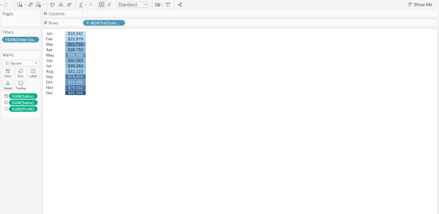
Let’s move on to measure filtering within the same Tableau Superstore dataset. We’re going to filter the months where 2016 sales were above $50,000. Without a measure filter applied, our sales data for 2016 would look like the following:
To filter out the months where sales were more than $50,000, move the sales measure from the data pane to the filter pane. Observe the following:

Here, we can choose any one of the filter options depending upon our requirement. Let’s choose sum and click on “Next”. As shown below, we are provided with four different options.

We can then choose one of the following filter options:
- Enter a range of values;
- Enter the minimum value that you want to display using the “At least” tab;
- Enter the maximum value that you want to display using the “At most” tab;
- From the Special tab, select “all values”, “null values” or “non-null” values;
Per our example, we want to filter for sales that total more than $50,000. Thus, we will choose the “At least” tab and enter a minimum value of 50,000.

In the output, we are left with the six months (i.e. March, May, September, October, November, December) that have a sum of sales that is greater than $50,000.

Similarly, we can choose other options such as minimum, maximum, standard deviation, variance, etc. for measure filters. Dimension and measure filters make it very easy to analyze our data. However, if the dataset is very large, measure filters can lead to slow performance since Tableau needs to analyze the entire dataset before it filters out the relevant values.
3. Quick Filters
Quick filters are radio buttons or check boxes that enable the selection of different categories or values that reside in a data field. These filters are very intuitive and infuse your visualizations with additional interactivity. Let’s review how to apply quick filters in our Tableau sheet.
In our scenario, we have sales data for different product segments and different regions from 2014 to 2019. Our data looks like the following:

We want to filter the data by segments and see data for only two segments (Consumer and Corporate). One way to do this would be to use a dimension filter, but what if we want to compare segments and change the segment every now and then? In this scenario, a quick filter would be a useful addition to the visualization. To add a quick filter, right click on the “Segment” dimension in Marks pane and choose “Show Filter”.

Once we click on “Show Filter”, a box will appear on the right side of the Tableau screen. The box contains all constituent values of the Segment dimension. At this point, we could choose to filter on any segment value available in the quick filter box. If we were to select both Consumer and Corporate values, Tableau will display two charts instead of three.

Similarly, we can add other quick filters for region, country, ship status or any other dimension.
4. Higher Level Filters
Dimension, measure and quick filters are very easy to use and make the process of analyzing data hassle free. However, when multiple filters are used on a large data source, processing becomes slow and inefficient. Application performance degrades with each additional filter.
The right way to begin working with a large data source is to initially filter when making a connection to the data. Once the data is filtered at this stage, any further analysis will be performed on the remaining data subset; in this manner, data processing is more efficient. These filters are called Macro filters or Higher-Level filters. Let’s apply a macro level filter on our main data source.
We can choose the “Add” option under the Filters tab in top right corner of the Data Source window.

Once we click on “Add”, Tableau opens a window which presents an option to add various filters.

Upon clicking “Add” in the Edit Data Source Filters dialogue box, we’re presented with the entire list of variables in the dataset. We can then add filters to the one we select. Let’s say we want to add a filter to the Region field and include only the Central and East region in our data.

Observe that, our dataset is filtered at the data source level. Only those data points where the region is either Central or East will be available for our analyses. Let’s turn our attention back to the sales forecast visualization that we used to understand quick filters.

In the above window, we observe options for only “Central” and “East” in the Region Filter pane. This means that our filter applied at the data source level was successful.
Chaitanya Sagar and team are part of Perceptive Analytics, a trusted Tableau Partner Company offering services from Tableau developers to strategic Tableau consulting solutions.
Hopefully after reading this article you are more aware of both the importance and variety of filters available in Tableau. However, using unnecessary filters in unorthodox ways can lead to performance degradation and impact overall productivity. Therefore, always assess if you’re adding unnecessary options to your charts and dashboards that have the potential to negatively impact performance.
To scale interactive dashboards, many organizations engage Tableau Consultants to ensure filtering actions are consistent and performance-friendly.