


Statistics in Tableau
Data in the right hands can be extremely powerful and can be a key element in decision making. American statistician, W. Edwards Deming quoted that, “In God we trust. Everyone else, bring data”. We can employ statistical measures to analyze data and make informed decisions. Tableau enables us to calculate multiple types of statistical measures like residuals, correlation, regression, covariance, trend lines and many more.
Today let’s discuss how people misunderstand causation and correlation using Tableau.
Correlation and Causation
Correlation is a statistical measure that describes the magnitude and direction of a relationship between two or more variables.
Causation shows that one event is a result of the occurrence of another event, which demonstrates a causalrelationship between the two events. This is also known as cause and effect.
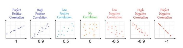
Types of correlation:
- 1 → Positive correlation.
- -1 → Negative Correlation.
- 0 → No correlation.
Why are correlation and causation important?
The objective of analysing data is to identify the extent by which a variable relates to another variable.
Examples of Correlation and Causation
- Vending machines and obesity in schools: people gain weight due to junk food. One important source of junk food in schools is vending machines. So if we remove vending machines from schools obesity must reduce, right? But it isn’t true. Research shows that children who move from schools without vending machines to schools with vending machines don’t gain weight. Here we can find a correlation between children who were overweight and eating junk food from vending machines. In actuality, the “causal” point (which is the removal of vending machines from schools) has a negligible effect on obesity.
- Ice cream sales and temperature: If we observe ice cream sales and temperature in the summer, we can determine that they are causally related; i.e. there is a strong correlation between them. As temperature increases, ice cream consumption also increases. Understanding correlation and causation allows people to understand data better.
Now let’s explore correlation using Tableau. We are going to use the orders table from the superstore dataset which comes default with Tableau.
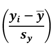
Before going further let’s understand how to calculate the correlation coefficient ‘r’.
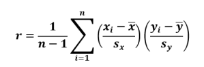
We can easily understand the above formula by breaking it into pieces.
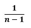
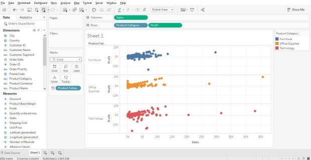
In Tableau, we can represent the above formula as 1/SIZE() -1 where SIZE is function in Tableau.
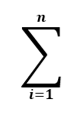
We can use WINDOWSUM function for doing this summation in Tableau.

xi is the sum of profit and x-bar is the mean of profit, which is window average of sum of profit, and sx is standard deviation of profit. That means that we need to subtract mean from sum of profit and divide that by standard deviation.
(SUM([Profit])-WINDOW_AVG(SUM([Profit]))) / WINDOW_STDEV(SUM([Profit])))
This is similar to the formula above but we only need to swap profit with sales.
(SUM([Sales])-WINDOW_AVG(SUM([Sales]))) / WINDOW_STDEV(SUM([Sales])))
Now we have to join all these formulae to get the value of the correlation coefficient of r. Be careful while using parenthesis or you may face errors. Here is our final formula to calculate r.
1/(SIZE()-1) * WINDOW_SUM(( (SUM([Profit])-WINDOW_AVG(SUM([Profit]))) / WINDOW_STDEV(SUM([Profit]))) * (SUM([Sales])-WINDOW_AVG(SUM([Sales]))) / WINDOW_STDEV(SUM([Sales])))
Let’s implement this in Tableau to see how it works. Load superstore data into Tableau before getting started.

After loading the superstore excel file into Tableau, examine the data in the orders sheet. You can see that it contains store order details complete with sales and profits. We will use this data to find correlation between profit and sales.
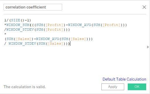
Let’s get our hands dirty by making a visualization. Go to sheet1 to get started. I made a plot between profit and sales per category.
Now in order to find the correlation between profit and sales, we need to use our formula to make a calculated field which serves our purpose.
Now drag and drop our calculated field onto the colors card and make sure to compute using customer name as we are using it for detailing.

Here we can see the strength of the relationship between profits and sales of data per category; the darker the color, th he stronger the correlation.
Next we’ll add trend lines to determine the direction of forecasted sales.

These trend lines help demonstrate which type of correlation (positive, negative or zero correlation) there is in our data. You can explore some more and gain additional insights if you add different variables like region.

From this analysis we can understand how two or more variables are correlated with each other. We begin to understand how each region’s sales and profits are related.
Let’s see how a correlation matrix helps us represent the relationship between multiple variables.
A correlation matrix is used to understand the dependence between multiple variables at same time. Correlation matrices are very helpful in obtaining insights between the same variables or commodities. They are very useful in market basket analysis.
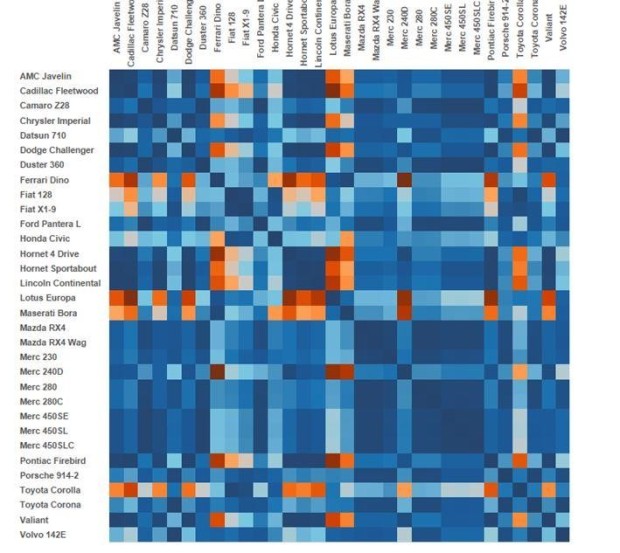
Let’s see how it works in Tableau. Download the “mtcars” dataset from this link. After downloading it, connect it to Tableau and explore the dataset.
The dataset has 35 variables where each row represents one model of car and each column represents an attribute of that car.
Variables present in dataset:
Mpg = Miles/gallon.
Cyl = Number of Cylinders.
Disp = Displacement (cubic inches)
Hp = Gross Horsepower
Drat = Rear axle ratio
Wt = Weight (lb/1000)
Qsec = ¼ mile time
Vs = V/Sec
Am = Transmission (0 = automatic, 1 = manual)
Gear = Number of forward gears
Carb =Number of Carburetors
Let’s use these variables to make our visualization. I made this amazing visualization showing correlation between models by referring to Bore Beran’s blog article, in which he explained how to make this visualization which helps us understand more about using Tableau to understand correlation.
Analysts often collaborate with Tableau Consultants to ensure statistical calculations and correlations are implemented correctly and visualized accurately across dashboards.
Conclusion
We must keep in mind that if we want to measure the dependence between two variables, correlation is the best way to do it. A correlation value always lies between -1 and 1. The closer the value of the correlation coefficient is to 1, the stronger their relationship. We must remember that correlation is not causation and many people misunderstand this. There are many more relations and insights that can be unlocked from this dataset. Explore more by experimenting with this dataset using Tableau. Practice to be perfect.
Looking to do more with your data? Check out our other services : Tableau Consultants | Tableau Consulting | Tableau Expert | Tableau Contractor | Tableau Freelance Developer | Tableau Developer | Tableau Partner Company