


Executive Introduction
Today’s CFOs juggle shrinking margins, volatile forecasts, and board requests that can’t wait until month‑end. Static reports won’t cut it; an executive‑ready layer of Power BI dashboards helps turn numbers into timely, confident decisions.
This article curates 12 essential finance dashboards that put you in control of liquidity, profitability, compliance, and strategic planning—chosen because they’re practical, clear, and move the business forward.
If month‑end firefighting is the norm, let’s tailor this set to your biggest gaps—cash runway, DSO, variance hotspots, or margin leakage—so fixes land in weeks, not quarters.
| No. | Dashboard | Key takeaway — why this matters for CFOs |
| 1 | CFO Executive Dashboard | Unified view of revenue, costs, profits, and segment performance for boardroom‑ready decisions |
| 2 | Cash Flow Dashboard | OCF/ICF/FCF visibility to protect liquidity and surface risk early |
| 3 | Working Capital Dashboard | DSO/DPO/DIO clarity to tighten the cash conversion cycle |
| 4 | Accounts Receivable Dashboard | Risk‑weighted collections that reduce overdue exposure |
| 5 | Accounts Payable Dashboard | On‑time payments and vendor trust with clear overdue control |
| 6 | Budget vs Actual Performance | Site/unit adherence; stop persistent overruns and scale what works |
| 7 | Budget vs Forecast Variance | Trace deviations to profit impact to reforecast and reallocate fast |
| 8 | P&L Actuals | Multi‑entity visibility with drill‑downs to catch anomalies early |
| 9 | Product Profitability | Expose winners and loss‑makers to guide price, promo, and mix |
| 10 | Credit Line Scenario Planning | Simulate needs to optimize utilization and lender terms |
| 11 | Investment Evaluation & Scenario | Model ROI, valuation, and macro sensitivities for strategic bets |
| 12 | Tax Exposure & Audit Lifecycle | Track dues, exposure, and audit stages across jurisdictions |
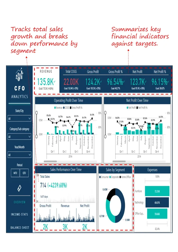
1. CFO Executive Dashboard
Start here for a clean “are we on plan?” view before leadership reviews—revenue, cost, profit, and segment trends without hunting through decks.
Industry Fit
Cross‑industry; mid‑to‑large enterprises with multiple products or regions.
Relevance For
Chief Financial Officers, Finance Directors, FP&A Heads
Objective
Give at‑a‑glance performance vs targets for rapid, confident decisions.
What’s Good About This Dashboard
- Tracks revenue, gross profit, and net profit vs goals for instant health checks
- Shows operating profit and margin trends to spot volatility early
- Breaks down sales by product and segment to reallocate resources fast
- Summarizes expense distribution for quick cost structure reviews
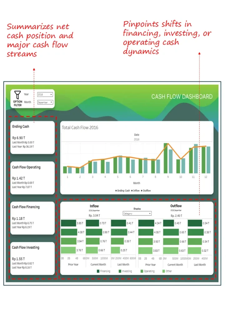
2. Cash Flow Dashboard
Know where cash stands and where it’s headed—OCF/ICF/FCF visibility keeps runway and risks from becoming surprises.
Industry Fit
Capital‑intensive sectors like manufacturing, construction, and energy—plus any business prioritizing liquidity.
Relevance For
CFOs, Treasury Heads, Corporate Controllers
Objective
Track net cash and major movements for liquidity planning and early risk detection.
What’s Good About This Dashboard
- Ending cash vs last month/year for directional clarity
- Inflow/outflow trends by operating, investing, financing
- Monthly net movements to catch inflection points
- Side‑by‑side source/use comparisons to spot pattern shifts
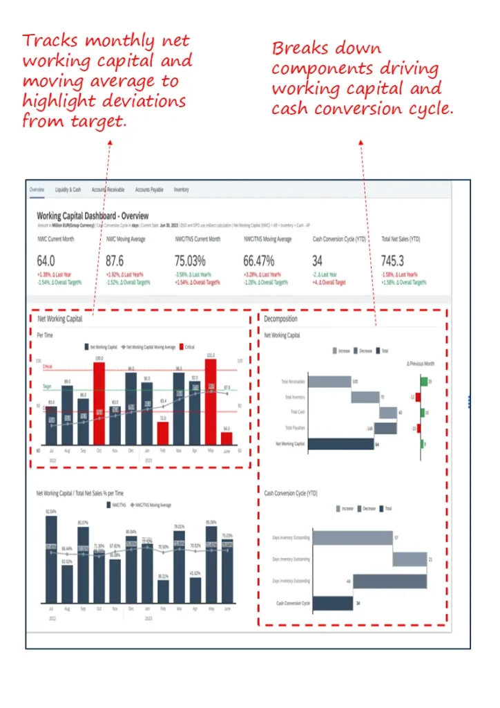
3. Working Capital Dashboard
Turn tied‑up cash into capacity—see DSO/DPO/DIO together so you shorten the cash conversion cycle without blunt cuts.
Industry Fit
Retail, manufacturing, distribution—inventory and receivables heavy models.
Relevance For
CFOs, FP&A Leads, Working Capital Teams
Objective
Monitor NWC trends, diagnose deviations, and manage CCC by component.
- NWC and moving averages to separate seasonality from structural issues
- Receivables, payables, inventory decomposition for root‑cause analysis
- CCC visualization to expose bottlenecks
- Benchmarks vs prior month and targets to prompt action
If cash runway updates take days, we’ll wire up AR/AP/inventory signals so your cash view refreshes alongside operations.
4. Accounts Receivable Dashboard
Point collections where it counts—prioritize by risk and value, see regional hotspots, and keep aging under control.
Industry Fit
B2B with high invoice volumes and long cycles: construction, pro services, wholesale.
Relevance For
CFOs, Credit & Collections Managers, AR Teams
Objective
Reduce overdue exposure via targeted collections at client/region/project levels.
- Aging buckets for risk profiling and prioritization
- High‑risk, high‑value client flags for focused action
- Overdue concentration by region/project for field guidance
- Invoice‑level detail for escalations and follow‑through

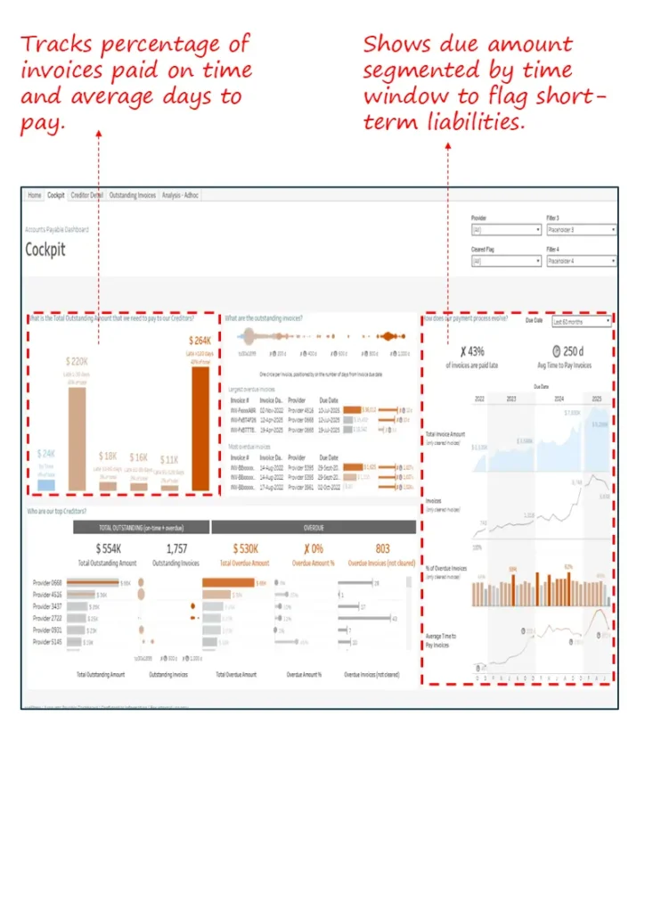
5. Accounts Payable Dashboard
Protect vendor trust and rebate schedules—see on‑time rates and overdue liabilities so you can sequence payments with confidence.
Industry Fit
Manufacturing, pharma, logistics—complex vendor ecosystems.
Relevance For
CFOs, Payables Teams, Procurement Finance
Objective
Track discipline and reduce overdue exposure while maintaining supplier relationships.
- On‑time payment% and days‑to‑pay for supplier confidence
- Overdue by time bucket to triage urgency
- Breakdown by vendor/region/unit for targeted actions
- Priority cues based on risk and payment history
6. Budget vs. Actual Performance Dashboard
Keep spend honest at the edge—compare income, expenses, and net income by site or unit to stop persistent overruns.
Industry Fit
Multi‑location: real estate, hospitality, healthcare, retail.
Relevance For
CFOs, Financial Controllers, Business Unit Heads
Objective
Monitor adherence and focus attention on outliers that move P&L.
- Compact actual vs budget view for core lines
- Top/underperformers flagged by variance
- Persistent overrun detection by property/cost center
- Ready visuals for monthly steerco reviews
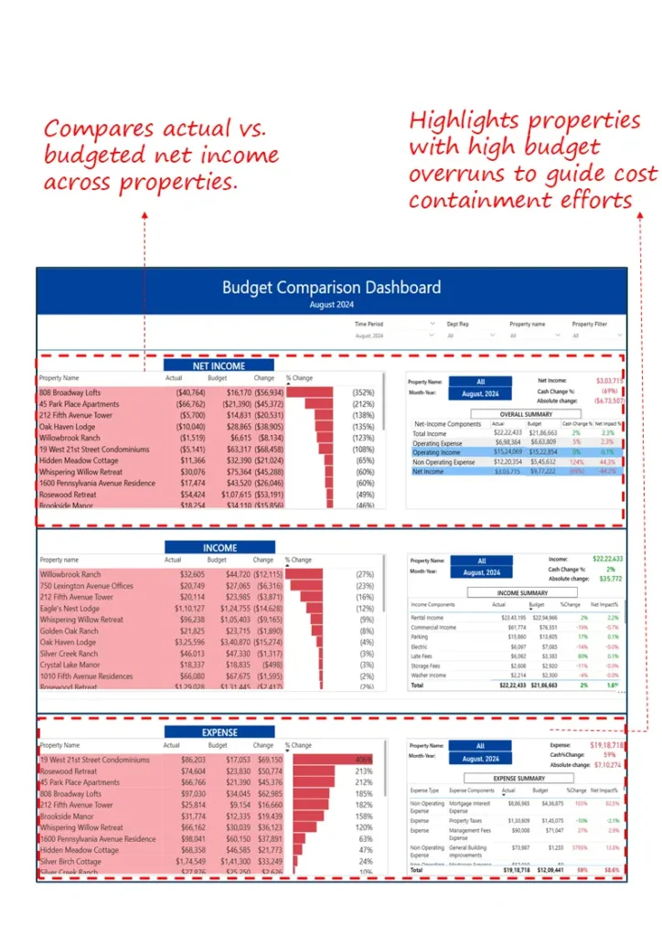
If variance reviews end with “we’ll investigate,” we’ll wire line‑item traces so owners see causes—and fixes—during the meeting.
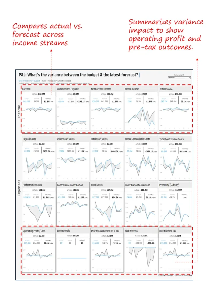
7. Budget vs. Forecast Variance Dashboard
Tighten forecast credibility—trace deviations to cost or volume drivers and show how they hit operating and pre‑tax profit.
Industry Fit
Transportation, telecom, SaaS, insurance—monthly reforecast cadence.
Relevance For
CFOs, FP&A Leaders, Business Finance Partners
Objective
Compare actuals vs forecast, quantify profit impact, and guide reallocation.
- Actual vs forecast across key income and expense lines
- Cost category breakdowns for root drivers
- Impact view for margin, interest, pre‑tax profit
- Guides reforecasting and budget shifts
8. Profit & Loss (P&L) Actuals Dashboard
See the P&L from the right altitude—drill by entity, department, or owner to spot anomalies and correct course fast.
Industry Fit
Multi‑entity operations: conglomerates, real estate, franchised networks.
Relevance For
CFOs, FP&A Leads, Group Finance Managers
Objective
Review actuals with drill‑down to account‑level drivers and inter‑entity variances.
- P&L by income/expense categories across entities
- Filters by manager, owner, cost center
- Month‑over‑month pattern detection
- Account‑level drill for root‑cause analysis
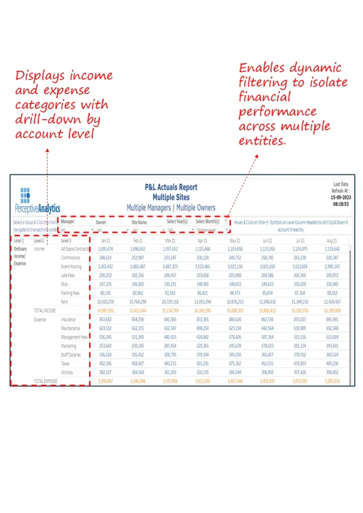
If profitability reviews feel like post‑mortems, we’ll surface leading signals so you can fix margin leaks mid‑cycle.
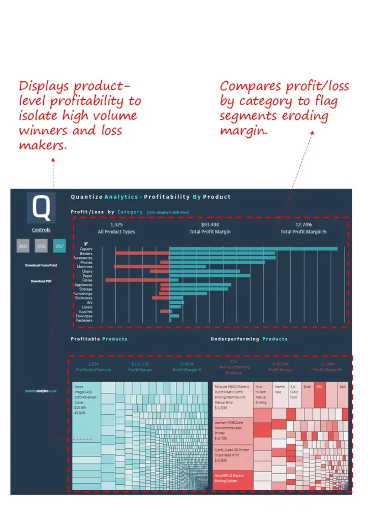
9. Product Profitability Dashboard
Shine a light on winners and silent losers—adjust price, promo, and mix with confidence instead of gut feel.
Industry Fit
CPG, retail, e‑commerce, industrial manufacturing—product‑driven P&L.
Relevance For
CFOs, Product Controllers, Category Managers
Objective
Isolate high‑margin winners and underperformers to guide corrective actions.
- Profit/loss by category to spot dilution
- Segments profitable vs underperforming products
- Flags high‑volume loss‑makers for price/cost fixes
- SKU/category optimization via treemaps and bars
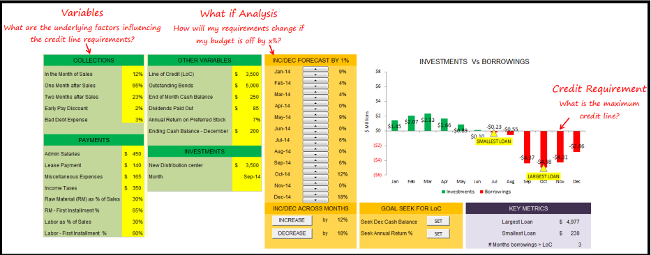
10. Credit Line Scenario Planning Dashboard
Walk into lender conversations with numbers, not narratives—stress test inflows/outflows and time credit usage to your advantage.
Industry Fit
Mid/large businesses with seasonal cash flows and credit dependencies.
Relevance For
CFOs, Treasury Leaders, Financial Planners
Objective
Forecast volatility, evaluate utilization, and support lender negotiations with evidence.
- Simulates inflows/outflows across collections, payments, investments
- Dynamic what‑if for needs under varied revenue/cost assumptions
- Peaks/troughs in usage to optimize timing
- Goal‑seeking for year‑end cash or target returns
11. Investment Evaluation & Scenario Dashboard
Pressure‑test strategic bets before committing capital—project earnings, value outcomes, and macro sensitivities side by side.
Industry Fit
Cross‑sector; equity or asset‑based investments in energy, mining, capital markets, and beyond.
Relevance For
CFOs, Corporate Strategy Heads, M&A Analysts
Objective
Support investment decisions through projections, valuation, and scenario modelling.
- 5‑year earnings and cash flow projection by key drivers
- Upside/base/downside scenarios for price, volume, cost
- DCF and sensitivity for EV and ROIC implications
- Macro impact quantification on return metrics
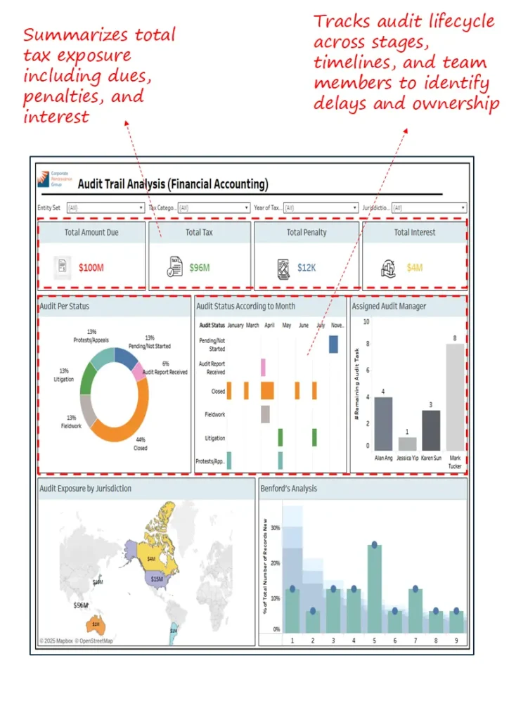
12. Tax Exposure & Audit Lifecycle Dashboard
Keep surprises out of tax and audit—see exposure by jurisdiction, track status by stage, and flag anomalies before they escalate.
Industry Fit
Large multinationals across jurisdictions: pharma, manufacturing, consumer goods.
Relevance For
CFOs, Heads of Tax, Internal Audit Leaders
Objective
Monitor dues, exposure, and the audit lifecycle across time, geography, and accountable teams.
- Total dues, penalties, interest summarized for clear exposure
- Audit status by stage and timeline to prevent delays
- Exposure by jurisdiction for concentration and compliance tracking
- Benford’s analysis flags anomalies for deeper review
Closing Note
Dashboards are the finance operating layer—speed and accuracy together; if you want fewer post‑mortems and more mid‑cycle course corrections, this set will help you get there fast.
Prefer a pragmatic first step? We’ll review your current reporting and outline a two‑week path to a live executive view your team will actually use.