


Introduction
Customer support today is no longer just a reactive function, it’s a strategic advantage. As support operations scale across digital and traditional channels, CXOs, COOs, and Heads of Support must monitor more than ticket volume or CSAT alone. They need visibility into contact drivers, escalation risks, backlog aging, and channel performance without drowning in operational noise.
This article presents 10 curated dashboards; each selected for its ability to deliver executive-level insight. These dashboards span the full customer support landscape, from NPS diagnostics and regional churn to SLA trends and digital deflection barriers. Designed for action, they highlight where customer experience breaks down, and where operational strategy must respond.
| No. | Dashboard | Key takeaway — why this matters for service leaders |
| 1 | Executive Contact Centre Overview Dashboard | Gives CXOs and COOs a channel-wise view of volumes, SLAs, and escalation trends so they can quickly act on emerging friction points |
| 2 | Complaint Distribution & Severity Dashboard | Pinpoints high-severity complaint drivers and problematic products/brands, helping leaders prioritize urgent fixes |
| 3 | Service Request, Incident & Problem Overview Dashboard | Consolidates request, incident, and problem data into one view, making SLA breaches and backlog trends visible at the executive level |
| 4 | City-Level Omnichannel Performance Dashboard | Enables region-wise comparison of support quality and customer satisfaction to identify geographic service gaps |
| 5 | NPS Performance & Feedback Driver Dashboard | Diagnoses loyalty trends by segment and feature, helping CXOs and product leaders spot detractor drivers early |
| 6 | Service Quality & Customer Experience Dashboard | Tracks MTTR, churn, and call drops across geographies, giving visibility into service quality and retention risks |
| 7 | Problem Management & Root Cause Analysis Dashboard | Highlights unresolved, recurring problems linked to incidents, ensuring leaders can drive accountability and systemic fixes |
| 8 | Telecom Customer Churn Dashboard | Surfaces churn patterns by region, plan, and driver, enabling targeted retention actions |
| 9 | Voice of the Customer – Self-Service & Escalation Dashboard | Shows where self-service fails and why customers escalate, helping improve digital deflection and reduce avoidable contact |
| 10 | Forecast vs Actual – SLA & Staffing Dashboard | Reveals mismatches between forecasted and actual volumes, enabling better workforce planning and SLA adherence |
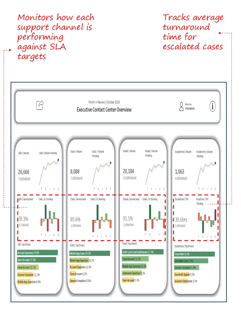
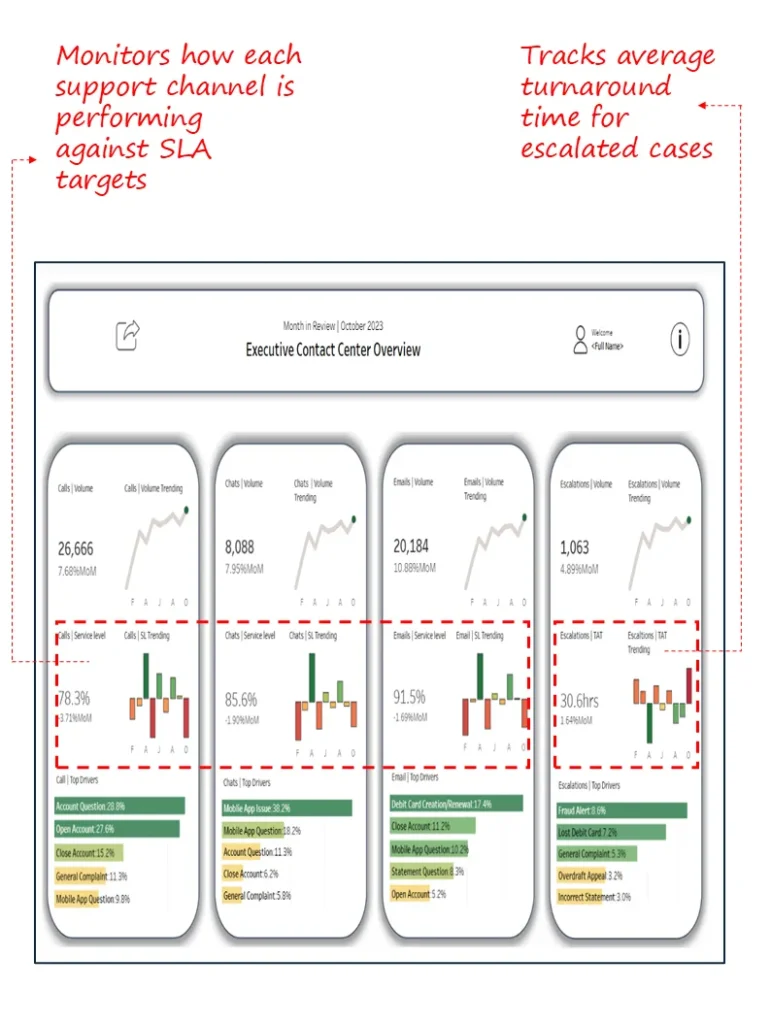
1. Executive Contact Centre Overview Dashboard
Industry Fit: Cross-industry (Telecom, BFSI, Retail, Utilities, B2B SaaS)
Most Relevant For: Chief Customer Officers (CCO), COOs, Heads of Customer Support, Contact Centre Directors
Objective:
To provide a consolidated, channel-wise view of contact volumes, service levels, and top escalation drivers enabling executives to monitor performance trends, spot volume shifts, and act on emerging friction areas across calls, chats, emails, and escalations.
What’s Good About This Dashboard:
- Offers segmented views for calls, chats, emails, and escalations, each with volume, service level, and monthly trendlines.
- Highlights Top 5 contact drivers per channel, helping prioritize issue resolution based on real customer intent.
- Tracks escalation turnaround time (TAT) and its month-over-month trend—critical for service recovery strategies.
- Uses clean, visual layout with red-green colour coding for quick trend interpretation.
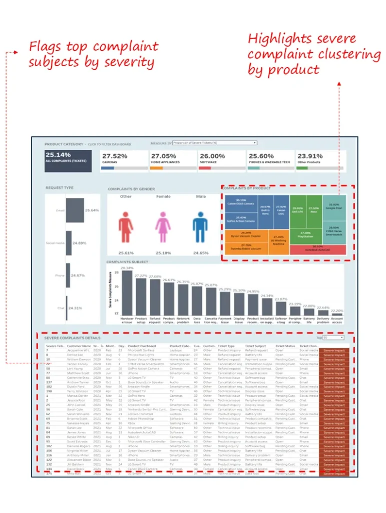
2.Complaint Distribution & Severity Dashboard
Industry Fit: Consumer electronics, home appliances, software, and e-commerce
Most Relevant For: Quality heads, support operations managers, customer experience directors
Objective: To pinpoint high-volume and high-severity complaint patterns across products, channels, and demographics
What’s Good About This Dashboard:
- Identifies top severe complaint drivers across categories (e.g., refund, network, installation).
- Filters complaints by product type, gender, and request channel for targeted root-cause analysis.
- Highlights the most problematic SKUs and brands with high-severity complaint rates.
- The detailed ticket-level table helps drill into unresolved or high-impact cases
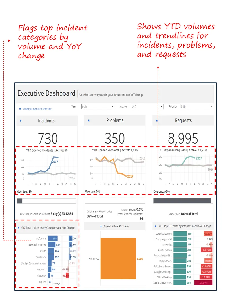
3.Service Request, Incident & Problem Overview Dashboard
Industry Fit: Cross-industry (IT Services, Telecom, Healthcare, Finance)
Most Relevant For: Chief Operating Officer (COO), Head of Customer Support, VP of IT Service Management
Objective: Offer a consolidated view of service performance across requests, incidents, and problems to aid high-level decision-making and SLA adherence
What’s Good About This Dashboard:
- Summarizes volume and YoY trends for all service request types in a single glance.
- Tracks overdue and SLA compliance metrics across incidents, problems, and requests.
- Breaks down incident types and problem backlog by priority and age.
- Flags top 10 items by service request volume with change percentages

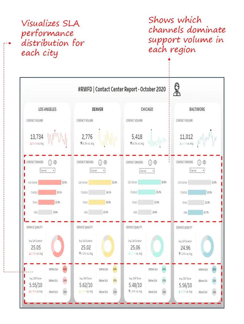
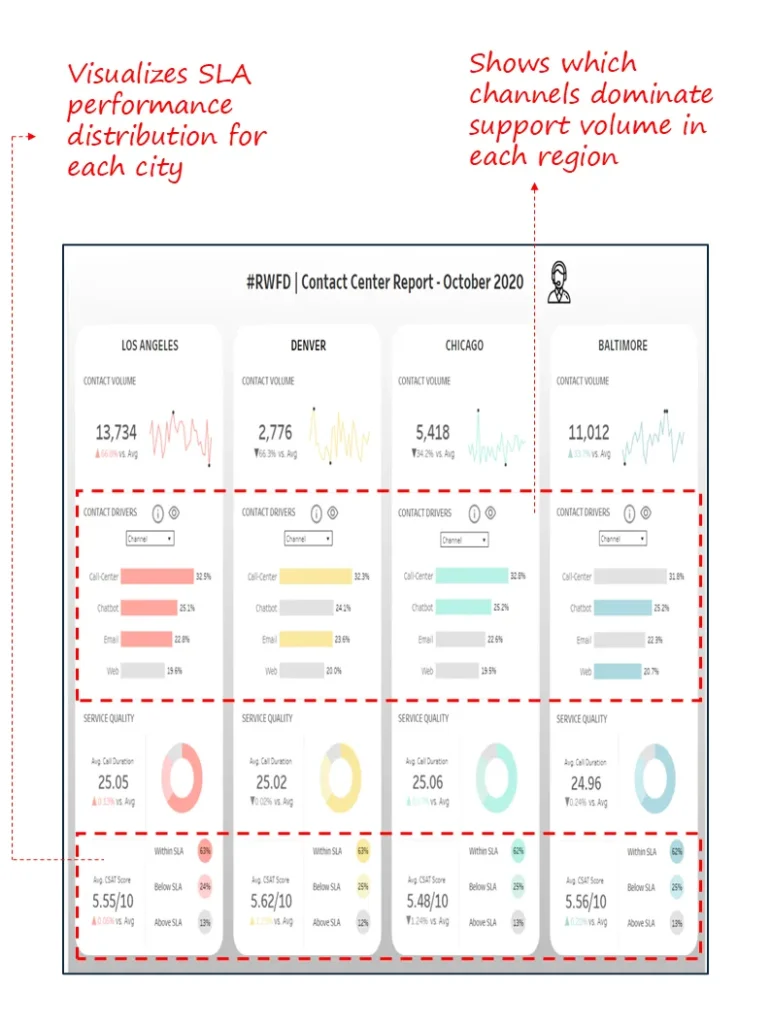
4. Contact Centre Report – City-Level Omnichannel Performance Dashboard
Industry Fit: Retail, Telecom, Healthcare Networks, Government Services, Utilities
Most Relevant For: COOs, Chief Customer Officers (CCO), Regional Operations Heads
Objective:
To monitor omnichannel support performance at the regional level enabling leadership to compare contact volumes, customer satisfaction, and SLA adherence across geographies and channels.
What’s Good About This Dashboard:
- Provides side-by-side city-level comparisons (e.g., LA, Denver, Chicago, Baltimore) of contact volumes and service quality.
- Breaks down channel-wise drivers (Call Centre, Chatbot, Email, Web) for each city helping diagnose demand patterns.
- Tracks CSAT scores, average call duration, and SLA compliance in a clean, consistent format.
- Supports identification of geographic service gaps and operational inconsistencies across regions.
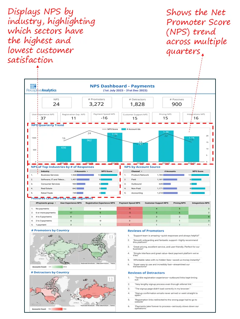
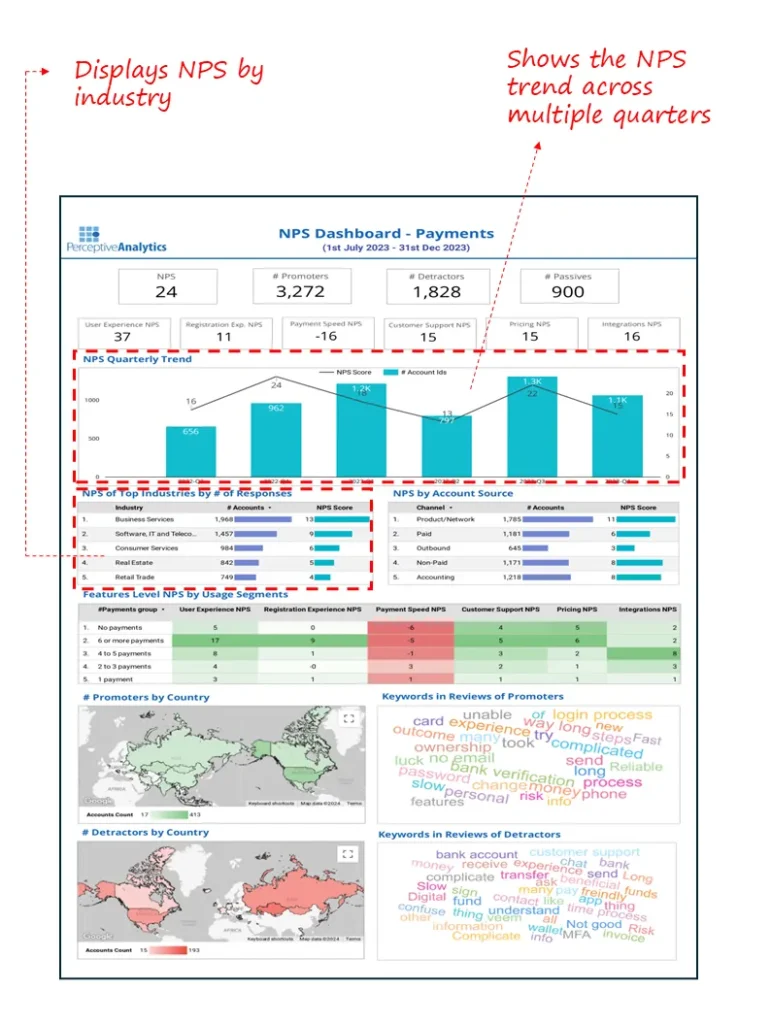
5.NPS Performance & Feedback Driver Dashboard
Industry Fit: SaaS, Payments, Fintech, B2B Platforms
Most Relevant For: CXOs, Heads of Customer Experience, Product Teams
Objective:
To monitor Net Promoter Score (NPS) by channel, product feature, usage group, and geography, enabling leaders to diagnose pain points and elevate customer loyalty across the payment platform.
What’s Good About This Dashboard:
- Dissects NPS across channels (paid, product, outbound), usage frequency, and customer segments.
- Flags low-scoring features like registration experience and payment speed using clear red-green heatmaps.
- Shows top industries by account volume and NPS contribution, offering strategic segmentation.
- Combines NPS trendline with real customer feedback to contextualize promoter and detractor behaviour.
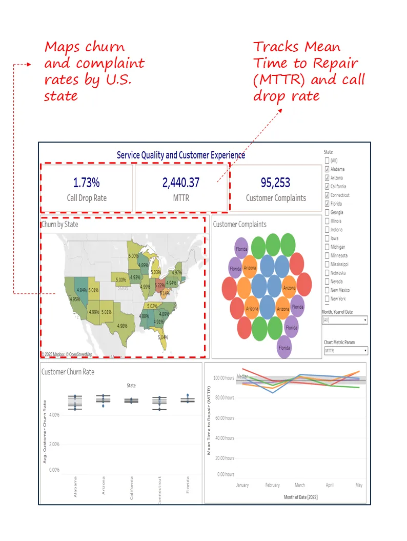
6.Service Quality and Customer Experience Dashboard
Industry Fit: Telecom, Utilities, Insurance, Regional Service Providers
Most Relevant For: Heads of Operations, CX Leaders, Regional Managers
Objective:
To track service-related customer pain points call drops, Mean Time to Repair (MTTR), and complaint volume across states and over time, to improve churn outcomes and customer experience delivery.
What’s Good About This Dashboard:
- Shows geographic variation in churn and complaints, highlighting regional hotspots.
- Tracks MTTR trends and call drop rate for service quality benchmarking.
- Visualizes complaint clustering with state-wise filters for diagnostic drill-down.
- Offers side-by-side views of churn, service metrics, and complaint volume for unified decision-making.

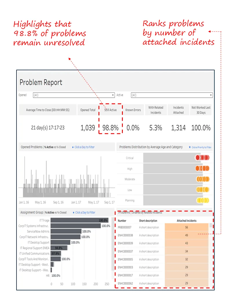
7. Problem Management and Root Cause Analysis Dashboard
Industry Fit: IT Services, Managed Infrastructure, Enterprise Support.
Most Relevant For: Problem Managers, IT Service Managers, ITSM Leaders
Objective:
Monitor unresolved problems, assess incident linkage, and prioritize long-standing root causes for resolution based on severity and impact.
What’s Good About This Dashboard:
- Surfaces backlog of open problems, with an alarming 98.8% still unresolved.
- Flags problems not worked on in last 30 days, helping drive accountability.
- Visualizes distribution by severity and average age, aiding in prioritization.
- Shows top problems with high incident linkage, highlighting recurring root causes.

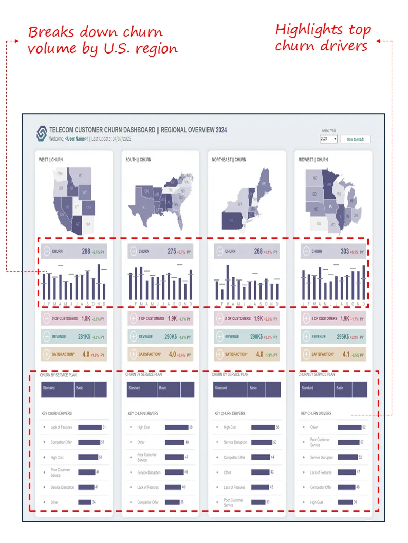
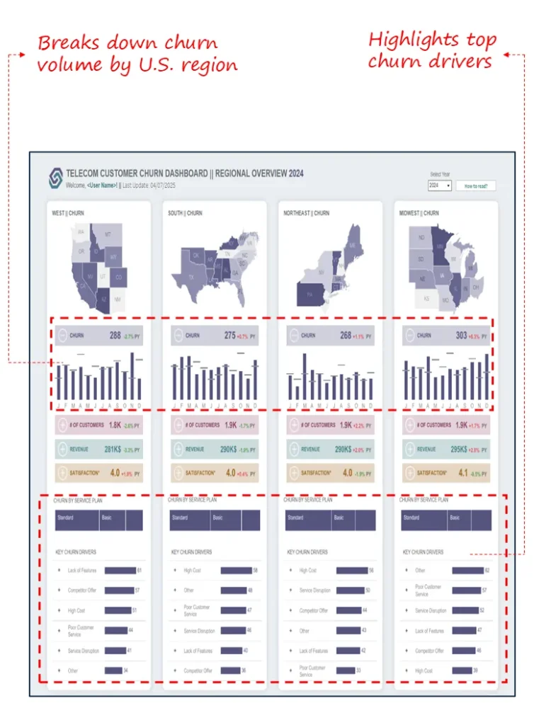
8.Telecom Customer Churn Dashboard
Industry Fit: Telecom
Relevance For: Customer Service Directors, Regional Ops Heads, Retention Managers
Objective:
Diagnose churn trends across regions, plans, and churn drivers to inform targeted retention strategies
What’s Good About This Dashboard:
- Breaks down churn by U.S. region, highlighting high-impact geographies like the Midwest
- Connects churn to satisfaction, revenue, and customer volume at the regional level
- Flags leading churn drivers (e.g., lack of features, poor service, competitor offers) to support root cause analysis
- Segments churn data by service plan (Standard vs. Basic) for deeper retention insight
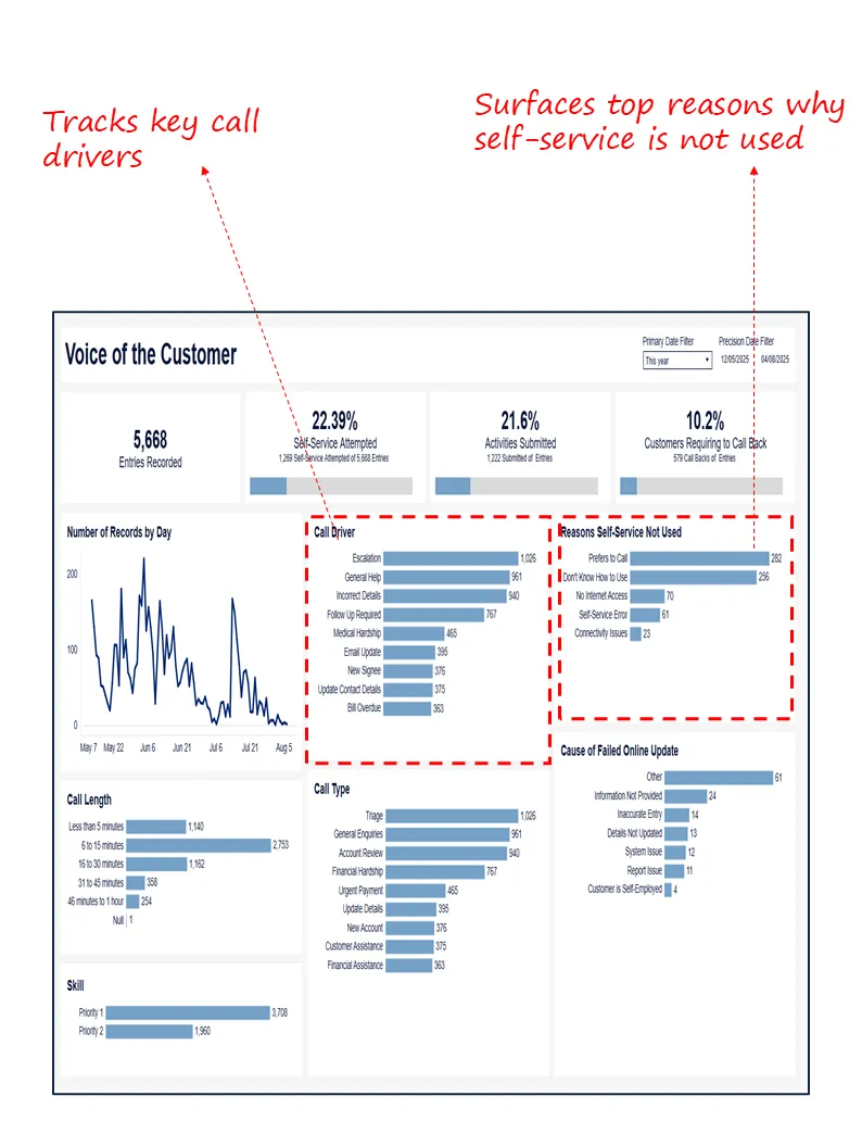
9. Voice of the Customer – Self-Service & Escalation Performance Dashboard
Industry Fit: Cross-industry (B2B and B2C service environments with digital and call-based support)
Most Relevant For: Chief Customer Officers (CCO), Chief Operating Officers (COO), Heads of Digital Support
Objective:
To evaluate the effectiveness of self-service channels, understand top customer call drivers, and identify barriers to digital resolution that result in escalation or call-back demand.
What’s Good About This Dashboard:
- Measures self-service adoption and completion rates alongside volume of customer support interactions.
- Highlights primary call drivers such as escalation, incorrect details, or general inquiries revealing avoidable contact opportunities.
- Surfaces clear reasons why customers don’t use self-service (e.g., preference for calling, lack of knowledge, system errors).
- Provides operational insights into call length, callback volume, and failed update causes supporting digital deflection and triage improvement efforts.

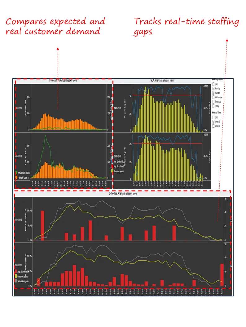
10. Forecast vs Actual – SLA & Staffing Analysis Dashboard
Industry Fit: BPOs, Contact Centres, Telecom, Shared Services, Government Helpdesks
Most Relevant For: COOs, Heads of Workforce Management, Service Delivery Executives
Objective:
To align service volume forecasts with actual inflow, track SLA adherence by time slot, and ensure agent staffing matches operational demand to avoid service degradation.
What’s Good About This Dashboard:
- Compares forecasted vs actual call volumes to assess planning accuracy.
- Visualizes SLA performance by 15-minute intervals, surfacing shortfalls in real-time service delivery.
- Tracks required vs scheduled agents, making under- or overstaffing visible to operational leaders.
- Displays abandonment trends when staffing mismatches occur supporting proactive workforce planning.

Closing Note
In customer service, what gets measured shapes what gets improved, but only if the right people see the right data. These 10 dashboards give executives what they need most: clarity, focus, and control. Whether the priority is reducing churn, improving SLA adherence, or scaling omnichannel support, the dashboards featured here translate complexity into insight and into action.
Executives don’t need more metrics. They need better visibility. These dashboards deliver exactly that.
Customer service executives often work with Tableau Consultants or hire Power BI consultants to create dashboards that integrate ticketing, CRM, and customer satisfaction metrics, ensuring clarity, speed, and accountability across teams.
Each month, we curate the latest updates, insights, and trends for senior leaders in data analytics and AI in our CXO Analytics Newsletter.
Our mission is “to enable businesses to unlock value in data.” For over 20 years, we’ve partnered with more than 100 clients—from Fortune 500 companies to mid-sized firms—to solve complex data analytics challenges. Our services include Advanced Analytics Consulting, Generative AI Consulting, and Business Intelligence (Tableau Consulting, Power BI Consulting and Looker Consultants) turning data into strategic insight. We would love to talk to you. Do reach out to us for a free consultation.