


Driving Sales Performance with Tableau Dashboards
Executive Overview
Business leaders don’t need more reports — they need clarity. A well-designed Tableau sales dashboard converts data from multiple sources into one real-time, trusted view of commercial performance. It highlights risk, surfaces opportunity, and provides a single narrative that connects analytics to business action.
At Perceptive Analytics, we build executive dashboards that shorten reporting cycles, increase analytics adoption, and improve forecast accuracy across enterprise sales functions.
Why Many Sales Dashboards Fail to Influence Decisions
- Fragmented data sources: disconnected spreadsheets and legacy BI tools create inconsistent KPIs.
- Slow refresh times: dashboards load slowly, forcing executives to rely on outdated data.
- Low adoption: if dashboards are difficult to interpret, users return to static reports.
- No business context: too many visuals, not enough insight into ROI, churn, or revenue risk.
How We Turn Dashboards into Decision Engines
Our design principle is simple: every Tableau dashboard must answer a clear business question and trigger a decision. We use a consultative framework that moves from Problem → Approach → Solution → Impact.
- Define the decision: what leadership decision should this dashboard drive? (e.g., “Which regions risk missing this quarter’s target?”)
- Focus KPIs on outcomes: limit to 6–8 metrics that influence revenue, margin, or retention.
- Design for speed: cascade views and use lightweight filters for instant loading.
- Add context and ownership: use annotations, thresholds, and calls to action that clarify next steps.
Advisory note: If dashboards are slow or disconnected from board priorities, start with a 2-week pilot to align KPIs and rebuild your Tableau layer for real-time visibility.
Design Principles That Convert Data into Decisions
1. Keep the Narrative Tight
Every dashboard should read like a concise business story — Headline → Evidence → Action. Executives should grasp the core message in three seconds.
2. Choose Chart Types Intentionally
Each visual must serve a purpose:
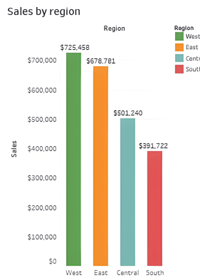
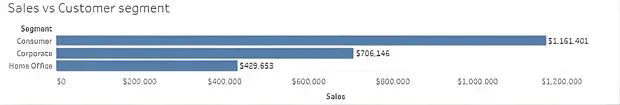
- Bar charts — compare contributions by region or product.
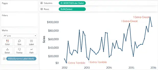
- Line charts — track trends and seasonality for sales or churn.
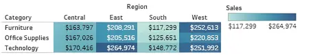
- Highlight tables — reveal performance vs. targets instantly.
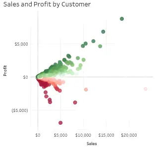
- Scatter plots — identify correlations such as discount vs. velocity.
- Bullet graphs — benchmark progress toward goals.
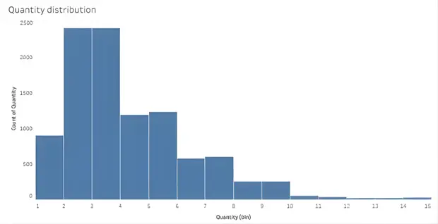
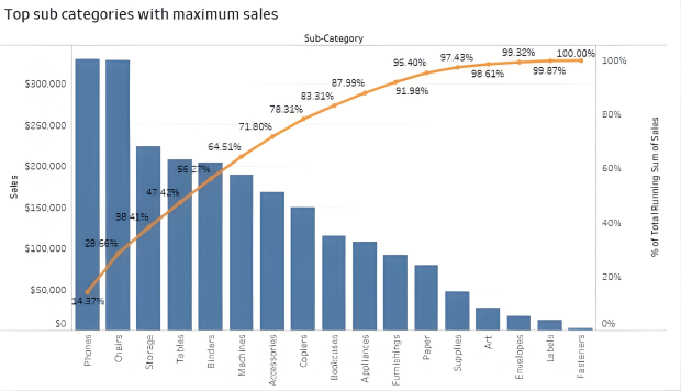
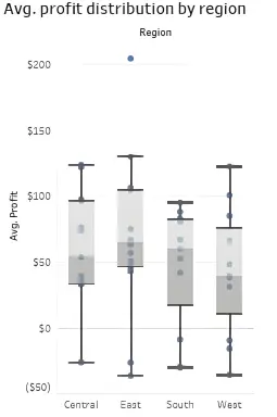
Example visuals:
3. Architect for Performance
Replace heavy filters with cascading dashboards. Load a high-level summary first, then enable deep dives on demand — executives see insights instantly, while analysts can explore details. For dashboards processing large datasets or complex calculations, optimizing string calculations and aggregations can dramatically reduce load times. Learn how we reduced a Tableau workbook’s load time from 112 million string calculations.
4. Eliminate Visual Clutter
Remove redundant gridlines, shadows, and axis labels. Replace decorative titles with data-driven headlines (e.g., “Q3 Revenue Down 6% vs Plan”).
5. Embed Context and Actions
Use dynamic titles, threshold alerts, and reference lines. Each panel should suggest the next step and display the owner accountable for it.
6. Institutionalize Through Playbooks
Provide short dashboard playbooks and templates for reuse across teams — especially for recurring sales and operations reviews.
Example: Tableau Sales Dashboard
This executive dashboard brings together trend, regional, and profitability data into one cohesive, decision-ready view.

Insight to action: If your dashboards require multiple exports before board meetings, you may be measuring everything except what drives growth. Let’s simplify that.
Advanced Chart Types and Visual Enhancements
Bullet graphs — track goal achievement over time.

Pareto analysis — surface the 20% of accounts driving 80% of results.
Box plots — identify performance outliers or distribution gaps.
Regional Insight Through Maps
Geospatial visualization exposes geographic strengths and weaknesses. Tableau maps can also operate offline via local caching when data confidentiality matters.
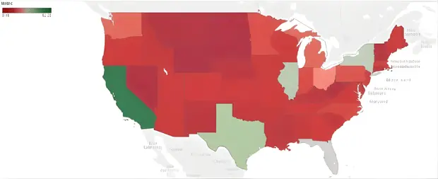
Map: Sales performance by region (green = positive, red = negative).
Adding Interactivity and Cues
Use interactive highlights, contextual labels, and visual cues to make key insights stand out. The examples below illustrate label and shape techniques that guide attention.

Green arrows indicate positive progress; red arrows signal decline.
Take interactivity further: Beyond viewing data, executives can update records, add comments, and assign follow-ups directly from the dashboard using write-back functionality. Learn how write-back in Tableau helps the C-suite drive faster, smarter decisions.
Automated Alerts and Calculated Fields
Create dynamic metrics and configure threshold alerts in Tableau Server to notify executives when KPIs cross critical limits. This keeps leadership aligned to real-time data.
Case Study
Driving Predictable Growth with Sales Analysis Dashboards: A Case Study in AI Finance Solutions

Business Impact from Consultative Deployment
- Reporting speed: reduced from weeks to hours.
- Higher adoption: 30–50% more active dashboard users in the first quarter.
- Forecast accuracy: gains of 15–30% depending on data maturity.
- Operational savings: analysts spend less time compiling reports.
Example: A mid-market SaaS client replaced spreadsheet reports with a three-panel Tableau suite, cutting manual reporting time by 45% and improving forecast accuracy by 20%.
Checklist for Effective Implementation
- Define one decision per dashboard.
- Limit to 6–8 key metrics.
- Use clear, one-line insights as titles.
- Adopt cascading dashboards for fast loads.
- Set targets, alerts, and owners for KPIs.
- Provide a short dashboard playbook for teams.
Sales teams frequently collaborate with our Tableau Consultants to optimize dashboards for speed, accuracy, and scalability.
Next Step: Review Your Sales Dashboard
Identify three quick improvements that make your dashboards executive-ready and faster to interpret.